Christian Heilmann

Posts Tagged ‘usability’

Stumbling on the escalator

Thursday, February 16th, 2012

I am always amazed about the lack of support for progressive enhancement on the web. Whenever you mention it, you face a lot of “yeah, but…” and you feel having to defend something that should be ingrained in the DNA of anyone who works on the web.

Escalator

When explaining progressive enhancement in the past Aaron Gustafson and me quoted the American Stand-Up comedian Mitch Hedberg and his escalator insight:

An escalator can never break – it can only become stairs. You would never see an “Escalator Temporarily Out Of Order” sign, just “Escalator Temporarily Stairs. Sorry for the convenience. We apologize for the fact that you can still get up there.”

This is really what it is about. Our technical solutions should be like escalators – they still work when the technology fails or there is a power outage (if you see CSS animations and transformations and transitions and JavaScript as power) – but they might be less convenient to use. Unlike real world escalators we never have to block them off to repair them.

We could even learn from real-world escalators that shut down when nobody uses them for a while and start once people step on them. On the web, we call this script loading or conditional application of functionality. Why load a lot of images up front when they can’t be seen as they are far away from the viewport?

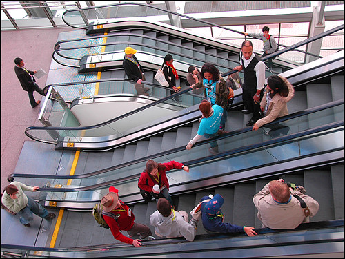
An interesting thing you can see in the real world is that when an escalator broke down and became stairs people stumble when they enter it. Our bodies have been conditioned to expect movement and our motor memory does a “HUH?” when there isn’t any.

This happens on the web as well. People who never were without a fast connection or new and shiny computer or phone with the latest browsers have a hard time thinking about these situations – it just feels weird.

Travelator

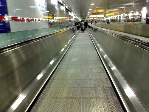
Another interesting thing are the horizontal walkways you have in airports. These are meant to accelerate your walking, not replace it. Still you find people standing on those complaining about their speed.

On the web these are the people who constantly complain about new technology being cool and all but they’d never be able to use it in their current client/development environment. Well, you don’t have to. You can walk in between the walkways and still reach the other side – it just takes a bit longer.

So next time someone praises flexible development and design practices and you have the knee-jerk reaction to either condemn them for not using the newest and coolest as “everybody has a xyz phone and browser abc” or you just don’t see the point in starting from HTML and getting to your goal re-using what you structured and explained in HTML as “GMail and Facebook don’t do it either” think about the escalator and how handy it is in the real world.

Think about it when you are tired (accessibility), or you carry a lot of luggage (performance) or when you just want to have a quick chat whilst being transported up without getting out of breath. Your own body has different needs at different times. Progressively enhancing our products allows us to cater for lots of different needs and environments. Specialising and optimising for one will have a much more impressive result, but for example a lift is pointless when it doesn’t work – no matter how shiny and impressive it looks.

Our job is to make sure people can do the things they went online for – get from their start to their desired goal. This could be convenient and fast or require a bit of work. Our job is to make sure that people do not get the promise of a faster and more convenient way that fails as soon as they try taking it.

You can comment on Google Plus if you want to.

Shopping impossible – why don’t people use Paypal for what it is good for?

Wednesday, November 3rd, 2010

The other day I logged into Paypal and was confronted with the following sight:

Ad for paypal campaign showing an old lady talking about nasal hair remover

That was the end of breakfast for me but I was also excited – I like the idea of winning a year’s salary and I had to buy a mouse for a friend of mine anyway. Normally I would go to ebay for a mouse or directly to SVP who’ve never let me down in the past. But hey, let’s win that extra income, right?

How wrong I was. I found two mice I would love to buy, from Pixmania and another one from Novatech. I clicked through and I was asked to sign up for each of the sites. They asked me for my address, they wanted my email, all of it was hidden in horrid 5 step processes. Pixmania even signed me up for their deals mailing list before I was able to buy my mouse. I then was not able to buy the mouse without becoming a Pixmania subscriber – no thanks. Novatech was even more interesting – I was able to go through the whole process just to be told at the final checkout before paying that they would only be able to deliver the mouse to the address of my Paypal account – and not the friend’s address – although I was asked to enter her address first.

In short, I gave up. I went to ebay, bought the mouse, checked out using Paypal and I was done. I couldn’t win the yearly income but I also kept my sanity. There is simply no point in the implementation of the promotion right now. I like Paypal, I like its simplicity. Why the implementers don’t recognise that I come from the promotion page to their sites and just let me pay with Paypal (as this is what the promotion is about) and send the product wherever I want is beyond me. Why Paypal pays money and promotes horrible shops like that is also beyond me.

So if you use Paypal for your shop – give me a way in. You know me, I can sign in with Paypal – don’t ask me to sign up again for you and ask for all kind of data – filling in forms is annoying. I already give you a blank cheque, just let me find a product, click it and buy it.

TTMMHTM: Scaling and redesigns, iPad for access, old games, HTML5 polyfills and unicorns

Tuesday, September 28th, 2010

Things that made me happy this morning:

Cleaning up the “CSS only sexy bookmark” demo code

Friday, January 8th, 2010

Going through my Google Reader I stumbled upon an article today called Sexy bookmark like effect in pure CSS. Normally when I hear “pure CSS” I skip as 99% of these solutions don’t work with a keyboard and are thus a bad idea to use on the web. However, this one intrigued me as I had no clue what a “sexy bookmark like effect” might be.

Turns out it was not a porn bookmark but one of those “share this with the social media” link-bars you have below blog posts to help the copy and paste challenged people out there:

Link menu with different social media options

OK, that can’t be that problematic. The trick to do a list of links as a cool rollover using CSS only has been done in 2004 in the first CSS sprites article. Notice that the links are in a list.

Now, the new article’s HTML is the following:

There are a few things wrong with this in my book:

  • There is no semantic structure of what is going on here. Line breaks do not mean anything to HTML so in essence this is a list of links without any separation. Imagine sending three links to a friend in an email or putting them on a page. Would you do it like this: GoogleI can has cheezburgerb3taSpotify ? looks confusing to me…
  • There is no content in the links – when CSS is turned off you find nothing whatsoever.
  • There is quite a repetion of classes there. When every element in another element has the same class in it then something fishy is going on. Unless this class is used as a handle for – let’s say a microformat, you can get rid of it and use the cascade in CSS. So in this case you can style all the links with .sharing-cl a{} and get rid of the repeated classes.
  • A navigation is a structured thing, so instead of a div with links in it, how about using a list? This way when CSS is off, this still makes sense.

So here’s my replacement:

Of course you should replace the empty href attributes with the real links.

Normally I’d use IDs instead of classes, but as this bar might be used several times in the document, let’s leave it like it is.

The HTML now is 318 bytes instead of 294 which is a slight increase. But:

  • It makes sense without CSS
  • It is well-structured and makes sense even to screen readers
  • The links make sense as they say where they are pointing to.

Let’s check on the CSS:

.sharing-cl{
}

.sharing-cl a{
display:block;
width:75px;
height:30px;
float:left;
}

.sharing-cl .share-sprite{
background:url(http://webdeveloperjuice.com/demos/images/share-sprite.png) no-repeat}
.sharing-cl .sh-su{
margin-right:5px;
background-position:-210px -40px;
}

.sharing-cl .sh-feed{
margin-right:5px;
background-position:-70px -40px;
}

.sharing-cl .sh-tweet{
margin-right:5px;
background-position:-140px -40px;
}

.sharing-cl .sh-mail{
margin-right:5px;
background-position:0 -40px;
}

.sharing-cl .sh-digg{
margin-right:5px;
background-position:-280px -40px;
}

.sharing-cl .sh-face{
background-position:-350px -40px;
}

.sharing-cl .sh-mail:hover{
margin-right:5px;
background-position:0 1px;
}

.sharing-cl .sh-feed:hover{
margin-right:5px;
background-position:-70px 1px;
}

.sharing-cl .sh-tweet:hover{
margin-right:5px;
background-position:-140px 1px;
}

.sharing-cl .sh-su:hover{
margin-right:5px;
background-position:-210px 1px;
}

.sharing-cl .sh-digg:hover{
margin-right:5px;
background-position:-280px 1px;
}

.sharing-cl .sh-face:hover{
background-position:-350px 1px;
}

So here we have a lot of repetition. You also see where the share-sprite class comes in: if you wanted to add an element to that section that is a link but has no image background you just leave out the class. This, however is exactly the wrong approach to CSS. We can assume that every link in this construct gets the background image, which is why it makes more sense to apply the image to the a element with .sharing-cl a{}. As every link has a class you can easily override this as the “odd one out” with for example .sharing-cl a.plain{}.

The same applies to the margin-right:5px. If that is applied to all the links but one, don’t define it for all the others and leave it out at the “odd one out”. Instead, only apply it to the odd one out and save a lot of code.

Final CSS:

.sharing-cl{
overflow:hidden;
margin:0;
padding:0;
list-style:none;
}

.sharing-cl a{
overflow:hidden;
width:75px;
height:30px;
float:left;
margin-right:5px;
text-indent:-300px;
}

.sharing-cl a{
background:url(http://webdeveloperjuice.com/demos/images/share-sprite.png) no-repeat;
}

a.sh-su{background-position:-210px -40px;}
a.sh-feed{background-position:-70px -40px;}
a.sh-tweet{background-position:-140px -40px;}
a.sh-mail{background-position:0 -40px;}
a.sh-digg{background-position:-280px -40px;}
a.sh-face{
margin-right:0;
background-position:-350px -40px;
}

a.sh-mail:hover{background-position:0 1px;}
a.sh-feed:hover{background-position:-70px 1px;}
a.sh-tweet:hover{background-position:-140px 1px;}
a.sh-su:hover{background-position:-210px 1px;}
.sh-digg:hover{background-position:-280px 1px;}
a.sh-face:hover{
margin-right:0;
background-position:-350px 1px;
}

From 1028 bytes down to 880. Just by understanding how CSS works and how the cascade can be used to your advantage. I would have loved to get rid of the a selectors, too, but they are needed for specificity. Notice the overflow on the main selector – this fixes the issue of the floats not being cleared in the original CSS. By using negative text-indent we get rid of the text being displayed, too. Personally I think this is bad and you should try to show the text as you cannot expect end users to know all these icons.

For example:

#text{
margin-top:3em;
font-weight:bold;
font-family:helvetica,arial,sans-serif;
}

#text a{
text-indent:0;
height:auto;
text-align:center;
font-size:11px;
padding-top:35px;
color:#999;
text-decoration:none;
}

You can see the solution in action here:

Sharing bar - cleaned up by  you.

To me, praising “CSS only solutions” is not enough – if you really love CSS and see it as a better solution than JavaScript then you should also show how people can use its features to create smart, short and flexible code.

On password fields masking and Jakob Nielsen

Friday, June 26th, 2009

Jakob Nielsen just posted on alertbox that we should stop password masking (you know, showing asterisks or dots instead of showing the password while the user types it in.

His argument is the following:

Most websites (and many other applications) mask passwords as users type them, and thereby theoretically prevent miscreants from looking over users’ shoulders. Of course, a truly skilled criminal can simply look at the keyboard and note which keys are being pressed. So, password masking doesn’t even protect fully against snoopers.
More importantly, there’s usually nobody looking over your shoulder when you log in to a website. It’s just you, sitting all alone in your office, suffering reduced usability to protect against a non-issue.

Which makes me wonder when was the last time that Mr.Nielsen left his house to communicate with the real world. As a frequent traveller I am constantly seeing people logging into web sites in hotel lobbies (when they check in for their flight for example and enter their bonus miles account details), in Internet Cafes or when they use their laptop in a public space. While it is harder to spot the keyboard (especially with fast typers) there is no problem whatsover looking over their shoulder or – using my 10x optical zoom camera – even spot what they enter on the screen from across the room.

However, password masking is not a 100% security measure but anyone working in security promising you a 100% security is nobody you should trust anyways.

I do agree though that password masking can be very annoying on a mobile device, as is entering any form (my favourite bugbear is Opera Mini Uppercasing the first word I enter in any text field – no this is my user name, not a sentence).

As I am changing my passwords every few weeks I do get confused from time to time, too, which is why I have written myself a GreaseMonkey script that adds a link to any password field that allows me to toggle its display:

Password shower greasemonkey script by  you.

This, in my book, should be a standard feature of browsers (or a convention we should start to follow when we design forms) – not showing sensitive information as readable text on a screen just because we don’t think anyone would ever watch us.

Let’s also not forget that browsers deal with an input field with the type of password differently than with one that is text. For starters browsers do not collect previously entered information and offer them as options to autofill the field – something that would be terribly dangerous for passwords.