Christian Heilmann

Posts Tagged ‘accessibility’

WebmaKey MaKey? – here is something to start from

Sunday, September 23rd, 2012

MaKey MaKey is amazingly cool. It is a very simple Arduino based board with a USB cable and Alligator Clips to simulate keys pressed by touching a cable and closing the circuit by holding the other cable. This would be boring though, so you can connect the second clip to anything that can transmit a current – fruit, play-doh, graphite pen drawings, you name it. Check out the video to see the idea behind it and some examples.

More than a toy

On first glance this is cool, but seems like a toy for children to do their first steps with computing. And yes, it is magic for that as the Night Zoo teacher experiment shows. But there is more to this.

A great accessibility opportunity

I’ve almost given up on trying to get the accessibility web world excited about affordable and open solutions, but using a MaKey MaKey you could create switch interfaces for people who can not handle a keyboard on a shoestring and have fun at the same time as it can be customised in any way you want to. The beachball interface for Flabbyphysics is a great example of that.

There is a whole section on the MaKey MaKey forums dedicated to accessibility called Hackcess. In general it is a good idea to check the forums for inspiration as people build a lot of wonderfully crazy things with it.

WebmaKey?

The thing I was missing a bit on the site was the web component, as a lot of the demos used Flash or native code of sorts. As I thought it a good idea to mix MaKey MaKey with Webmaking I put together a very simple blueprint to use MaKey MaKey input in an HTML page called Testy Testy.

All it is are event handlers for the right keys showing and hiding different sections in the page. There is also a demo for moving a Foxkeh around with the cursor keys.

Here’s what the README explains:

As MaKey MaKey simulates various keystrokes and click events you can interact with the computer. Testy Testy is a simple start for doing something with this.
The HTML contains sections linked to the keys simulated by MaKey MaKey. When you activate one, the appropriate section is shown, when you release the key (or the cable) it gets hidden.

<section id="right" class="reactors">
  <p>Right</p>		
</section>

So, if you want to for example connect your MaKey MaKey to a Banana and show a picture of a banana, all you need to do is alter the HTML:

<section id="right" class="reactors">
  <a href="http://www.flickr.com/photos/robin24/5129712590/" 
     title="Banana - Isolated by robin_24, on Flickr">
    <img 
      src="http://farm5.staticflickr.com/4059/5129712590_98642c5ebf_n.jpg"
      width="320" 
      height="213" 
      alt="Banana - Isolated">
  </a>		
</section>

Hopefully this will get some people started to mix HTML learning and MaKey MaKey hacking.

Mozilla Festival

At this year’s Mozilla Festival we’ll have a MaKey MaKey session. and I am actually working on a hug/kiss/high-five camera booth using MaKey MaKey and WebRTC. Let’s see how that works out :)

In any case I can only recommend to get a kit yourself as it is incredibly fun to play with!

The discussion happens on Google+ (maybe).
Alcance by CPQD – an accessible and simple interface for smartphones

Tuesday, July 31st, 2012

Accessibility and mobile devices is still and issue that needs solving. Sure, there were solutions for phones around for quite a while that would for example allow a blind person to listen to their phone (a friend I know uses a Nokia N95 for that) and the iPhone is considered by many a really good solution for people with disabilities but the price of the iPhone makes it less accessible for a lot of people.

At Campus Party Recife I gave a talk about Mozilla and the Open web device and got introduced by Felipe Cunha of Telefonicá Brazil to a product called Alcance by CPQD. Here is a quick interview with Felipe about it:

Here are the main points:

  • CPQD built this prototype after doing user testing and research with blind users, the elderly and people with learning disabilities and low literacy
  • The software runs on mid-range Android phones and uses private access to boot directly into the interface circumventing the main Android OS interface
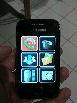
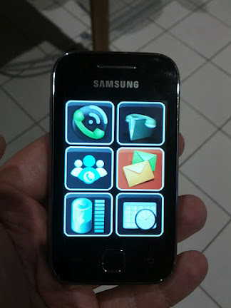
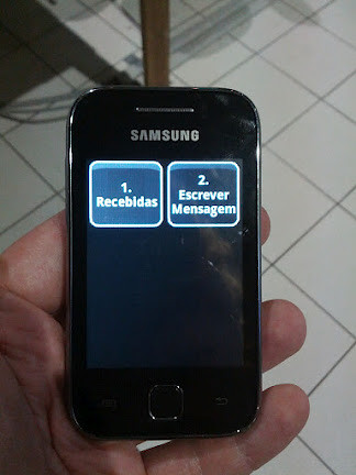
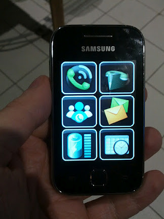
  • Users can swipe on the screen and a voice reads out what app they are currently touching. Double-clicking opens that app with more voice information. Subsequent screens then all are the same size icons (6 per screen)

Here are some screenshots of the device in action:


Alcance by CPQD - start screen
Alcance start screen – no app selected


Alcance by CPQD - selected app
Alcance selected app screen


Alcance by CPQD - another selected app
Alcance another selected app screen


Alcance by CPQD - secondary menu
Alcance secondary app screen

Of course this will not replace a full-on smart phone with all its possibilities but I like the idea and the simplicity of it a lot. Telefonicá is very interested in seeing where this can go and I am pretty sure this could be easily converted to Firefox OS and in HTML5.

What I like most about it is that it was built after doing research with the intended audience rather than yet another protoype that assumes a lot and lands in the “innovation” bin in the company a few weeks later.

It will be interesting to see what else happens with this product. Especially in a market like Brazil where low literacy is an issue this could be a good way to bring connectivity to those who can benefit from it.

TTMMHTM: Scaling and redesigns, iPad for access, old games, HTML5 polyfills and unicorns

Tuesday, September 28th, 2010

Things that made me happy this morning:

TTMMHTM: Swinging, Darkroom, iPad accessibility and AI in PacMan

Monday, May 24th, 2010

Things that made me happy this morning:

Chasing the shiny – HTML5, CSS3, transitions – oh my!

Friday, May 14th, 2010

Yesterday I had a back and forth on Twitter with Paul Irish and Divya Manian on Twitter about a thing that is full of win but also drives me crazy.

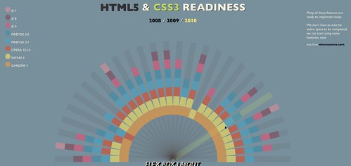
Those two lads built http://html5readiness.com/ – a beautiful demo of what you can do with CSS transformations, JavaScript and markup these days. Here’s what it looks like:

HTML5 Readiness

In essence this is the designer’s eye for http://caniuse.com/ which listed the same information in a lesser visual but very useful manner.

When I looked at the visualisation I went “WOW” and so did a lot of other people. But actually when using the site my fascination and interest quickly disolved.

I consider myself quite an observant person and I can read really, really fast. Looking at this visualization though I found myself constantly having to check from the coloured ray to the legend to understand just which browser we are currently talking about. Clicking the fixed browser position checkbox made this a bit more obvious but I am still very confused – especially as the colours are close to each other (on my laptop) and the rollover colour change doesn’t match the legend any more. This gets even more confusing when the colour of the main ray and the rollover changes:

HTML5 Readiness dark rollover.

I have no clue why the ray is coloured differently. I might think it is the connector between HTML5 and CSS3, but Geo Location is not part of HTML5.

The next thing I normally do to any interface is to turn off CSS to see how it degrades for non-visual users or on old mobile devices (yes, I do have to use an old Blackberry from time to time).

If you do this on HTML5 readiness you get a terrible experience:

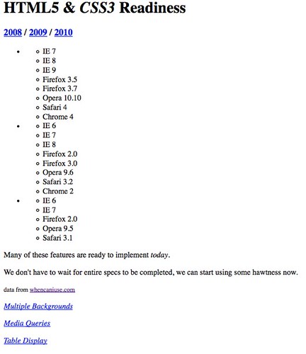
HTML5 without CSS

  • There is no connection between the year names and the browser support (other than links – a nested list would make the connection much more obvious).
  • None of the links (like “Multiple backgrounds”) does anything.

What really made me very confused was looking at the source code though. The authors use B and I tags all over the shop and one of the rays for example is:


Multiple Backgrounds

OK, I get it – I and B are text stylistically offset from the normal prose without conveying any extra importance> which technically gives us a carte blanche to do whatever we please with these elements.

Back in the real world, however, WYSIWYG editors have B and I buttons which include these elements as BOLD and ITALIC. Now, as accessibility and semantics fans we’ve been bickering for years that this is a bad idea as this is painting with HTML rather than telling a user agent that the text needs to be emphasized or strong. We made quite some headway with this – and people started listening to us. Now we go back and say “oh well then, actually this is all fine – use whatever you want”.

All in all this example reminds me of something I built 8 years ago:

Logo painted with a layout table

This was friggin cool back then. It was done for the Commodore 64 scene and it had to work in every browser that knows HTML - including Amiga ones. I managed to make it a “how is that done” moment by not using an image but instead a layout table with spacer gifs:


.: the very best of :.


Wow, terrible, right? Who would use tables for layout? This is madness – these are technologies we shouldn’t need to use any longer.

Or is it? By using the plethora of HTML elements in the visualisation above we do exactly the same thing! HTML is there to logically structure content and give it semantic meaning – not to paint lovely pictures.

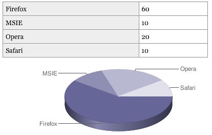
The page uses Can I use as its source of data – but instead of using a scraper and converting it to the necessary HTML (and by that making it possible to update automatically) the data is duplicated – and once displayed with no semantic value or logical structure whatsoever. We have the technology to convert sensible, good and clean HTML and turn it into something different. I’ve proven that in the past with the data table to charts conversion script:

Generating charts from accessible data tables using the Google Chart API by  you.

I really don’t understand why we forget the simple promise we share with our users over and over again:

  • Build on stuff that works and then make it more interactive and pretty

In the case of this visualisation – use data tables and generate all the fluff and classes you need to make the CSS work out with JavaScript. Or – how about using SVG for the whole thing?

I am not saying that Paul and Divya did something bad – I am big fans of their work – I am just saying that we keep doing the same mistakes. If you would not write some HTML by hand and only need it for an effect – you are doing things wrong.