Christian Heilmann

Posts Tagged ‘bestpractice’

Cleaning up the “CSS only sexy bookmark” demo code

Friday, January 8th, 2010

Going through my Google Reader I stumbled upon an article today called Sexy bookmark like effect in pure CSS. Normally when I hear “pure CSS” I skip as 99% of these solutions don’t work with a keyboard and are thus a bad idea to use on the web. However, this one intrigued me as I had no clue what a “sexy bookmark like effect” might be.

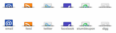
Turns out it was not a porn bookmark but one of those “share this with the social media” link-bars you have below blog posts to help the copy and paste challenged people out there:

Link menu with different social media options

OK, that can’t be that problematic. The trick to do a list of links as a cool rollover using CSS only has been done in 2004 in the first CSS sprites article. Notice that the links are in a list.

Now, the new article’s HTML is the following:

There are a few things wrong with this in my book:

  • There is no semantic structure of what is going on here. Line breaks do not mean anything to HTML so in essence this is a list of links without any separation. Imagine sending three links to a friend in an email or putting them on a page. Would you do it like this: GoogleI can has cheezburgerb3taSpotify ? looks confusing to me…
  • There is no content in the links – when CSS is turned off you find nothing whatsoever.
  • There is quite a repetion of classes there. When every element in another element has the same class in it then something fishy is going on. Unless this class is used as a handle for – let’s say a microformat, you can get rid of it and use the cascade in CSS. So in this case you can style all the links with .sharing-cl a{} and get rid of the repeated classes.
  • A navigation is a structured thing, so instead of a div with links in it, how about using a list? This way when CSS is off, this still makes sense.

So here’s my replacement:

Of course you should replace the empty href attributes with the real links.

Normally I’d use IDs instead of classes, but as this bar might be used several times in the document, let’s leave it like it is.

The HTML now is 318 bytes instead of 294 which is a slight increase. But:

  • It makes sense without CSS
  • It is well-structured and makes sense even to screen readers
  • The links make sense as they say where they are pointing to.

Let’s check on the CSS:

.sharing-cl{
}

.sharing-cl a{
display:block;
width:75px;
height:30px;
float:left;
}

.sharing-cl .share-sprite{
background:url(http://webdeveloperjuice.com/demos/images/share-sprite.png) no-repeat}
.sharing-cl .sh-su{
margin-right:5px;
background-position:-210px -40px;
}

.sharing-cl .sh-feed{
margin-right:5px;
background-position:-70px -40px;
}

.sharing-cl .sh-tweet{
margin-right:5px;
background-position:-140px -40px;
}

.sharing-cl .sh-mail{
margin-right:5px;
background-position:0 -40px;
}

.sharing-cl .sh-digg{
margin-right:5px;
background-position:-280px -40px;
}

.sharing-cl .sh-face{
background-position:-350px -40px;
}

.sharing-cl .sh-mail:hover{
margin-right:5px;
background-position:0 1px;
}

.sharing-cl .sh-feed:hover{
margin-right:5px;
background-position:-70px 1px;
}

.sharing-cl .sh-tweet:hover{
margin-right:5px;
background-position:-140px 1px;
}

.sharing-cl .sh-su:hover{
margin-right:5px;
background-position:-210px 1px;
}

.sharing-cl .sh-digg:hover{
margin-right:5px;
background-position:-280px 1px;
}

.sharing-cl .sh-face:hover{
background-position:-350px 1px;
}

So here we have a lot of repetition. You also see where the share-sprite class comes in: if you wanted to add an element to that section that is a link but has no image background you just leave out the class. This, however is exactly the wrong approach to CSS. We can assume that every link in this construct gets the background image, which is why it makes more sense to apply the image to the a element with .sharing-cl a{}. As every link has a class you can easily override this as the “odd one out” with for example .sharing-cl a.plain{}.

The same applies to the margin-right:5px. If that is applied to all the links but one, don’t define it for all the others and leave it out at the “odd one out”. Instead, only apply it to the odd one out and save a lot of code.

Final CSS:

.sharing-cl{
overflow:hidden;
margin:0;
padding:0;
list-style:none;
}

.sharing-cl a{
overflow:hidden;
width:75px;
height:30px;
float:left;
margin-right:5px;
text-indent:-300px;
}

.sharing-cl a{
background:url(http://webdeveloperjuice.com/demos/images/share-sprite.png) no-repeat;
}

a.sh-su{background-position:-210px -40px;}
a.sh-feed{background-position:-70px -40px;}
a.sh-tweet{background-position:-140px -40px;}
a.sh-mail{background-position:0 -40px;}
a.sh-digg{background-position:-280px -40px;}
a.sh-face{
margin-right:0;
background-position:-350px -40px;
}

a.sh-mail:hover{background-position:0 1px;}
a.sh-feed:hover{background-position:-70px 1px;}
a.sh-tweet:hover{background-position:-140px 1px;}
a.sh-su:hover{background-position:-210px 1px;}
.sh-digg:hover{background-position:-280px 1px;}
a.sh-face:hover{
margin-right:0;
background-position:-350px 1px;
}

From 1028 bytes down to 880. Just by understanding how CSS works and how the cascade can be used to your advantage. I would have loved to get rid of the a selectors, too, but they are needed for specificity. Notice the overflow on the main selector – this fixes the issue of the floats not being cleared in the original CSS. By using negative text-indent we get rid of the text being displayed, too. Personally I think this is bad and you should try to show the text as you cannot expect end users to know all these icons.

For example:

#text{
margin-top:3em;
font-weight:bold;
font-family:helvetica,arial,sans-serif;
}

#text a{
text-indent:0;
height:auto;
text-align:center;
font-size:11px;
padding-top:35px;
color:#999;
text-decoration:none;
}

You can see the solution in action here:

Sharing bar - cleaned up by  you.

To me, praising “CSS only solutions” is not enough – if you really love CSS and see it as a better solution than JavaScript then you should also show how people can use its features to create smart, short and flexible code.

UK government browser guidance in dire need of upgrading

Monday, September 8th, 2008

One thing web developers who do not work in large corporations or with the public sector or education often forget is that there’s a lot of red-tape and checkbox ticking to be done before you even start a line of code. This get worse once there has been a decision made or a guideline in place, as replacing or upgrading those slips far down the list of need-to-do’s.

The web is a large and confusing place and the fact that you just cannot control or demand the setup your visitors use to come to your site and consume what is there can be frustrating. To me, it is what the web is about and I love the challenge of the unknown. Official sites, however, do not revel in unknowns and challenges and try to help webmasters to release quickly by cutting down on things to support.

Last friday, the UK government’s Central Office of Information (COI) published a public consultation on browser standards for public sector websites which misses the mark of good advice by quite a bit.

Bruce Lawson checked the guidelines in detail and responded to them on the WaSP blog

I agree with all that is said there, and humbly point the COI to the graded browser support my employer applies to steer the wild web into easier supportable channels.

There’s a comment form on the bottom of the page on the guidance site that gives you a chance to react to this. It might not mean much, but let’s not forget that if we can have an impact on the public service, it’ll mean a lot more web sites out there that do the right thing. These are the areas we should concentrate on – if your blog doesn’t render properly that is much less of an issue than you not being able to pay a parking ticket or sign up your kids for school.

Creating Happy Little Web Sites audio recording available on the Guardian blog

Monday, July 7th, 2008

Two weeks ago I went to East London to give a “brown bag” presentation at the office of the Guardian. In a very crowded room around 30 developers sat and listened to me raving about best practices in web development and what the YUI already solved for you.

There is a very nice write-up on the inside guardian blog and they also host the podcast mp3 of the talk.

The slides for the talk are on slideshare:

[slideshare id=488632&doc=happylittlewebsites-1214566328957709-8&w=425]

It is very cool to see your name on an old-school media site and the way they wrote up what the talk is about makes me realize that journalism will never be replaced by blogging and twitter.

Pragmatic Progressive Enhancement

Tuesday, May 6th, 2008

Last week I went to AKQA in London to give a brown-bag presentation on progressive enhancement. I took this chance to vent some of my ideas on the subject and counteract some of the criticisms I heard about the need for enhancing web solutions progressively.

I’ve come up with the following “Seven rules of progressive enhancement”:

  1. Separate as much as possible
  2. Build on things that work
  3. Generate dependent markup
  4. Test for everything before you apply it
  5. Explore the environment
  6. Load on demand
  7. Modularize code

Instead of explaining them here, I’ve used a longer train ride to write up an article on the subject explaining the details of all the “rules” and examples of why and how to use them: Pragmatic Progressive Enhancement.

The article is licensed with creative commons, so you are very much invited to use and remix it to your needs.

I will upload my slides together with a video of the presentation once I got the material and checked if the video quality is good enough for publication.

Oh look, using Ajax in a stupid way is not a good idea?

Tuesday, April 29th, 2008

It is quite fascinating to me that the newest article on dev.opera.com entitled ‘Stop using Ajax!’ is such a big thing right now. Tweets, shared bookmarks and Google Reader items are pouring in and people seem to consider it an amazingly daring article.

Here’s the truth: James is right. He also was right when he more or less gave the same information as a talk at Highland Fling last year following my presentation on progressive enhancement and JavaScript.

However, there is nothing shocking or daring or new about this. All he says is:

  • Don’t use any technology for the sake of using it
  • Consider the users you want to reach before using a technology that may not be appropriate
  • Make sure your solution is usable and accessible
  • Build your solution on stuff that works, then enhance it.

This is what I consider to be a normal practice when developing any software or web solution.

However, the real question is now why we are at this state – how come that we see this information as daring, shocking or controversial, and how come a lot of comments are still “I don’t care about accessibility because it is not needed for my users”? How come the assumptions and plain accessibility lies are prevailing while the good stuff remains unheard of?

Well, the truth is that we have been preaching far too long to the choir. I’ve been in the web accessibility and standards preaching community for a long time and whenever I asked what about enterprise development and CMS I was told that it is not worth fighting that fight as “We will never reach them”. Well, this is where the money and a lot of jobs are and it is a fact that both accessibility and standards activists in a lot of instances don’t even know the issues that keep the stakeholders in these areas busy. My Digital Web Article ‘10 reasons why clients don’t care about accessibility’ and the follow-up Seven Accessibility Mistakes Part One and Part 2 listed these issues and the wrong ways of how we try to tackle them 3 years ago. My talk at the AbilityNet conference last week Fencing-in the habitat also mentioned this attitude and problems.

Here’s where I am now: I am bored and tired of people fighting the good fight by blaming each other’s mistakes or pointing out problems on systems that are within reach. When people ask for accessibility or Ajax usability advice you’ll get a lot of bashing and “go validate then come back” answers but not much information that can be used immediately or even questions that ask what lead to the state of the product. You’d be surprised what you can find out by asking this simple question.

We have to understand that large systems, frameworks and companies do still run the show, even when we think that bloggers, books on webdesign and mashups push the envelope. They do, but so far they are a minor discomfort for companies that sell Ajax and other out-of-the-box solutions that are inaccessible and to larger parts unusable for humans. When was the last time you used a clever expense or time tracking system in companies that are not a startup or a small web agency? When I was at the AjaxWorld conference in NYC earlier this year I heard a lot about security, ease of deployment and scalability but only a little bit about accessibility (the Dojo talk and the YUI talk, actually). People are a lot more concerned about the cost of software and the speed of release than about the quality or maintainability. It is cheaper to buy a new system every few years than to build one that is properly tested and works for all users. Does your company still have systems or third party solutions that only work on IE/Windows? I am sure there is at least one, ask the HR or finance department.

It doesn’t help to coin another term and call an accessible and usable Ajax solution Hijax, either. As much as I like the idea of it I have to agree with James’ comment – we don’t need another word, we need a reason for people to not just use things out of the box without thinking about them or – even better – offer help to the companies that build the solutions on assumptions in the first place. When I ranted about a system by a large corporation some weeks ago on twitter their marketing manager for EMEA starting following me and I am starting some talks with them.

I have heard numerous times that my ideas about progressive enhancement and accessibility are just a “passing fad” and “that in the real software market you don’t have time for that”. Challenging this attitude is what makes a difference – by proving that by using the technologies we are given in a predictable and secure way does save you time and money. However, there are not many case studies on that…

I cannot change the world when I don’t know what obstacles people have to remove to do the right thing. Deep down every developer wants to do things right, in a clean and maintainable fashion and be proud of what they’ve done. Bad products happen because of rushed projects, bad management and developers getting so frustrated that they are OK with releasing sub-par just to get the money or finally get allocated to a different project.

This is the battle we need to fight – where do these problems come from? Not what technology to avoid. You can use any technology in a good way, you just need to be able to sell it past the hype and the assumption that software is developed as fast as it takes to write a cool press release about it.