Christian Heilmann

Posts Tagged ‘css’

Demoing and displaying JavaScript at the same time using CSS

Tuesday, May 8th, 2012

When writing documentation or doing examples you constantly run into the same issue: how do you display and demo the code at the same time? You don’t want to have a code display and live code as they will get out of sync (on the other hand I always found that when copying code into a document I also cleaned it up and optimised it).

The easiest way for this are all the “new” services like JSFiddle, JSBin, Dabblet, Tinker.io and others (there seems to be a new one every month now) and you can even embed them into other documents, but it means you need an iframe and load content from another service (which might go down or get forgotten in the future).

The other way of course is to use Ajax/JavaScript to load the code into the page. Back in 2008, I wrote the Ajax Code Display script for that (and subsequently I never used it much).

I was wondering how you can simply demo and show inline JavaScript in a document without needing any extra libraries. The simplest way seemed to read out the innerHTML of the SCRIPT element and write it out into a PRE using textContent (innerHTML would render HTML or greater signs in the script, which isn’t the idea).

However, you can do a simple demo and display of the same script much easier these days using CSS. Check out this demo page for an upcoming Smashingmag article:

code displayed with CSS

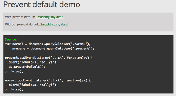
If you do a view-source you find no other script in use, yet it displays in the page. What is this sourcery*? Simple, and it was Mathias Bynens who got me onto it: just display script elements as block and add some generated content to show the “Source” text:

script {
  display: block;
  white-space: pre;
  text-shadow:none;
  background: #333;
  color: #fff;
  font-family: monaco, courier, monospace;
  padding: 10px;
}
script::before{
  content: 'Source:';
  color: #0f0;
}

Mathias has much more detailed explanations on why that works but I for one am once again amazed just how much easier things are these days with the awesome browsers that we have.

* Sourcery = magical code that does (seemingly) unexpected things.

Some thoughts on CSS – a foreword

Tuesday, March 13th, 2012

The other day I was asked to write a foreword for a book on CSS by someone I inspired, so here is what I wrote.


When Cascading Style Sheets got supported by browsers, a lot of things changed. I remember the first article I read about them was saying that using them could increase the speed of your web sites tenfold and your development and maintenance time will be cut in half.

That was totally true, as this was a time when connecting to the internet sounded like Dubstep sounds now and 56k connections were luxury. In order to style things we needed images, background colours, table layouts and font elements. And of course lots and lots of spacer gifs and   to create padding.

Fast forward to now, and you will see that it is almost impossible to think of any web design without CSS. In the last year alone we got so many cool new features to play with that animation and transformations with JavaScript can soon be as forgotten as spacer gifs are now. We can set colours in various formats, we can add our own fonts, create patterns and gradients, we have transformations and transitions and we can define animations. We can generate content in CSS in case we need it only for a visual effect and we have all kind of interaction selectors when the user hovers over something, clicks it or even selects text in the page.

A lot of this comes with a price: we have to repeat a lot of settings to support all the browsers (and those coming in the future) and there are differences in implementation that can make our life harder. This, however, is a temporary problem. Sadly enough it doesn’t stop people from repeating mistakes of the past like favouring one browser without providing fallbacks for others and older ones. We did that already with IE6 which is why now a lot of our products are hard to maintain and upgrade.

In general, the ubiquity of CSS in our development world made it a bit less magical. We actually see it as a given and there is hardly any thought and documentation out there how to write well-structured, clean and simple CSS that does the job. Our high speed connections, caching and a plain disregard of CSS amongst “real developers” made our style sheets a dumping ground rather than getting the same love we give our Python or JavaScript. Want proof? Github, a rather simple looking site loads 400KB of CSS in over 20000 lines of code. Facebook used to have over 2MB of CSS before some friends of mine re-engineered the CSS using an “object oriented approach” and last but not least a new bug in Internet Explorer got discovered: it only loads 32 external style sheets before giving up.

Now, as an old-school, hand-craft developer I shook my head at the mere thought of 32 style sheets, but the fact of the matter is that CMS and other systems create a sheet for each module on a large site and instead of concatenating them just add them to the template as a new link element.

I once wrote a 300 line CSS document for a massive, international web site. When I left the company, I looked at it half a year later and it grew to a whopping 3800 lines with massive selector chains and very specific class names like “headingright3c6bold”. In order to create a visual change the poor maintainers who obviously had no clue how CSS works (or didn’t care) added random HTML elements to the templates to have a handle to increase the specificity and many other crimes against CSS were committed before my very eyes.

That is why I am happy that there is a new movement, a desire to clean up the CSS we write and make it snappy and fast again, going full circle to the original promise of CSS.

This book is part of this movement, and the writer shows insight, foresight and interest in a topic that many consider too confusing to care about. I for one am very happy to see it come out and hope that by reading it you get inspired to put the art and the magic of speed back into your style sheets.

A quick one: (ab)using mediaqueries to not serve CSS to IE < 9

Wednesday, February 22nd, 2012

I am right now writing a post on how to use :target selectors for image galleries. As always, older IE are the fly in the ointment there as only IE9 supports the selector. So I thought about a way to serve the CSS only to the browsers in the know. The options were of course conditional comments, adding a selector IE < 9 doesn’t understand to every selector I want to filter out (like using
body:last-child article the same way we used html>body to filter out IE6) but then it came to me: media queries are only supported in IE9 and above. So you can simply do a:

.foo {
  // ... styles for ALL THE BROWSERS
}
@media screen and (min-width: 400px) {
  .foo {
    // ... styles for newer browsers
  }
}

A test of a 400 pixel wide browser window should be more than enough, right? Discuss on Google+

HP has a new logo! And they can do it in CSS

Wednesday, December 14th, 2011

There is a lot of discussion right now about HP’s new logo. I for one like it as they can save an HTTP request by creating it with CSS:

Animating with canvas and creating CSS3 animations with JavaScript

Monday, September 5th, 2011

Yesterday we went to a cool park in Krakow, Poland where they have all kind of physics experiments for kids (and me):

Physics Park exhibits

One of the things that always fascinated me was the optical illusion of non-concentric circles turning into a 3D cone. Take the following picture:

non-concentric circles

And then rotate it and you see what I mean (video on screenr).

Now, coming back (like any other kid) I wanted to recreate this for myself, and it is actually pretty easy in HTML5 canvas. If you get the embed below, then click the play button to see the result.

Check the source code. In essence all you do is paint a number of concentric circles with alternating black and white colouring and you decrease their radius. Instead of keeping the centre of the circles the same you move it back forth with a sine wave.

The animation works simply by rotating the canvas around the centre – no need to calculate the rotation in the loop.

This is what also ailed me about this: as the main image doesn’t change and we simply rotate the canvas, there is no need for the painting loop in the animation. Although the performance seems to be fine (at least here on this Macbook Air), I am pretty sure that the animation without the calculated circles will be smoother and less resource hungry. That’s why I painted the circles in one canvas and copy it into the animated one as an image. You can see the two canvases (the painting one in lighter grey) in this demo. Again, if you get the embed below, then click the play button to see the result.

The next step was to take the advice that everybody tells you right now and think about CSS animation as it is hardware accelerated and much better (citation needed, but that is the impression that I get). As all I am doing is to rotate a canvas around itself, it seems to be a good idea to do that. So, in the next example I animate with CSS and only use canvas for painting:

Smooth! I like it. What I don’t like is that now it does nothing in Opera for example. The other thing that annoys me is that the CSS is ridiculously verbose as I have to repeat all the animation information and keyframes for each browser with different prefixes.

That’s why I wanted to see if I can use CSS animation when it is supported and create the animation on the fly. That can be done but it is not that easy. Check out the result.

This seems to work nicely, try it in Opera and in other browsers to see the differences and get information what kind of animation was used. If I used transformation instead of animation it would even be easier. As it stands now, you can’t access, create and change keyframes that easily. this post has some more info on the issue and Joe Lambert did another showcase. Makes you wonder if we shouldn’t create an easier bridge between JS and CSS animations.