Google have lately been praised for their chart API and my esteemed colleague Ed Eliot has a workaround for its restrictions in terms of caching and server hits.
I played around a bit with it and thought it very cool but it felt a bit clunky to add all these values to a URL when they could be in the document for those who cannot see pie charts. This is why I wrote a small script that converts data tables to charts using the API and a wee bit of JavaScript.
Using this script you can take a simple, valid and accessible data table like the following and it gets automatically converted to a pie chart.
Browsers
| Browser | Percent |
|---|
| Firefox | 60 |
| MSIE | 25 |
| Opera | 10 |
| Safari | 5 |
Simply add the script to the end of the body and it’ll convert all tables with a class called “tochart”. You can define the size (widthxheight) and the colour as a hexadecimal triplet as shown in this example. If you leave size and colour out, the script will use presets you can alter as variables in the script itself.
What about data tables from charts?
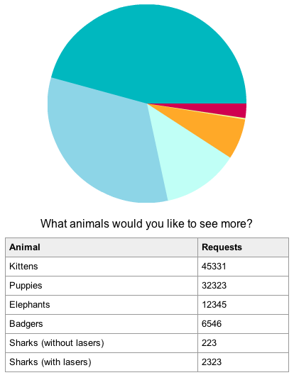
As Victor of the Yahoo! Accessibility group asked for the other way around, this is now also possible. When you use the verbose data mode for the charts and add the class “totable” to the image the script will generate a data table preceeding the image and null out the alternative text. For example:

The tables have a class called “generatedfromchart” which you can use to move them off-left if needed.
Check out the demo page and download the script with the demo page and CSS to have a go with it yourself. Of course, all is licensed creative commons, so go nuts.
Useful? Please comment if you want something extra or wonder how the script works.
[tags]accessibility,charts,api,google,tables,javascript[/tags]
