Chasing the shiny – HTML5, CSS3, transitions – oh my!
Friday, May 14th, 2010Yesterday I had a back and forth on Twitter with Paul Irish and Divya Manian on Twitter about a thing that is full of win but also drives me crazy.
Those two lads built http://html5readiness.com/ – a beautiful demo of what you can do with CSS transformations, JavaScript and markup these days. Here’s what it looks like:
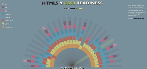
In essence this is the designer’s eye for http://caniuse.com/ which listed the same information in a lesser visual but very useful manner.
When I looked at the visualisation I went “WOW” and so did a lot of other people. But actually when using the site my fascination and interest quickly disolved.
I consider myself quite an observant person and I can read really, really fast. Looking at this visualization though I found myself constantly having to check from the coloured ray to the legend to understand just which browser we are currently talking about. Clicking the fixed browser position checkbox made this a bit more obvious but I am still very confused – especially as the colours are close to each other (on my laptop) and the rollover colour change doesn’t match the legend any more. This gets even more confusing when the colour of the main ray and the rollover changes:

I have no clue why the ray is coloured differently. I might think it is the connector between HTML5 and CSS3, but Geo Location is not part of HTML5.
The next thing I normally do to any interface is to turn off CSS to see how it degrades for non-visual users or on old mobile devices (yes, I do have to use an old Blackberry from time to time).
If you do this on HTML5 readiness you get a terrible experience:
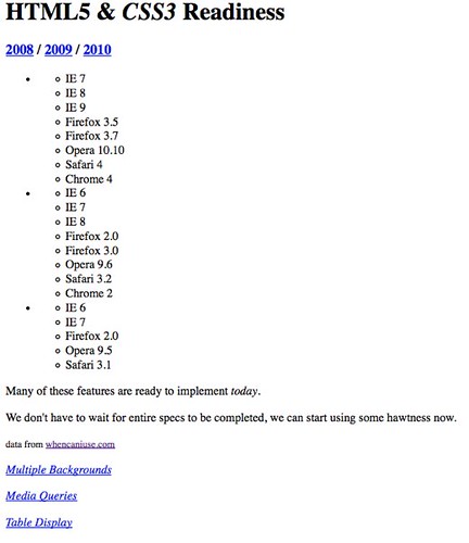
- There is no connection between the year names and the browser support (other than links – a nested list would make the connection much more obvious).
- None of the links (like “Multiple backgrounds”) does anything.
What really made me very confused was looking at the source code though. The authors use B and I tags all over the shop and one of the rays for example is:
OK, I get it – I and B are text stylistically offset from the normal prose without conveying any extra importance> which technically gives us a carte blanche to do whatever we please with these elements.
Back in the real world, however, WYSIWYG editors have B and I buttons which include these elements as BOLD and ITALIC. Now, as accessibility and semantics fans we’ve been bickering for years that this is a bad idea as this is painting with HTML rather than telling a user agent that the text needs to be emphasized or strong. We made quite some headway with this – and people started listening to us. Now we go back and say “oh well then, actually this is all fine – use whatever you want”.
All in all this example reminds me of something I built 8 years ago:
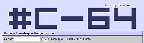
This was friggin cool back then. It was done for the Commodore 64 scene and it had to work in every browser that knows HTML - including Amiga ones. I managed to make it a “how is that done” moment by not using an image but instead a layout table with spacer gifs:

.: the very best of :.
Wow, terrible, right? Who would use tables for layout? This is madness – these are technologies we shouldn’t need to use any longer.
Or is it? By using the plethora of HTML elements in the visualisation above we do exactly the same thing! HTML is there to logically structure content and give it semantic meaning – not to paint lovely pictures.
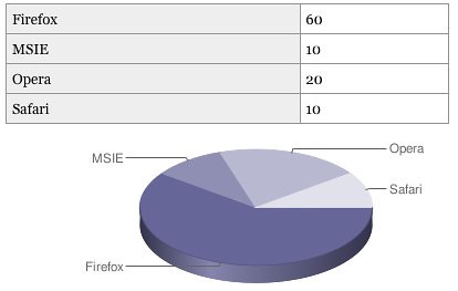
The page uses Can I use as its source of data – but instead of using a scraper and converting it to the necessary HTML (and by that making it possible to update automatically) the data is duplicated – and once displayed with no semantic value or logical structure whatsoever. We have the technology to convert sensible, good and clean HTML and turn it into something different. I’ve proven that in the past with the data table to charts conversion script:
I really don’t understand why we forget the simple promise we share with our users over and over again:
- Build on stuff that works and then make it more interactive and pretty
In the case of this visualisation – use data tables and generate all the fluff and classes you need to make the CSS work out with JavaScript. Or – how about using SVG for the whole thing?
I am not saying that Paul and Divya did something bad – I am big fans of their work – I am just saying that we keep doing the same mistakes. If you would not write some HTML by hand and only need it for an effect – you are doing things wrong.