How to persistently change third party web sites with browser developer tools
Tuesday, November 3rd, 2020This has also been published on Medium and dev.to in case you prefer them.
Often you find things in web sites that annoy you. And – as a web developer – you’re even asked to fix some problems in web sites without getting access to the source.
Using developer tools in browsers you can change a lot of things and you can even fix some issues. You get visual tools to tweak colours, dimensions and more without having to know CSS.
The problem is that the changes aren’t persistent – once you reload the page, they are gone. Furthermore it is tough to make your changes accessible to others short of a screencast or pair programming using live share.
Stuart Langridge complained about that on his blog and longed back for the days of Greasemonkey and Userscripts. Both are still around and to a degree maintained. There are also a few extensions for other browsers than Firefox that do similar things. But the overhead of having to install an extension to do some tweaking seems a lot.
There are some features in browser developer tools that can help you with this task though. Some may be hard to find or you never looked, so here’s an overview.
Elements, Styles and Changes
Using the Elements and Styles pane in Developer Tools you can inspect the HTML, and change or add to the styles of a chosen element. Most likely you’ll have done that already, tweaking your CSS until it did exactly what you wanted it to do.
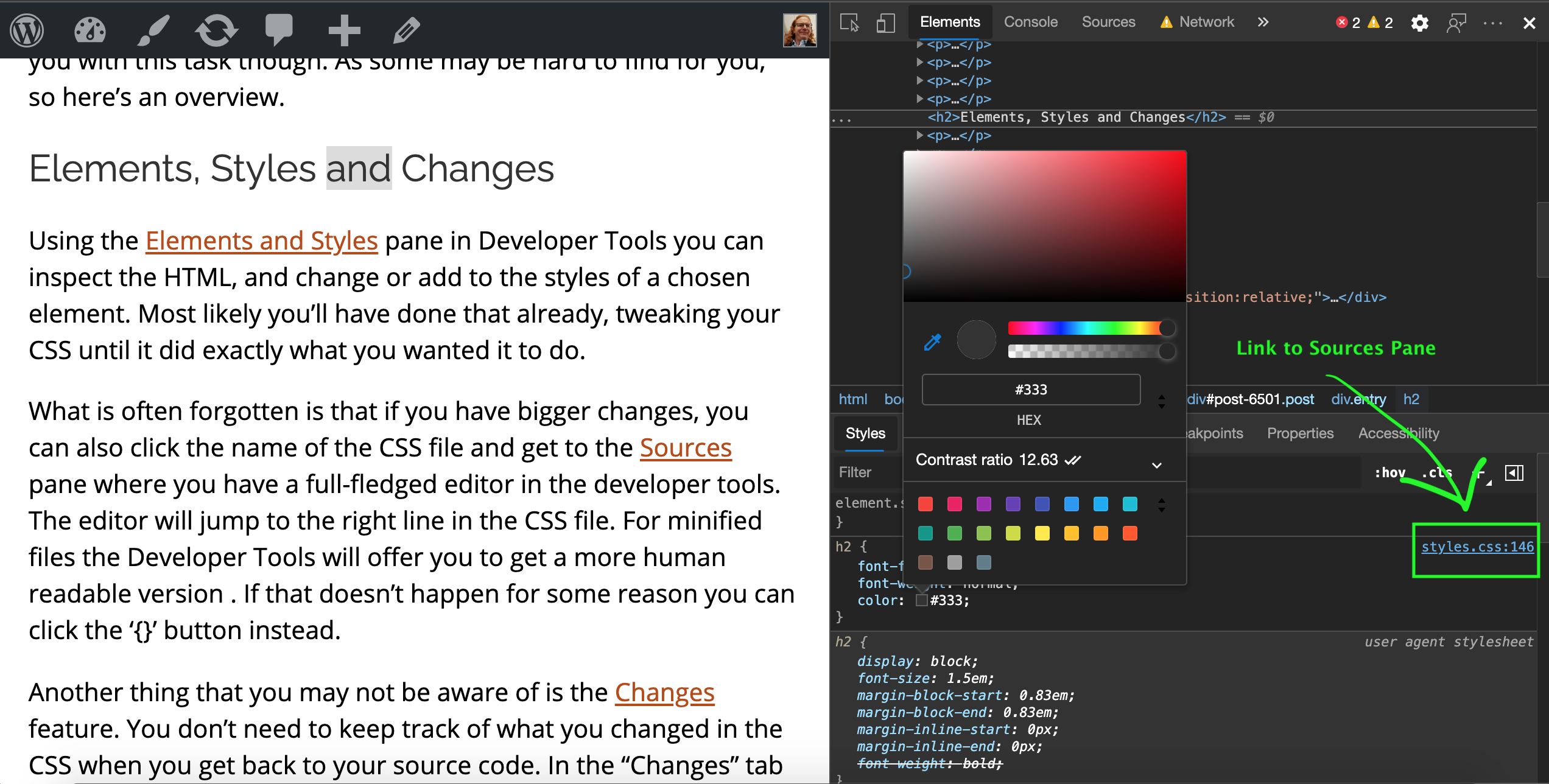
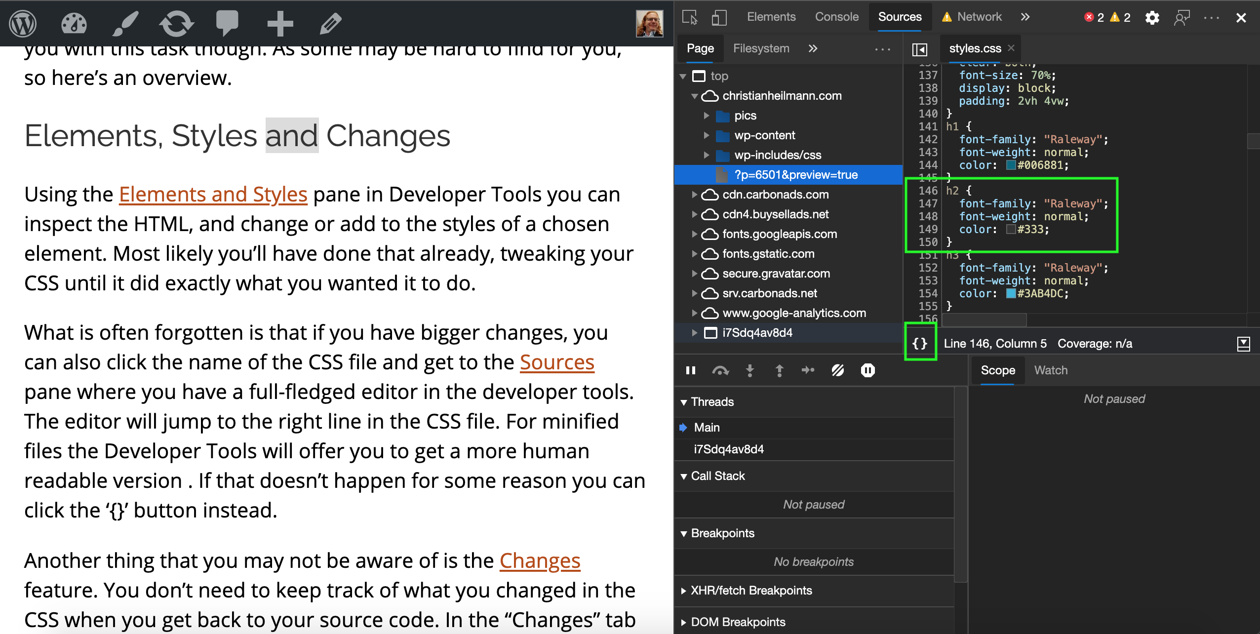
What is often forgotten is that if you have bigger changes, you can also click the name of the CSS file and get to the Sources pane where you have a full-fledged editor in the developer tools. The editor will jump to the right line in the CSS file. For minified files the Developer Tools will offer you to get a more human readable version . If that doesn’t happen for some reason you can click the ‘{}’ button instead.
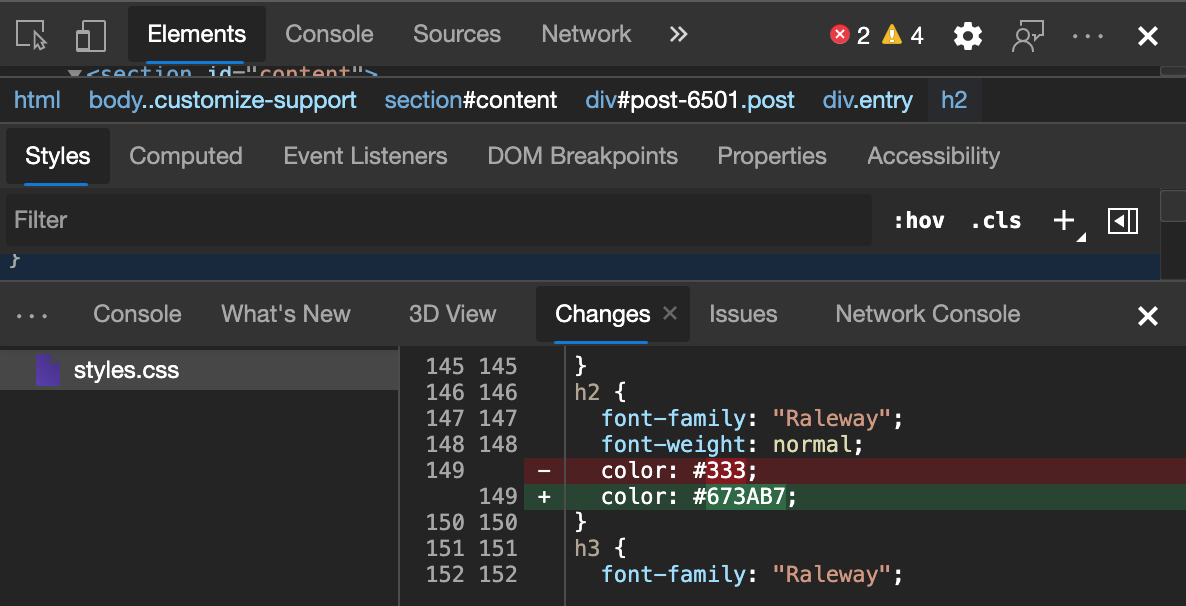
Another thing that you may not be aware of is the Changes feature. You don’t need to keep track of what you changed in the CSS when you get back to your source code. In the “Changes” tab you get a difference view of all the changes you did and you can copy and paste them.
Console
The Console is the go-to JavaScript debugging environment for most (although Breakpoints are so much better). You can also write JavaScript in the console that gets executed in the Window object of the currently open document. You have some handy shortcuts available there. For example $ is document.querySelector, $$ is document.querySelectorAll and $0 is the currently selected element of Developer Tools. The copy() command copies to the clipboard. You can find a list of all the available commands in the docs.
Often you find yourself trying to cram all the code to run against the page into one line, but that’s not needed. If you hit enter on a line that isn’t a full JavaScript expression, Console automatically realises you want to write more and indents the next line. You can also always use Shift-Enter to force linebreaks and hit Enter to execute the code when you’re done. Hitting the up and down arrow allows you go back and forward in the Console history, much like any other Terminal emulator.
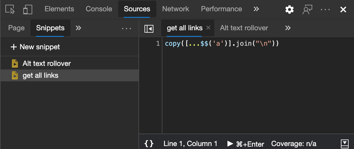
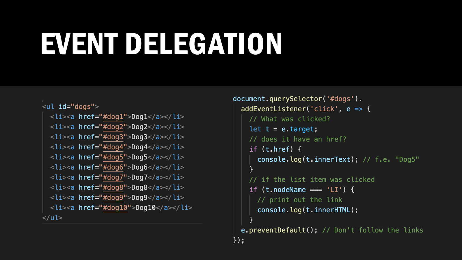
You can do clever things in the console. For example, if you wanted to get all the links in the document that have “media” in them and filter out duplicates, you could do the following:
copy( [...new Set($$('a') .map(l => l.href) .filter(l => l.includes('media')))] .join("\n") ) |
Running this against this page for example will give you a list of 25 unique images.
Whilst this is powerful, you also will lose your work when you restart the browser and the Shift+Enter trick is useful but also feels not natural.
That’s why Developer Tools also have a way to edit and store snippets of code to execute in the context of the current page.
Snippets
Snippets are a feature of the Sources pane in the Developer Tools. It allows you to write small scripts to execute in the context of the current page using a built-in editor. You can name the scripts and keep them as a collection for re-use later on.
This upgrades the Console experience, but you still need to run the script by hand every time you reload the page. And you can’t re-use any of the resources of the page you try to fix. To do this, you can use a feature called Overrides.
Overrides
By using Overrides you can take any resource of the current web site and store it locally on your computer. On later reloads of the document, the browser will take your local copy instead of the live one.
I wrote a detailed explanation how to use them on the official Developer Tools docs and here is a quick screencast explaining the feature.
The excellent part about overrides is that you use the real code of the page and change it. You can select files from the Network tab, directly from the Elements tab or really anywhere. Once you set up your overrides folder these stay in there as replacements until you delete them. The browser creates the correct folder structure for you. This means you can tweak the code and once you are done you can zip up your overrides folder and send it to the site maintainer as a drop-in. It is also an interesting feature to override annoying popup scripts.
More on overrides:
- Shawn Maust / A Faster Web
- Trys Mudford
- Screencast by Harry Roberts on Using ‘Local Overrides’ to Test Performance Hypotheses
- Screencast by Umar Hansa
Summary
These are some of the features of Developer Tools that allow you to change web sites for you locally. It is fun to play with live sites and change them to your needs. And running a few scripts locally is most likely safer and less detrimental to the performance of your browser than using overzealous browser extensions.

