Conditional animations with CSS properties
Saturday, March 13th, 2021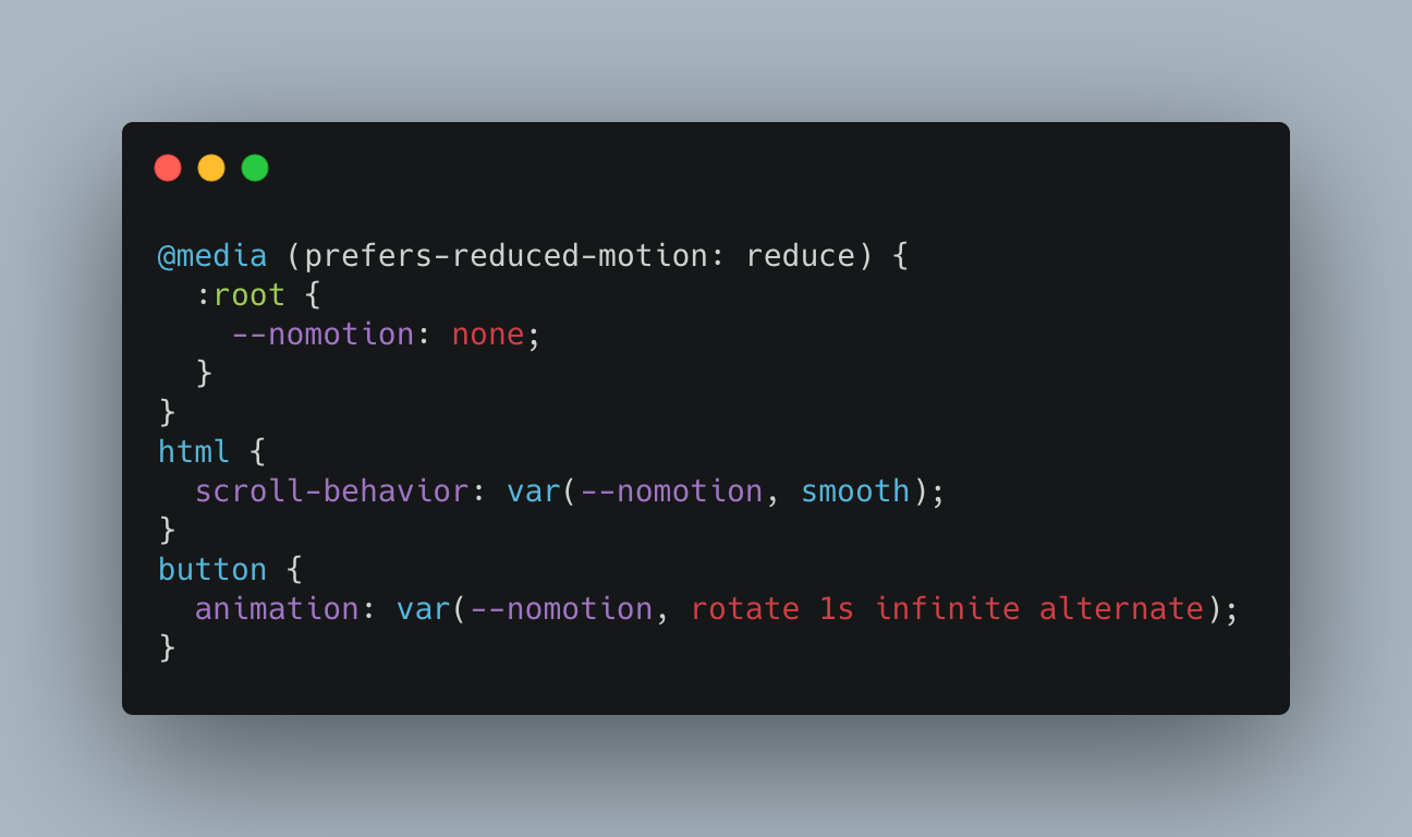
Using animations, transitions and smooth scrolling is fun, but they also represent an accessibility problem. Various groups of people have a hard time using your products when things move and change all the time. This is why operating systems have a “reduced motion” setting you can turn on. Our CSS animations should respect these settings and only apply themselves when the user wants to see animations. The best way to achieve this is to wrap them in a prefers-reduced-motion media query. You can use that in various ways as described in this excellent article but they all come with the problem that you need to repeat the settings. There is a simpler way. You can use a custom property:
@media (prefers-reduced-motion: reduce) {
  :root {
    --nomotion: none;
  }
}
html {
  scroll-behavior: var(--nomotion, smooth);
}
button {
  animation: var(--nomotion, rotate 1s infinite alternate);
} |
This defines the CSS custom property nomotion as “none” when the user doesn’t want to see any animations. If the user wants to see animations, it isn’t defined and thus the CSS engine applies the fallback, which is your animation settings.
You can see this in action in this CodePen:
See the Pen
Conditional animations with CSS properties by Christian Heilmann (@codepo8)
on CodePen.
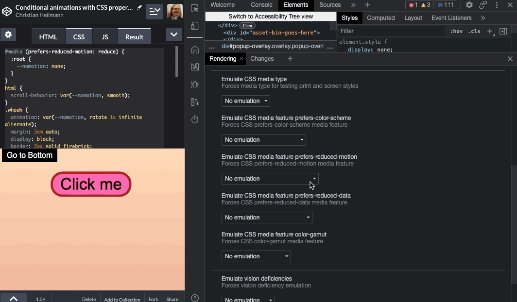
You can test it using the reduced motion emulation in the Browser Developer Tools. Here’s a screencast showing this in action: