Christian Heilmann

Author Archive

Behind the mirror Γ’β‚¬β€œ usability testing musings (day one)

Thursday, January 25th, 2007

I spent the day today in some usability testing of a product I am involved in at the moment. We sat in a small room with coffee, soft drinks and far too many chocolately nibbles and watched people through a one-way mirror remark on our wireframes and try to solve tasks given to them.

I’ve done this in the past, but had a bit of a break in between, so it was fun coming back to it. The most interesting part is that in the year or so I have been out of that loop not much changed.

Test subjects are still very much confused and driven by page copy.

There is somehow no way you can win this. If you use Lorem Ipsum the testers asked what language that is and why it was allowed there. If you use copy nicked from other sites or made-up by a copywriter user names or headlines make testers judge the site by this and don’t see it as just a demo of what can be done.

Everybody is a designer.

Even when it is obvious that this boxed grey monstrosity is not the final page, you get lots of feedback about font sizes, image sizes, and even the look and feel of a map although you kept them deliberately the bog-standard Google or Yahoo maps

It is easy to kill functionality with copy that makes assumptions about how tech-savvy the user is.

My favourite example is “People tagged this with� and “add a tag�. The functionality of tags – being able to give something a memorable keyword that allows you to find this again – is appealing to a lot of users, but the term “tag� just does not wash yet. A lot of users get confused about it and discard this functionality instead of seeing it as a benefit. The danger of that is that it becomes an assumption for webdesigners that way. “People don’t use tags� in reality should be “people don’t know tags if we don’t make them understandable to humans who are not ‘web-savvy’�.

Don’t show your colours prematurely.

Brand perception is a very powerful thing. Concepts that were alien to testers magically become very useful and interesting once you tell them who is behind the product. This messes terribly with your test results. My favourite example is Maggi, the German OXO, a company that produces spice-mixes, instant soups and sauces trying to start a range of sweets. They produced chocolate that was the same quality as competitors like Milka or Lindt, and branded it with their name. Nearly every test subject liked the chocolate but complained about “a slight aftertaste of herbs�.

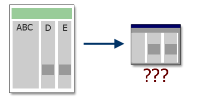
Think about the viewport, not about the whole layout.

Our wireframe was a three column layout that sorted different content into columns but without a strong visual separation between them. On the whole page there was no confusion at all but as two headlines of separate columns with totally unrelated content ended up on the same horizontal line testers ended up seeing this content juxtaposed in the viewport. This confused them as they started wondering what one thing has to do with the other. Of course, this is something that can be solved with proper design, but it was interesting to see how fast people forget what was at the top of the page.

Separations that make a lot of sense in the whole layout may become confusing when you consider that users only see a part of it.

Users know more than you do!

User testing makes you aware of the pros and cons of a product a lot more than any brain-storm, thought-shower, war-room or repeated stand-up session will ever be able to. Things you considered obvious and conventions on the web turn out to be stumbling blocks and things you considered too complex turn out to be a spark for users to come up with ideas how to enhance that functionality in ways you just didn’t think about.

[tags]usability,testing,viewport,tagging,brand[/tags]

Drew was the first to document my magic

Tuesday, January 23rd, 2007


The Magic of Christian Heilmann on Vimeo

[tags]humour,humor,office,fan,plastic cup,the force,jedi,procrastination[/tags]

Five CSS tricks that repeatedly saved my a**e, why need more?

Monday, January 22nd, 2007

Getting a lot of hits from the 53 CSS-Techniques You Couldn’t Live Without post on Smashingmagazine I realised I don’t really need a lot of those (although a lot are cool). Instead let me share with you CSS techniques that saved my a*** whenever I had to create a layout using CSS or proving those wrong that claimed layout tables cannot be replaced.

None of these are new, and many will be the comment that people knew about this, but I can safely say that knowing about the following and some scripting allows me to create almost any of the fancy 53 techniques mentioned.

Tabula Rasa – the global whitespace reset

In October 2004 I found Andrew Krespanis’ global whitespace reset on his still (to me ) beautiful site leftjustified. The idea behind it is so simple, it is ingenious: as every browser out there has an own mind when it comes to rendering styles with a built-in stylesheet, you can overcome all the differences with a simple * selector that undoes everything the browser did. You reset margins and paddings to zero, remove list-type and even set a standard font size. After using global whitespace reset you have a clean slate to start from.

Making the absolute relative

Absolute positioning can be dead handy when you need to align different elements horizontally. You just position one to right and give the other a right padding of the width of the first one, voila – columns. It gets problematic when you need to have other content above the multi column one and you don’t know how high that one will be. The trick is to have both in a parent element and position this element relative – the absolute element will be positioned in relation to this one and not the browser window. Douglas Bowman is the man to thank for this one and that it doesn’t work on MSIE 5.02/Mac is not really causing me any headache.

Containing the float

The problem with the second trick is that if the absolutely positioned column is not the longer one of the two it’ll spill out of the containing element, which is why it is better in a case where you have no clue about the column length to float both of them. The problem when you float them is that the containing element has no height whatsoever. The workaround is to set 100% width on the container and float it to the left, too. Make sure to put a clear:both on the following element on the page

Sliding doors of CSS

Another Bowman trick was Sliding doors or in short using a large background image and clever positioning to allow for expandable navigation elements. As I am not caring much for browsers that should not be supported any longer, I normally tend to use one massive background image and position it in the different elements accordingly as shown in the flexible CSS menu tutorial.

Using background-position to cut down on images and avoid caching issues

Another permutation of this solution is using one background image for several page elements and use dimensions and background-position to only show the relevant part of the image. This technique, christened CSS Sprites (rubbish, they aren’t 24×21 pixels like real sprites) by Dave Shea allows you to cut down load time (as you don’t need to resolve the URL and load lots and lots of images) and avoids nasty flickering on rollovers that MSIE had.

Out of the screen, out of the mind with off-left

Sometimes you need to show and hide content or you need to have content that is only available to visitors that have CSS disabled (the latter should never become a habit, it is a dirty hack and you know it). This is where the off-left technique comes in handy. Instead of using display:none you position the element far off the screen with a negative horizontal and vertical value. Screenreaders will still read them out, but CSS enabled browsers don’t show them at all.

I love CSS, I like most browsers, I just don’t think that we need to overcomplicate matters.

[tags]CSS,tricks,webdevtrick,webdesign[/tags]

First .net podcast out

Monday, January 22nd, 2007

So you expect me to talk?

Check the first .net podcast and hear Paul Boag (as the host), Dan Oliver, Gary Marshall, Andy Budd and me talk about the iPhone, hiring web developers, HTML emails and IE7.

[tags]iphone,ie7,html mails,hiring web developers,podcast[/tags]

Event Driven Web Application Design Article on the YUI Blog

Wednesday, January 17th, 2007

What started as a blog post grew out to be an article for ALA or Thinkvitamin but then ended up on the official blog of the YUI. In the article I am explaining a different approach than using frameworks or standard web design methodologies to create web applications. Instead of concentrating on the technology or the user agent conformity of the application you concentrate on how the app should react to what users do. Separation of Structure, Presentation and Behaviour was just the beginning. Separating out the events that drive the application might just make it easier to build complex applications. I know it did for me.

[tags]web application,application development,events,methodology,development[/tags]