OMG, you got to see this!
Wednesday, September 28th, 2011
I am right now on a ridiculous schedule, so not much posting here. Check this out:
Undoubtly I will meet some of you on the road, so if I am not taking part in all the shenanigans and merriment, this is the reason :)
The slides will pop up here one by one, so far I got up to Fronteers writing them.
Yesterday I was in Amsterdam to speak at the Kings of code conference. My ambitious goal was to cover the relevant parts of HTML5 and CSS3 for backend developers in 25 minutes and I think I just about managed to reach it.
The presentation slides are available here and embedded below (use cursor keys to navigate back and forth):
The audio recording of the talk (raw, unedited) is available on archive.org.
Overall the reaction was good, so I hope I managed to bust some myths and look forward to see what people do with the inspiration.
I am currently at the Mozilla all Hands in San Jose, California and decided to give a talk explaining a lot of open technologies to my colleagues so they can go out to conferences and get people excited about them. We have a lot of people and volunteers, and everybody should feel empowered to speak in public. A lot of times what is missing is a simple way to tell people about the things you want to cover.
To this end I put together not yet another slide deck on SlideShare, but a way to see a presentation and then pick and mix what you want to show yourself.
You can see and present the presentation here (use cursor keys to navigate the slides and press ‘N’ to show ):
The audio recording of the talk (raw, unedited) is available on archive.org.
The slides and screencasts are available on GitHub and we are also keeping a repository of the explanations and screencasts on the Mozilla Wiki.
The idea is that when you want to do a quick show and tell of new technologies you can go to the slides, uncheck the ones you don’t want to have in your presentation, hit the “start presentation” button and go for it.
Enjoy!
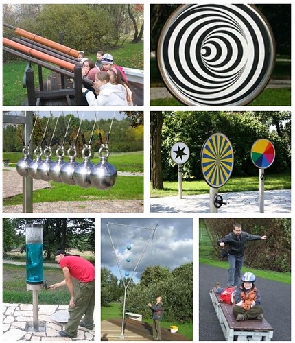
Yesterday we went to a cool park in Krakow, Poland where they have all kind of physics experiments for kids (and me):
One of the things that always fascinated me was the optical illusion of non-concentric circles turning into a 3D cone. Take the following picture:
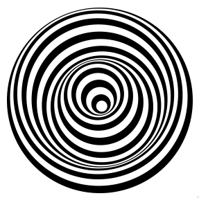
And then rotate it and you see what I mean (video on screenr).
Now, coming back (like any other kid) I wanted to recreate this for myself, and it is actually pretty easy in HTML5 canvas. If you get the embed below, then click the play button to see the result.
Check the source code. In essence all you do is paint a number of concentric circles with alternating black and white colouring and you decrease their radius. Instead of keeping the centre of the circles the same you move it back forth with a sine wave.
The animation works simply by rotating the canvas around the centre – no need to calculate the rotation in the loop.
This is what also ailed me about this: as the main image doesn’t change and we simply rotate the canvas, there is no need for the painting loop in the animation. Although the performance seems to be fine (at least here on this Macbook Air), I am pretty sure that the animation without the calculated circles will be smoother and less resource hungry. That’s why I painted the circles in one canvas and copy it into the animated one as an image. You can see the two canvases (the painting one in lighter grey) in this demo. Again, if you get the embed below, then click the play button to see the result.
The next step was to take the advice that everybody tells you right now and think about CSS animation as it is hardware accelerated and much better (citation needed, but that is the impression that I get). As all I am doing is to rotate a canvas around itself, it seems to be a good idea to do that. So, in the next example I animate with CSS and only use canvas for painting:
Smooth! I like it. What I don’t like is that now it does nothing in Opera for example. The other thing that annoys me is that the CSS is ridiculously verbose as I have to repeat all the animation information and keyframes for each browser with different prefixes.
That’s why I wanted to see if I can use CSS animation when it is supported and create the animation on the fly. That can be done but it is not that easy. Check out the result.
This seems to work nicely, try it in Opera and in other browsers to see the differences and get information what kind of animation was used. If I used transformation instead of animation it would even be easier. As it stands now, you can’t access, create and change keyframes that easily. this post has some more info on the issue and Joe Lambert did another showcase. Makes you wonder if we shouldn’t create an easier bridge between JS and CSS animations.