Christian Heilmann

You are currently browsing the Christian Heilmann blog archives for January, 2021.

Archive for January, 2021

Bringing Edge’s Developer Tools to VS Code for debugging Web Apps – a talk at VS Code Day

Wednesday, January 27th, 2021

Today is Visual Studio Code day and I gave a talk about an extension to Visual Studio Code that helps you with avoiding context switching. If you want to listen to the talk, here is a pre-recording I did as a fallback should my connection not work out.

Here’s what I talked about:

Hello there, let’s talk about making it easier to debug web applications with Visual Studio Code.

Specifically I want to talk about context switching and how to avoid it. What does that mean?

Three contexts of web development - editor, browser and terminal

As web developers, we work in three different contexts:

  • We write our code in an editor
  • We check if everything works and tweak it in the browser, and
  • We deal with version control and deployment in the terminal.

In essence, we use different tools for each task. This may not seem like much, but it is a cognitive overhead that impacts our developer efficiency. As web developers we are used to this, but people coming from other
platforms to the web are used to having one IDE that does all of that. This makes the web look harder and the tooling of it not up to par.

With browser developer tools we took a first step to remove one of the context switches making it shorter to go from testing to editing.

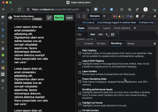
As you may know, browser developer tools have an in-built code editor. In addition to tweaking individual CSS settings, you can activate the link to the style sheet. This opens it in an editor. You can set up workspaces and you have a breakpoint debugging environment for scripts right in the browser.

The usage of this feature is, well, let’s call it sub-optimal.

The visual tools to tweak and debug CSS issues, on the other hand, are a roaring success. So much so that we keep improving them to offer accessibility and compatibility insights and offer new features like typography and CSS grids debugging.

In the editor space, Visual Studio Code has taken an excellent step towards aligning coding and deployment.
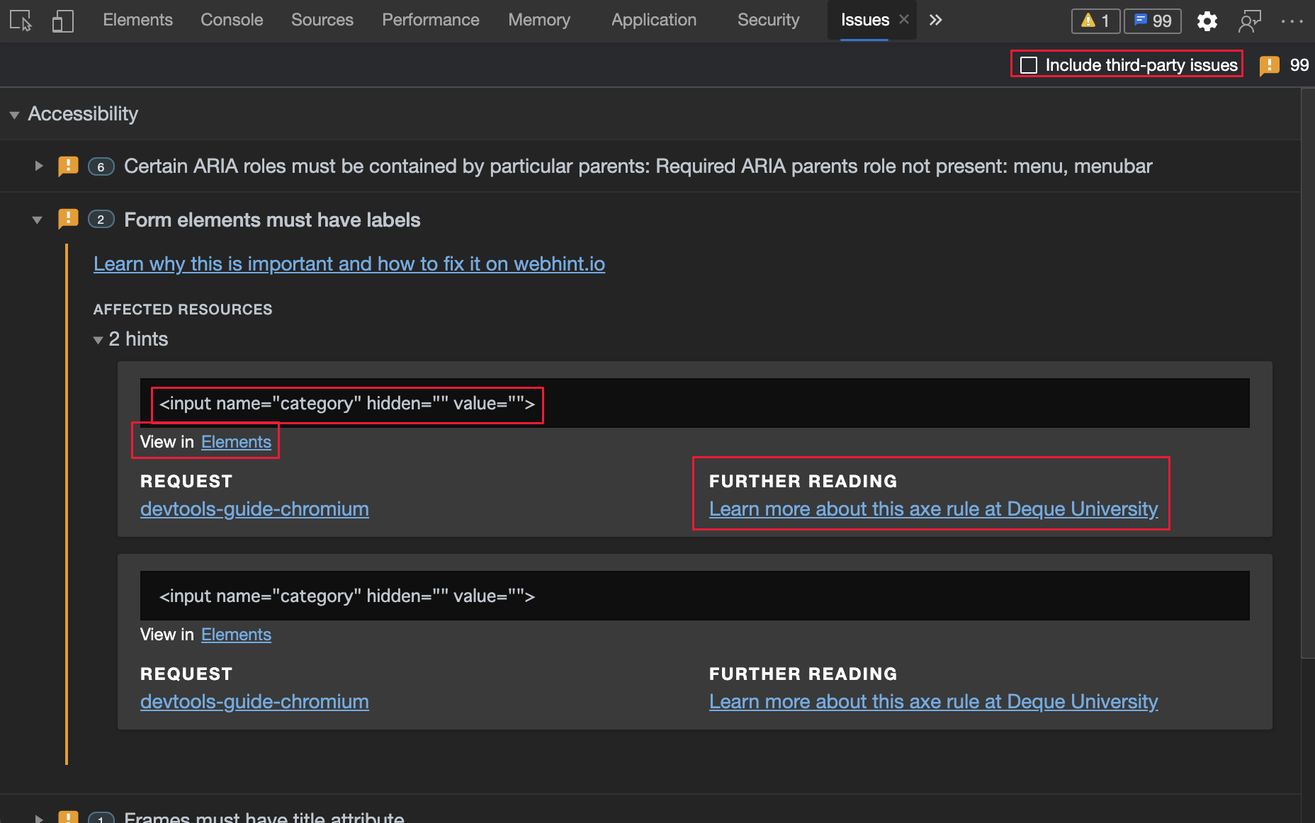
With an integrated terminal, Git support and linting options you don’t have to switch between editor and terminal any longer. If you haven’t looked into it yet, the webhint extension is an excellent way to make sure you don’t make obvious mistakes that you would need to fix in the browser. This cuts down on yet another context switch.

A lot has changed in the browser space since the days of Netscape and Internet Explorer. Browsers can be fully automated using Webdriver. Browsers are also embeddable into other applications as Webviews.

Probably one of the biggest success factors of Visual Studio Code is that it allows for extensions.

So, why don’t we merge the efforts of Visual Studio code and Edge to cut down on context switching?

Merging the efforts of VS Code and Microsoft Edge to cut down on context switching

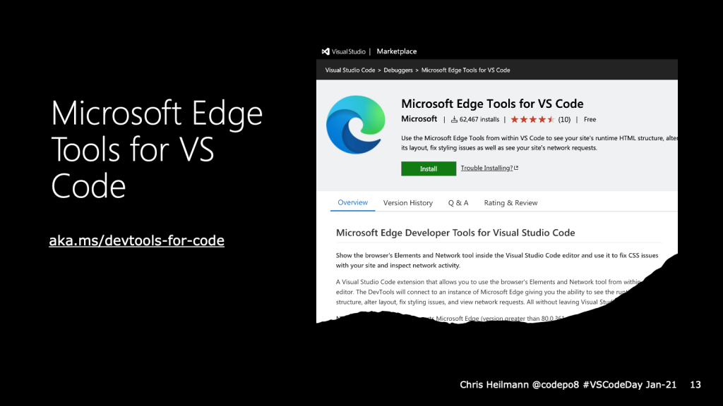
This is exactly what we did with the Microsoft Edge tools for VS Code extension. It’s been quite a success so far and we have a lot more plans for it.

Here is how it works: you open the extension, you connect to a new browser instance and you get a browser right inside Visual Studio Code with the developer tools already open. You can use the Visual tools to tweak the styles and the changes reflect in your source code. Or you can activate the style sheet links in the CSS pane to edit inside Visual Studio Code.

What you can do now…

  • Inspect, edit and tweak the DOM structure of the product you build using the tools
  • Inspect Network requests
  • Interact with the browser inside VS Code
  • Sync changes with your code (setting up Sourcemaps/Watchers)
  • Choose the version of Edge you want to have in the tool
  • Choose an own browser window or a headless version (embedded in the extension)

Things we learned building this extension:

  • Making a complex interface like developer tools keyboard and screenreader accessible is hard
  • Embedding this interface in an IFRAME in an extension makes that even harder
  • There are quite some differences in keyboard handling between Mac and PC
  • Mac OS doesn’t like browser windows running the background (use headless)
  • The Chromium version of Electron lags a few versions behind the main build (naturally)

Feature History (based on user feedback and research)

  • Elements tool was first – everybody uses that one
  • Network tool was next
  • Re-architected the extension to allow for contribution without having to download and build the whole of Chromium
  • Allowed for any version of Edge (previously only Canary)
  • Added Edge driver as a dependency – earlier you needed to install both extensions
  • Headless Mode
  • Themes (Dark/Light)

The extension is open source and available on GitHub. We deal with all of our feature requests and user interaction there. We’d love to hear from you and see what you can come up with. The features of this extension are driven by user requests and telemetry in the browser developer tools and we want to build what you need. So please, tell us what’s missing.

That said, one idea we have right now is to make yet another context switch unnecessary.

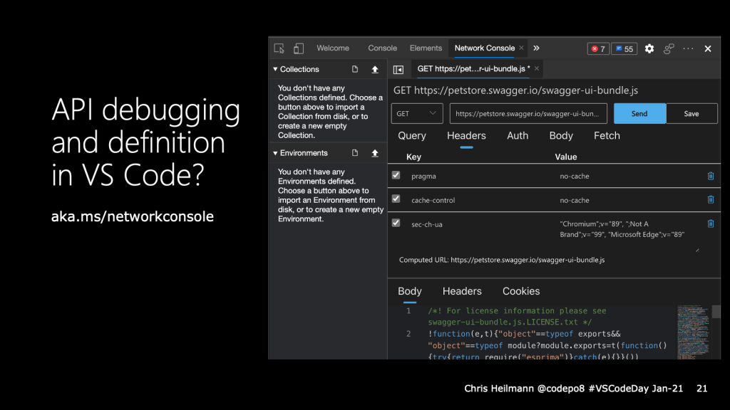
It is great that you can already inspect network traffic in the browser developer tools. But when things go wrong with an API call you still have to use a third-party tool or the terminal.

This is why we added an experiment that allows you to ”edit and resend” any network request. Editing the request opens the Network Console, which allows you to tweak the request parameters, authentication options or even import API collections and environments. That way you could fix any API issue directly in Visual Studio Code. What do you think? Tell us on GitHub.

The Network Console experiment in Microsoft Edge

And that’s all we have time for. I’d love for you to give the developer tools extension a spin and come to GitHub to work with us!

CSS is awesome: A dark/light mode switch with preference detection in 15 lines of CSS

Tuesday, January 26th, 2021

I just love how far CSS has come in the last few years. With custom properties and media queries you can achieve so much in just a few lines of code.

For example, these 15 lines make sure that users of light mode in their operating systems get a black on white document and those with a dark mode setting a white on dark one:

:root {
  --foreground: #111;
  --background: #f8f8f8;
}
@media (prefers-color-scheme: dark) {
  :root {
    --foreground: #f8f8f8;
    --background: #111;
  }
}
body {
  font-family: helvetica, sans-serif;
  color: var(--foreground);
  background: var(--background);
}

We define two properties called foreground and background and set them to dark on white as a default. We then check if the preferred colour scheme is dark using a media query and flip them if it is. Instead of fixed colours for color and background we use the properties and that’s that :).

You can try it out in this codepen. Users of dark mode should get a dark document, others a light one.


See the Pen
Target styling demo
by Christian Heilmann (@codepo8)
on CodePen.


You can try this out using the simulation options in Browser Developer tools :

Simulating dark/light mode with developer tools to test the CSS

CSS tricks has a great article that covers all on media queries if you want to learn more.

HTML and CSS still isn’t about painting with code

Thursday, January 21st, 2021

The other day I had a friend come to my place with the request to “learn HTML and how web sites work”. We spent a few hours playing with the topic and she got excited and quite far into it. The whole thing reminded me about a real problem when it comes to teaching people HTML. We keep fast-tracking the learning to the fun part of building visual things with it.

People who started early with the web had platforms that allowed them to quickly publish things. Geocities, Neopets and many others. For many these were the only accessible ways to get on the web and learn about it. These platforms allowed you to write your first HTML and CSS. Without a doubt using platforms that allowed for inline CSS and HTML to style things was an awesome experience. It is fun to game a system and impress your peers with visual tricks they didn’t think possible. It is also fascinating to go on a trial and error journey to get to a goal.

None of that taught us HTML and CSS though. Both are much more than their syntax. It taught us not to understand how the web works, but take any shortcut necessary to get to a certain look and feel. We can’t only blame these platforms for that. WYSIWYG editors and woefully outdated education materials in schools and universities also taught us that HTML and CSS are there to paint in the browser and make something look a certain way. 

It also taught us to rely on browsers to do the job to convert our efforts into something that kind of works.This is why browsers are such complex beasts and why browser interoperability is such a hard task. We’ve accumulated years of shortcuts and hacks and old web products rely on them. Browsers can’t break the web. They need to support the bleeding edge but also the sins of the past.

Coming to HTML from a “do this and it will look like that” taught us to do things that should only be a last resort option. Specifically, this way of “learning” HTML taught us to:

  • Paint with HTML, mixing structure and display (font elements, b, i, em, blockquote to indent, layout tables)
  • Inline styles or style blocks in the body of the document
  • Make the least effort to get to a visual result.

Sometimes these make sense to still use. HTML emails come to mind. But the limitation of an environment shouldn’t dictate what we use. Inline styles are at best a maintainability issue and at worst a security attack vector (f.e. IE filters).

The least effort thing is one that sticks the most. Want proof? How many images do you encounter without any proper alternative text? As alternative text isn’t displayed, it feels like extra effort to a lot of people. Title attributes, on the other hand, get quite some usage as they do show as a tooltip. I even remember people using ASCII art in titles.

In essence, we learned to write HTML and CSS to style a single element, which is exactly opposite to what CSS is good at.

These examples are from a long time ago, but things haven’t changed much. These days we are bombarded with “CSS only solution” and “one DIV paintings”, all mixing structure and presentation. They are impressive, and I love the creativity they represent and the efforts people get into. But as a first example for a learner of the web, they are as distracting as they are ill-advised.

HTML isn’t about look and feel. It is about structure. It means giving text content structure and link the web. We should use HTML elements not because how they look. We should use them for what they represent. And what functionality they should trigger in a browser.

  • Headings allow assistive technology to provide a faster way to navigate the document
  • Paragraphs chunk up text into easier digestible parts
  • Lists group similar things together
  • Buttons allow you to trigger script functionality independent of input device
  • Form fields and labels allow to user to enter information and know what they should enter even if they can’t see
  • Links point to other resources and should send the user there when activated
  • Video and audio elements give us an accessible player interface

And so on. This, together with an HTML document to host the structure makes up a web page. It allows browsers to show it as a web page. It allows assistive technology to convert it to sound or information on a Braille keyboard.

The problem is, that this isn’t exciting for most people. When I started to explain HTML, I used this document:

<!DOCTYPE html>
<!-- 
 ^ This tells a browser or any other software that this is an HTML 
 document and that it should understand it as such and do things 
 with the content. For example, provide an interactive button 
 when it gets a <button> element.
-->
<html lang="en">
<!--
 ^ You need to define the language to help people listening to your
 web site to get the proper voice to pronounce it. This also helps
 search engines to index your content.
-->
<head>
<!--
 ^ Everything in the <head> is extra information for the document 
   or links to other resources it needs (like a stylesheet or an    
   icon). Nothing in here shows up in the web site as content 
-->
 <meta charset="UTF-8">
<!--
 ^ It is important to define the charset you use to make sure that 
 special characters you might use, like "ü" display the right way 
-->
 <meta name="viewport" content="width=device-width, initial-scale=1.0">
<!-- 
 ^ This meta definition makes sure that your web site scales on 
 mobile devices and doesn't need the user to zoom in first 
-->
 <title>My web site</title>
<!--
 ^ This is the title of the document. It shows up in the title bar
 of the browser, when you bookmark or share it and it will be 
 the thing a search engine displays about your document.
-->
</head>
<body>
<!--
 ^ This is where the content of the document goes
-->
</body>
</html>

The comments are what I told my friend how and why these things need to be in there. I am pretty sure that none of us learned HTML that way. And that’s a shame. As, for example, the amount of web sites I encounter each day without a scaling meta tag is staggering. And that makes them annoying on a phone. Often these are signup pages for Wireless, which exacerbates the problem.

It was tough going starting this way to talk about HTML. The assumption was that you could learn some HTML elements and then go into styling things. The information what an HTML document needs to even allow the browser do its thing isn’t exciting.

But it is important. Not teaching HTML by explaining what it means and does results in people re-inventing it.
We’ve all seen DIV/SPAN constructs that are, in essence, an anchor. And they fail to be keyboard accessible. Then people add some ARIA and a tabindex to make them accessible. Well, not really. It is more important to not flag an automated accessibility test fail than making it accessible. We keep getting back into the “add whatever is needed to get to the result quickly” mode. The mode we learned when we got introduced to HTML/CSS as a technology stack to paint on the web.

In the best of worlds, we could get people excited with a visual first approach and get them to learn more later on. But that is a huge assumption. I’ve seen the shortcut mentality and reliance on browsers to be forgiving as the new normal. And every time we question it, there is an argument that we should get people excited first and rely on them to understand later. The state of the web right now makes me question the understanding part though.

I don’t want to take the fun out of learning the web. I want people to reach a result quickly. Tools help there. I got my friend to use Visual Studio Code with the Webhint extension and CodePen. That way my friend createded something fast and learned about CSS and HTML at the same time. Code autocompletion, linting and live insights are a powerful combination. And maybe that is a good way to get started.

More to come.

Seven ways to test for accessibility of your web site with browser Developer Tools

Monday, January 11th, 2021

There are lots of ways to test your web site for accessibility issues. Services, software packages, even human testing companies. They all have their place and often a test with real people is the best thing to do. However, for a quick, preliminary test you don’t need to install anything or pay for a service. Browsers come with developer tools built-in and these have great accessibility testing features. Here’s a list of the ones in the Developer Tools of browsers like Microsoft Edge and Google Chrome:

Issues Panel

The issues panel shows all kind of problems with the current web page. You can either open it directly or click the issues icon top right (the blue speech bubble). Issues are also announced in the Console.

In the panel you then navigate to the “Accessibility” section and can see if there are any problems. Each reported issue comes with an explanation what is wrong and why and a link to the parts of the developer tools where you can inspect and fix the problem.

The issues panel is powered by Webhint, a service that checks for all kind of problems (and NPM package in case you want to use it in your CI/CD workflow).

Issues Panel with accessibility parts highlighted

Element picker with accessibility info overlay

Information shown in the elements overlay

When you have the developer tools open, you can use the element picker tool to highlight and inspect parts of the page. The overlay shows all kind of information:

  • The type of HTML element and class/ID information
  • The dimensions of the element
  • The Text colour
  • The Font used
  • Margin information

In addition to that you also get accessibility information

  • The contrast ratio of foreground to background – if there is enough contrast you can see a green checkmark, otherwise a red exclamation icon
  • The name as announced to assistive technologies like screenreaders
  • The ARIA role
  • An indicator if the element is keyboard focusable or not (either a green checkmark or a grey circle with a line through it)

This information should get you pretty far. Once you found an element with not enough colour contrast you can use the colour picker to fix it.

Colour Picker with contrast check

Once you recognised that some colours on your page have contrast problems, you can use the colour picker of the elements tool to see how to fix them. You open the colour picker by clicking on any of the colour swatches in the CSS of the element.

Picking a colour from the styles pane

In the colour picker you get a section showing the contrast ratio and whether it is compliant with AA or AAA web guidelines or not. For colours that don’t have enough contrast the picker also suggests colours that are compliant. To pick those, just click on the colour swatches.

Colour picker showing possible colours with enough contrast

The colour picker also shows two lines over the colour selection box that indicate AA or AAA compliance. That way you can see if quickly if your desired colour falls into any of those sections.

However, there is an issue with this algorithm as it doesn’t take into consideration the font weight of a certain font but only the contrast ratio of foreground and background colour. A lightweight font with enough contrast may yet be unreadable. This is why the current contrast algorithm will soon be replaced by one that takes this into consideration and you can turn the new one on in the developer tools settings.

Turning on the new contrast algorithm

Once you turned the experiment on and reloaded developer tools, the colour picker contrast section looks different and only shows one line for valid colours.

The colour picker with the new contrast options showing only one line in the colour field

Vision Deficit Emulation

The way you perceive your web site isn’t how the world perceives it. This is why we added an option to emulate different vision deficiencies. Using this feature in the rendering pane of the developer tools you can see what your product looks like for different users:

Simulating different visual deficiencies using devtools

  • Blurred vision – The user has difficulty focusing on fine details.
  • Protanopia – The user is unable to perceive any red light.
  • Deuteranopia – The user is unable to perceive any green light.
  • Tritanopia – The user is unable to perceive any blue light.
  • Achromatopsia – The user is unable to perceive any color, which reduces all color to a shade of grey.

Choose from one of the options and the site will automatically change colours.

Showing fruit pictures with simulated colour deficits

Rendering Emulation (dark, light, high contrast, reduced motion)

The rendering view also has a few features to simulate different operating system settings. One of them is to simulate reduced motion which is great to ensure that your animations are not shown to users that don’t want or can’t cope with animations on the web.

You can also switch from dark to light mode without having to change the settings of your computer.

Soon you will also be able to simulate high contrast mode without having to change your operating system. I’ll blog more about this soon.

Reddit in simulated forced colour mode

Accessibility Tree

The accessibility pane of the developer tools also shows the accessibility tree of the document. This is different to what you see in the elements pane but is what assistive technology gets about your document. Using the accessibility tree you can check if an element is announced the way it should be to, for example, screen readers.

Source Order Viewer (experimental)

Using CSS you can change the order of elements how they appear on the screen. This change, however, is not part of the source code of the document and thus will not be announced by assistive technology like screen readers. By using the Source Order Viewer the developer tools will overlay the order number of each element in the browser and you can see if they are not only shown visually close to another but also for non-sighted users or search engines.

Source order viewer overlaying the order on HTML elements to show problems in the reading order

More to come

We are constantly working on improving the accessibility tooling in the developer tools and are open to feedback. Feel free to contact me or talk to @EdgeDevTools on Twitter.