Seven ways to test for accessibility of your web site with browser Developer Tools
Monday, January 11th, 2021 at 4:01 pmThere are lots of ways to test your web site for accessibility issues. Services, software packages, even human testing companies. They all have their place and often a test with real people is the best thing to do. However, for a quick, preliminary test you don’t need to install anything or pay for a service. Browsers come with developer tools built-in and these have great accessibility testing features. Here’s a list of the ones in the Developer Tools of browsers like Microsoft Edge and Google Chrome:
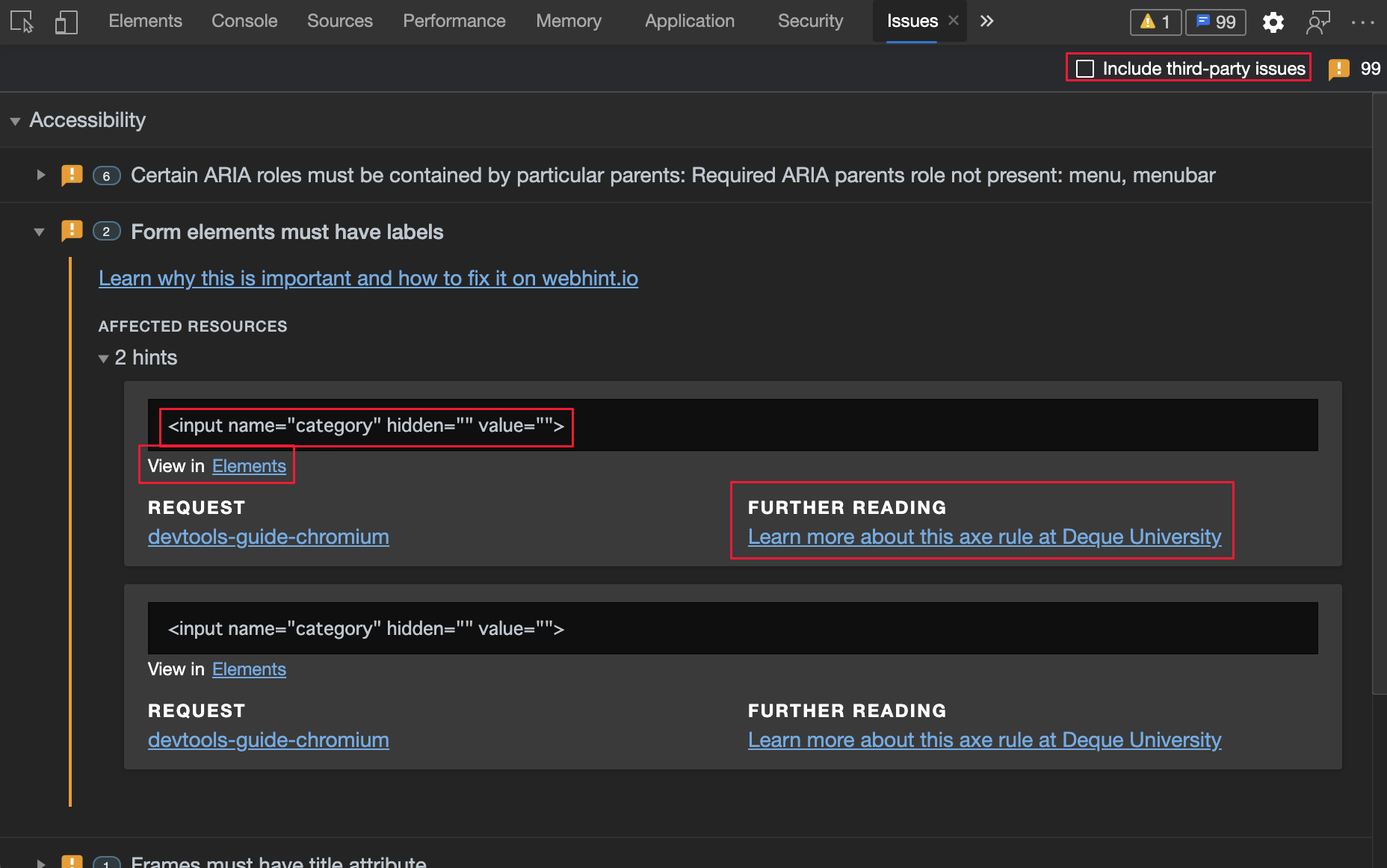
Issues Panel
The issues panel shows all kind of problems with the current web page. You can either open it directly or click the issues icon top right (the blue speech bubble). Issues are also announced in the Console.
In the panel you then navigate to the “Accessibility” section and can see if there are any problems. Each reported issue comes with an explanation what is wrong and why and a link to the parts of the developer tools where you can inspect and fix the problem.
The issues panel is powered by Webhint, a service that checks for all kind of problems (and NPM package in case you want to use it in your CI/CD workflow).
Element picker with accessibility info overlay
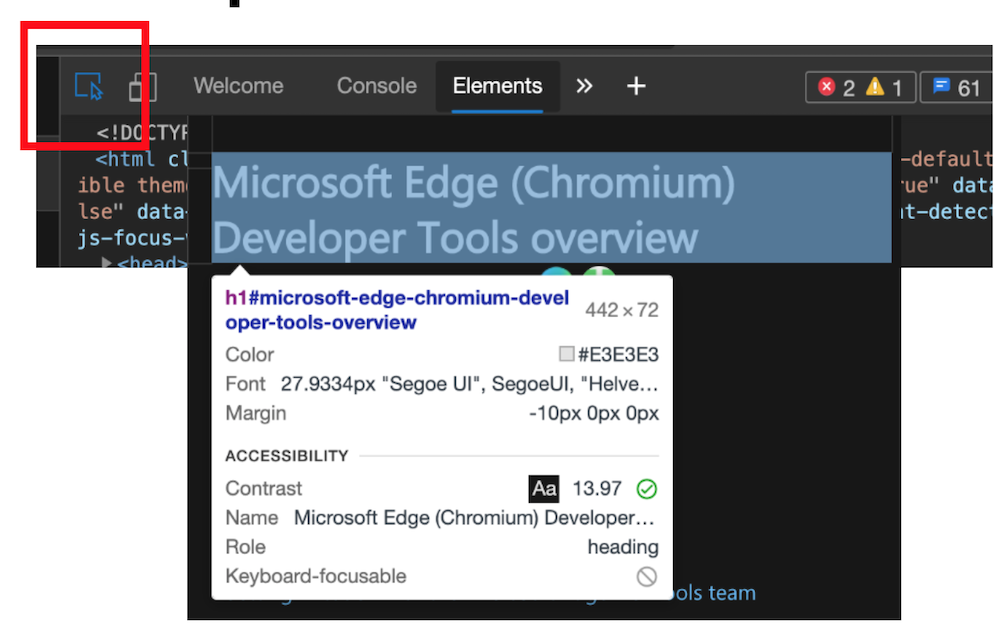
When you have the developer tools open, you can use the element picker tool to highlight and inspect parts of the page. The overlay shows all kind of information:
- The type of HTML element and class/ID information
- The dimensions of the element
- The Text colour
- The Font used
- Margin information
In addition to that you also get accessibility information
- The contrast ratio of foreground to background – if there is enough contrast you can see a green checkmark, otherwise a red exclamation icon
- The name as announced to assistive technologies like screenreaders
- The ARIA role
- An indicator if the element is keyboard focusable or not (either a green checkmark or a grey circle with a line through it)
This information should get you pretty far. Once you found an element with not enough colour contrast you can use the colour picker to fix it.
Colour Picker with contrast check
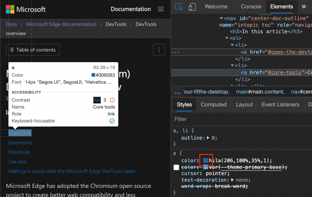
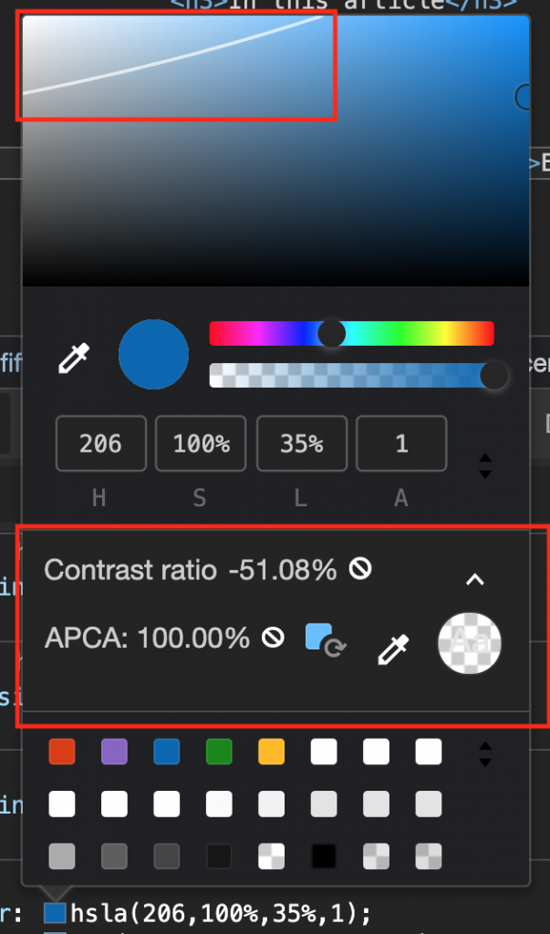
Once you recognised that some colours on your page have contrast problems, you can use the colour picker of the elements tool to see how to fix them. You open the colour picker by clicking on any of the colour swatches in the CSS of the element.
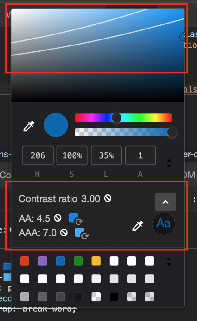
In the colour picker you get a section showing the contrast ratio and whether it is compliant with AA or AAA web guidelines or not. For colours that don’t have enough contrast the picker also suggests colours that are compliant. To pick those, just click on the colour swatches.
The colour picker also shows two lines over the colour selection box that indicate AA or AAA compliance. That way you can see if quickly if your desired colour falls into any of those sections.
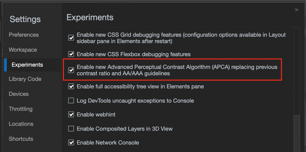
However, there is an issue with this algorithm as it doesn’t take into consideration the font weight of a certain font but only the contrast ratio of foreground and background colour. A lightweight font with enough contrast may yet be unreadable. This is why the current contrast algorithm will soon be replaced by one that takes this into consideration and you can turn the new one on in the developer tools settings.
Once you turned the experiment on and reloaded developer tools, the colour picker contrast section looks different and only shows one line for valid colours.
Vision Deficit Emulation
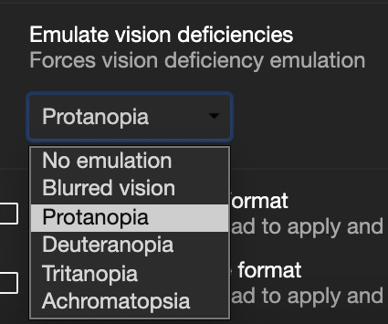
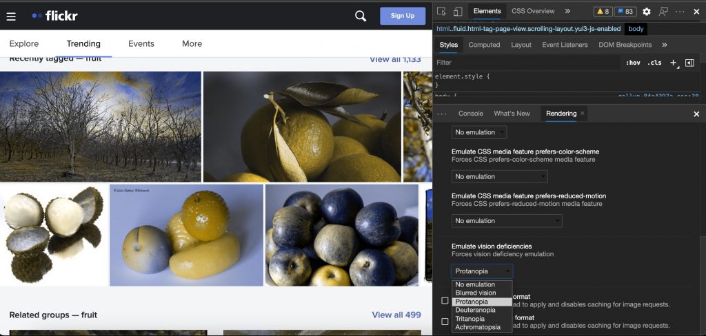
The way you perceive your web site isn’t how the world perceives it. This is why we added an option to emulate different vision deficiencies. Using this feature in the rendering pane of the developer tools you can see what your product looks like for different users:
- Blurred vision – The user has difficulty focusing on fine details.
- Protanopia – The user is unable to perceive any red light.
- Deuteranopia – The user is unable to perceive any green light.
- Tritanopia – The user is unable to perceive any blue light.
- Achromatopsia – The user is unable to perceive any color, which reduces all color to a shade of grey.
Choose from one of the options and the site will automatically change colours.
Rendering Emulation (dark, light, high contrast, reduced motion)
The rendering view also has a few features to simulate different operating system settings. One of them is to simulate reduced motion which is great to ensure that your animations are not shown to users that don’t want or can’t cope with animations on the web.
You can also switch from dark to light mode without having to change the settings of your computer.
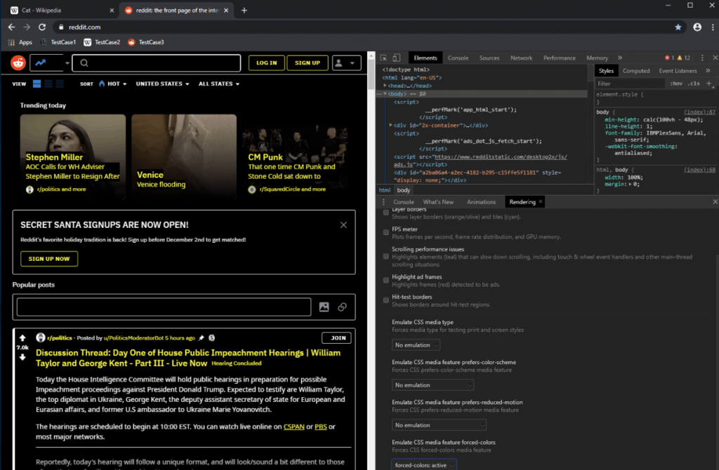
Soon you will also be able to simulate high contrast mode without having to change your operating system. I’ll blog more about this soon.
Accessibility Tree
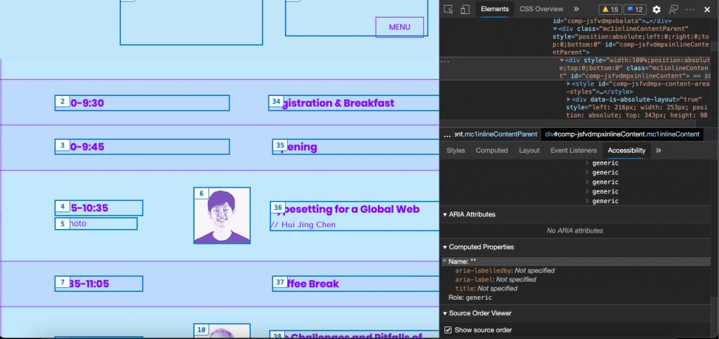
The accessibility pane of the developer tools also shows the accessibility tree of the document. This is different to what you see in the elements pane but is what assistive technology gets about your document. Using the accessibility tree you can check if an element is announced the way it should be to, for example, screen readers.
Source Order Viewer (experimental)
Using CSS you can change the order of elements how they appear on the screen. This change, however, is not part of the source code of the document and thus will not be announced by assistive technology like screen readers. By using the Source Order Viewer the developer tools will overlay the order number of each element in the browser and you can see if they are not only shown visually close to another but also for non-sighted users or search engines.
More to come
We are constantly working on improving the accessibility tooling in the developer tools and are open to feedback. Feel free to contact me or talk to @EdgeDevTools on Twitter.
