Tools should not only be for experts – they should turn us into them
Tuesday, September 15th, 2020About eight years ago Bret Victor tried to change the way developer tools work by providing a faster and simpler way from creation to consumption. He also followed it up with a Learnable Programming Course asking for simpler development teaching courses.
The presentation “Inventing on Principle” was a smash hit, despite its deplorable video quality. Many people in the field set out to create more visual development tools. Tools that invite users to play with values and see the immediate effects. Tools that disrupt the “code, deploy, test and debug” cycle. Quite a few startups built tools based on the principles laid out by Victor but in the long run failed to get traction.
Fast forward to now. A few things changed but most of our tools are still daunting to use. They offer a lot of functionality and empower programmers. But they also demand a lot of effort to learn how to use them.
There seems to be a common consensus that using a crowded interface and command line is a right of passage to call yourself a “coder”.
This isn’t inclusive. And I am not convinced that tools like these are superior because they worked for such a long time. I’d happily forego my command line skills and concentrate on great UX for my users instead.
I think it is high time we moved away from the concept of “tools for experts” towards one of “using this tool over time makes you an expert”. To put it in other words:
Our tools should never make people feel “too stupid” to use them or wonder why some features are even there.
As an example, let’s take a look at the developer tools bundled with browsers these days. These are excellent. It is wonderful to have all you need to build and test your web products in the tool you use to surf the web.
Web development has always been independent of platform and creation tool. You could and can use any text editor, write some HTML, CSS and JavaScript and test it in the browser. But web development has become more complex these days. And our tools grew with that complexity.
Intermission: why are we where we are?
I work as a Principal Program Manager for Developer Tools at Microsoft. My focus is the built-in developer tools of the Microsoft Edge browser.
These are the tools of the Chromium project and are as old as the project itself – at least 10 years. They are a complex bit of machinery and offer lots of different ways to use them. You can look at CSS and tweak it, you can debug scripting, you can even set up local workspaces to write your code. You have a networking part and you can dive deep into the rendering of the browser and see why your code might be slow.
They grew in an organic fashion over the years and with new demands to the web. Animations and transitions became a thing, the mobile web and responsive web design. Offline first and service workers are common and performance is a big topic. For each of these tasks you have dedicated tools in the browser. And experts who love them as they give them the insights they need.
A ton of training material, documentation and conference talks cover these tools. They explain how you can use them to build great web experiences and get detailed insights into what you do.
Other talks and publications try to predict the next big thing for the web. These cause a loud, short lived demand for tooling around the experimental technology du jour. As part of the browser wars, makers often reacted too quickly to these demands. They added yet another feature to the already crammed interface. That’s easy to do. Testing it with users to ensure that it is easy to understand takes more effort. And removing things always results with a public outcry.
Having the best developer tools in your browser has become a differentiator. Developers are early adopters and influence others to use your browser.
Over the last few years this meant we added a lot of features that only on the surface filled a need. We followed the demands of a small, but outspoken minority of the developer community.
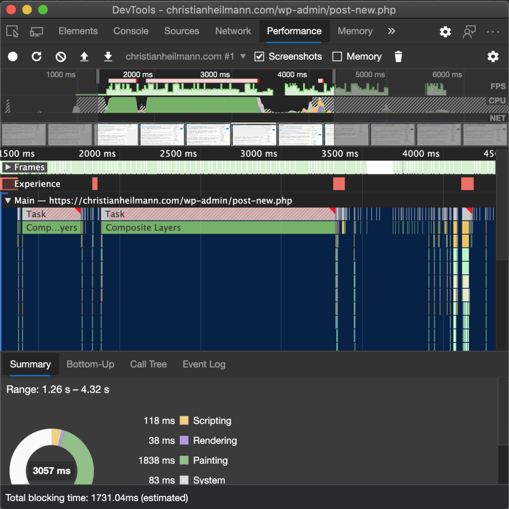
When you look at the telemetry and usage statistics things are different. The Elements and Console tabs together reign supreme and make up a huge part of the usage. Most of the other tools are far behind with some of them hardly ever looked at. The “must have” feature shown in the keynote often never made it past experiment stage as usage waned quickly. Which is a pity – it might be a great help to developers. But if you don’t move fast, interest goes away.
Even some of the standard tools eke out a meager existence. There’s a complex and insightful debugging experience using breakpoints, watch expressions and listeners. An experience massively overshadowed by the usage of console.log().
It is great to have these insights, so we could concentrate on what to remove to cut down on complexity. Except, we can’t. Any change to the current state of the tools is likely to irk people. That’s understandable. Change can be annoying. Developers love to follow our known paths where we can use the muscle and brain memory we honed over the years.
And this is the current state: a lot of excellent tools with low usage numbers adding up to a collection that at first glance seems incredibly complex. And this can be discouraging for beginners and busy developers alike.
How can we be better?
There’s a few ways we could think about our tooling to get better.
- Visual tools and interactions
- Contextual tooling
- Tool bundling
- Merging documentation, best practices and tooling
Visual tools and interactions
It may be fun for some to tweak numbers and see the changes after running a build and checking it in the browser. Most people will get better results using a visual interface though. This was a big thing in Victor’s talk and it is great to see that some things changed since then.
For example Lea Verou built a visual tool to tweak the easing of animations and transitions.
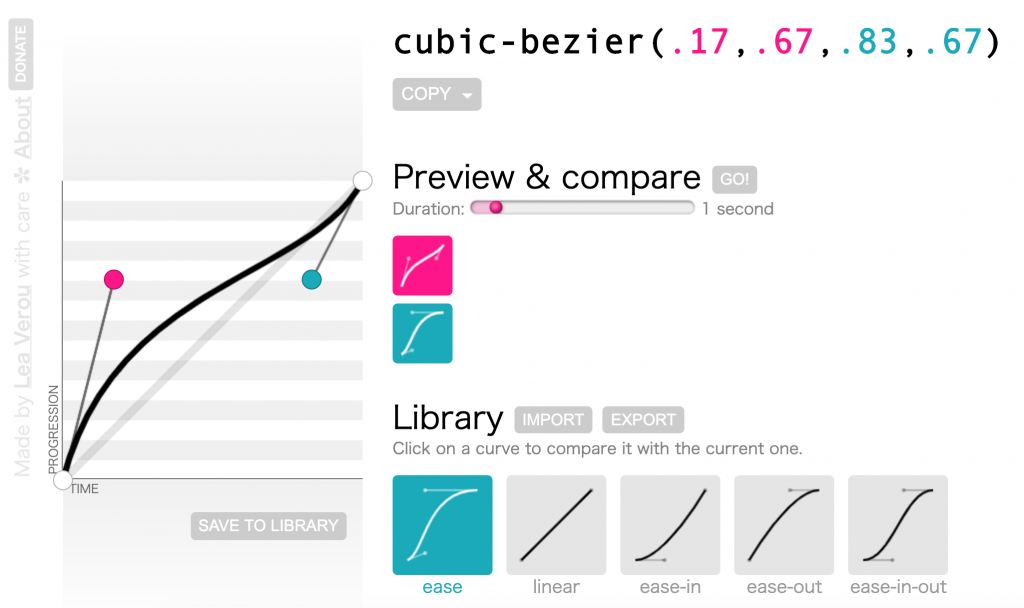
This soon made it into the developer tools and is now available for any CSS animation.
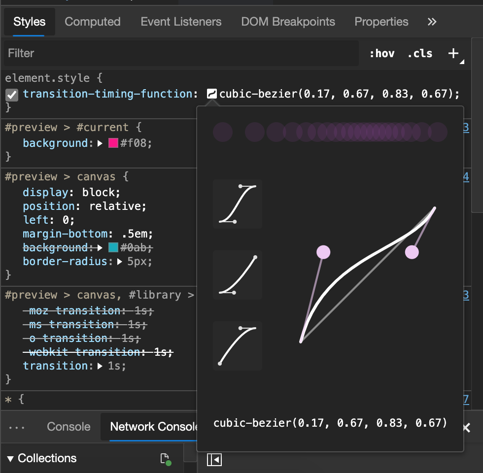
Colour pickers are also common these days. Visual representations of animations and small popup tools for drop shadows are other examples.
I like this a lot as it empowers people to tweak the look and feel and create the code needed to cause it. Some CSS syntax can get rather complex and we’re working on other things like font editors.
Often a change of your point of view can have interesting results. The 3D view in browser developer tools seems superfluous and strange at first sight. User testing and telemetry shows though that people like to use it.
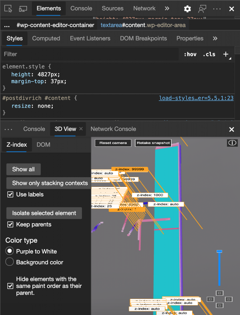
Seeing how complex your generated HTML is in a 3D space gives people an insight why the page performs poorly. And there are reports that a 3D representation of z-index finally made people understand the concept.
DOM breakpoints are another a great example. They allow you to use your product’s interface and link it to the debug workflow. When I show them on stage at events I get “wow” feedback, but they’ve been around for quite some time. There seems to be a big disconnect between work on the interface and work on the code that creates it. Which doesn’t make much sense, when you think about it.
Contextual Tooling
Right now far too many developer tools give me all the options at the same time. You have a main panel with lots of information and buttons, a sub-panel that displays more content. You often have another menu to turn on even more features or a cog to set preferences. These all are great, once you put the effort in to customise them to your needs and you read up on how they work. As you may have guessed, that does hardly ever happen.
Other products have understood that going out of the way until needed is a better experience. Keynote, Powerpoint, Photoshop and many others are context aware. You don’t get to see the image editing tools and information until you highlight or add an image. The toolbar ribbon shows only what’s needed at the time. Granted, coming from years of using “welcome to everything but the kitchen sink” tools this can be annoying at first. But I find myself concentrating more on what I want to do, not what else could come later.
Maybe it is a good time to bring more of this to our development tools. Turn usage into a journey of discovery rather than trying to pick from a huge offering.
Tool Bundling
Right now, we have a collection of a lot of tools organised by function. We have Elements, Console, Sources, Network, Performance, Memory, Application, Security. And even as I am typing this I get tired and overwhelmed. It is up to the developer to know which bit does what and what to use it for.
As product managers, we often talk about “JTBD”, or “Jobs to be done”. What does the user of our product need it for, what is the end goal?
Wouldn’t it make sense to have a different order of tools according to these? If all I want to do is to tweak the look and feel of a web site and play with CSS values, Memory, Performance and Application is just noise. When I want to know why my product is slow the whole visual tools for pushing pixels is also not what I want.
This may sound similar to the contextual behaviour explained earlier, but it is a bit different. The idea would be to have themes like “I want to edit a web site”, “I want to fix the performance problems of my app” and turn off the tools that don’t apply and use the extra space in the tool to provide guidance and documentation as to go through the process step by step.
Other ideas in the bundling space would be to automate parts that you will use some kind of script for anyways. Say, for example, the tool discovers that your images are huge and non-optimised. Instead of having to learn how to do that by hand we could integrate a tool like ImageOptim or Squoosh to help you with that.
Merging documentation, best practices and tooling
There is no shortage of great documentation and best practices for the web. The problem is that there is so much, you can’t even know what is solid advice and what isn’t. That’s why most of us don’t read the docs. Instead we Google or go directly to Stackoverflow and copy and paste the first result that fits. Understanding what we do can come later – we’re busy people, after all.
Why don’t we put documentation and insightful messages in our tools instead? As subject matter experts, we are likely to be able to give you good advice. Showing the information in context also means that you don’t need to go elsewhere. And that the information isn’t drowned in lots of ads or follows a hidden agenda.
I’ve been using WebHint for that purpose for quite a while inside Visual Studio Code (via the Webhint VS Code extension) and I’ve become a more organised developer because of it. Webhint is a linting tool for the web. It checks your code for problems with performance, security, accessibility and cross browser compatibility and gives you hints how to fix the issues.
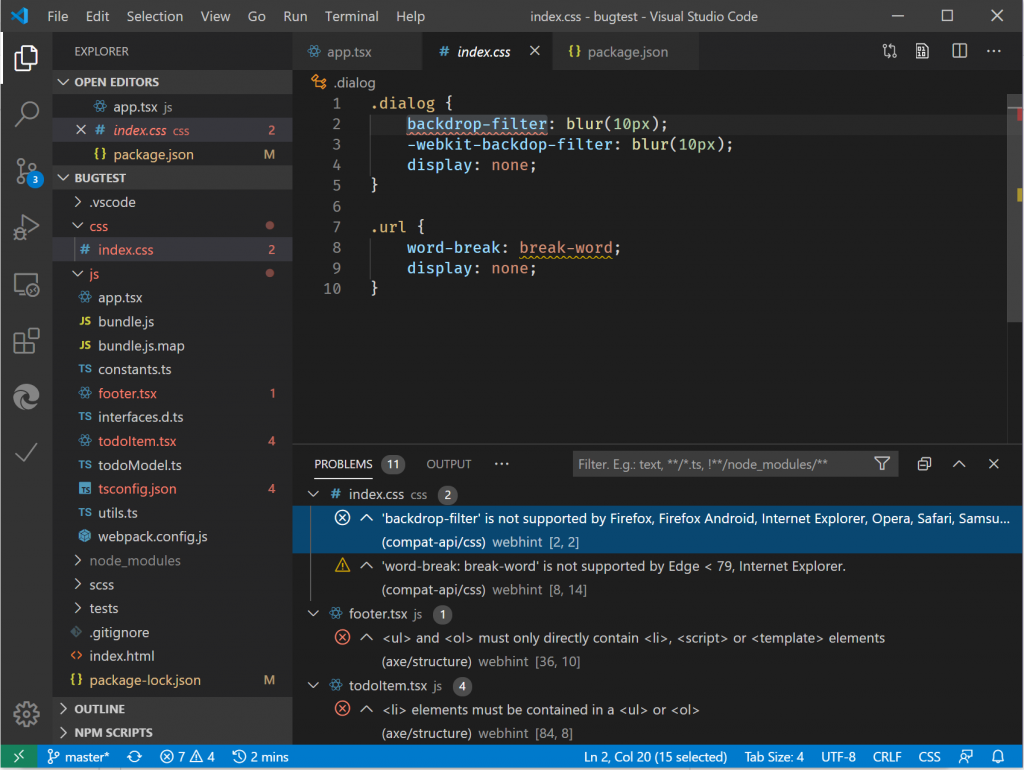
What I like most about this is that it doesn’t only tell me that something is wrong, but also how to fix it and – if available – links through to relevant documentation. In essence, I am learning about mistakes I make whilst I am developing and not after deploying and testing. Any bug we haven’t written is a learning opportunity.
Whilst this is great in my editor, I was missing something similar in the browser and there is now an experiment in Microsoft Edge that adds Webhint into the browser as an issues pane.
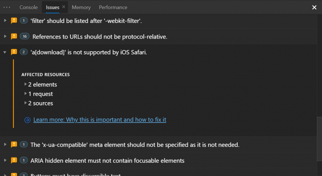
This could make testing and avoiding obvious problems much easier.
Things are happening
As a product manager every user who feels overwhelmed by my product feels like a failure on my part. The problem is though that you often don’t get feedback as there is a hesitance to admit that you don’t understand the developer tools.
Not being a command line expert or knowing about how to debug can feel like a failure. Seeing all those cool videos and talks about experts using the tools can be frustrating as not everybody has time to go that deep. And the most frustrating part is when experts call things that flummox me “easy” and “basic knowledge”.
So here’s a truth: we all don’t know what we do all the time. Even as someone working on the developer tools I find new things all the time I never looked at. If you feel overwhelmed, that should be on us to help you with – it isn’t a failure on your part.
But, you can help make it better.
- Report things that frustrate you back to the teams who build the products.
- Tell us if you think there is a bit of documentation missing, or what we could do to make it easier to understand.
- Use preview versions of browsers and turn on experiments in the tools to play with upcoming features and help make them great.
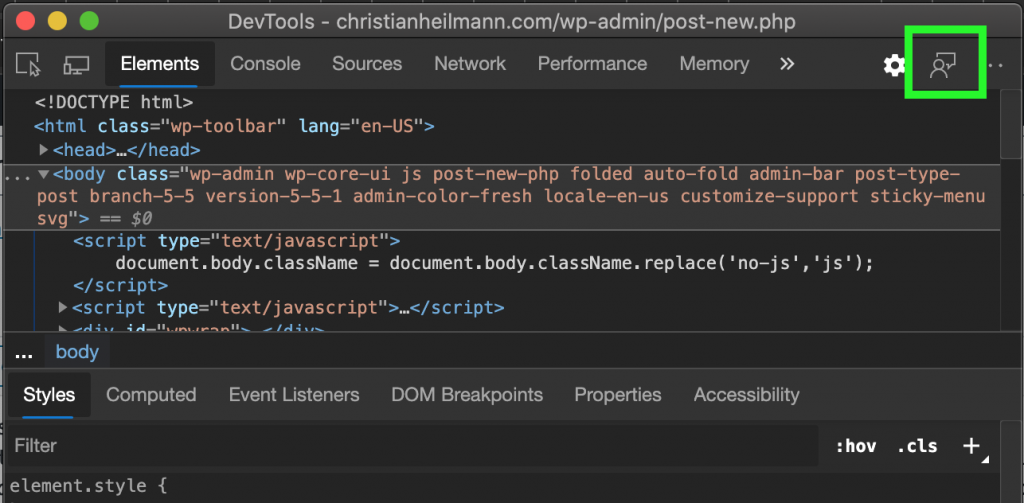
For browser development tools you can contact me directly, or the official Twitter account (@EdgeDevTools). Even better is to use the feedback mechanism built into the browser tools as this one goes directly into the bug queue. You can reach it by clicking the “person in front of screen” icon top right:
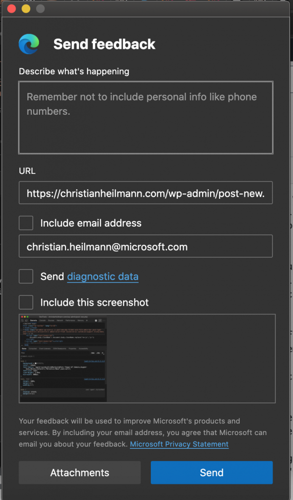
This will open a dialogue that gives you a chance to describe your issue. It also creates a screenshot for you of the page you had the issue with. You can also send telemetry and give us an email to ask for more details. You can ask questions in any language – we have a team of translators helping us with that.
We know the issue, and we want tools to be something you use and learn while you use them. Not something you need to already be an expert in. This is a good time to slim down, re-arrange and find new ways to empower the next generations of developers.
I am happy to work with a team dedicated to making things easier and trying to reach out to fill the needs for all developers. There are quite a few things in the making and these are exciting times.