Christian Heilmann

You are currently browsing the Christian Heilmann blog archives for July, 2021.

Archive for July, 2021

Using console.log() debugging in Visual Studio Code

Friday, July 30th, 2021

Using the new in-built JavaScript debugger in Visual Studio code you can use the browser developer tools Console right inside the editor.

I just published a “TikTok” style video on the official Visual Studio Code channel explaining this and – after lots of criticism for the quality of the video (lads, this is on purpose!) – people had more questions, so here goes.

In the video I use a project I have open with a launch.json file already defined, which means it opens the correct URL for you when you start debugging. You can, however, also do that by hand. And it even works without a local server. So, let’s do this.

Step 1: Create a folder and call it consoledebug
Step 2: Start Visual Studio Code, choose “open” – select that folder

New instance of Visual Studio Code with "Open Folder" selected

Step 3: Select New File, call it index.html
Step 4: Add some HTML/JS and save it

HTML Example for console debugging

Step 5: Select the “Run and Debug” icon and press the “Run and Debug” button

Selecting the Run and Debug workflow

Visual Studio Code now opens a browser window for you and you can see the console.log message from the demo code in the Debug Console.

Console messages in the Debug Console of Visual Studio Code

You can use the Debug Console to do anything you normally do in the Console of the browser tools. You also have access to all the convenience methods, like $ for document.querySelector. Try it out by using $(‘body’) in the Debug Console. You get all the information about the body element of the current document.

Accessing the document body from the debug console

This is a full REPL console, and you can just type in any JavaScript to try out, for example 2+3 or ‘log’.repeat(20)

Running JavaScript in the Debug Console

You also have full access to the Window object and the DOM of the current page, for example, to change the background colour of the document, you can use $(‘h1’).style.background = ‘peachpuff’ (and not what I did first in the screenshot).

Changing CSS from Console

For all the features of Console, check the documentation.

If you use Edge as your debugging browser, you also get something extra. Hitting the Inspect button on the debug bar will open the Developer Tools Elements and Network right inside your editor.

Developer Tools in VS Code

But more on that later.

Accessibility WTF: Voiceover on Mac announcing a list tree as a table?

Wednesday, July 28th, 2021

I’m currently investigating a strange bug we got reported with the Edge Developer Tools. Voiceover on MacOS announces the DOM tree as a table and tells you how to navigate it – which then doesn’t work.

Voiceover announcing a list marked up as an ARIA tree as a table.

The reason is that the markup isn’t a table. The DOM tree is, well, a tree, built with OL, LI and ARIA roles. But Voiceover doesn’t recognise that. Narrator on Windows and NVDA work.

Developer tools open on Developer Tools showing the right markup for an accessible tree

I thought at first that it is a problem related to the list-style:none voiceover issue but it even happens on an example without any styles and on the W3C demo of treeview .

Bare bones example of the HTML of Developer Tools with Voiceover announcing it wrong

W3C treeview demo announced as table in voiceover

Let’s hope this gets fixed soon, as for now, I am stumped as to work around this issue.

Update: As Tomas Caspers pointed out on Twitter, this might be caused by a weird old HTML demo in the ARIA spec using a table and lots of roles to explain the functionality.

Debugging JavaScript, DOM, CSS and accessing the browser console without leaving Visual Studio Code

Thursday, July 22nd, 2021

Now that Visual Studio Code has an in-built JavaScript debugger, it has become incredibly convenient to debug your project without leaving the editor. You can debug JavaScript, tweak CSS and the DOM and interact with the browser Console right inside VS Code. And you don’t need to know which extensions to install as the editor guides you along the way.

Under the hood, this uses the JS Debugger and the Edge Tools for VS Code extensions. Here’s what the flow looks like:

If you haven’t got the Edge Tools extension installed, VS Code will prompt you to do so the first time, as shown in this screencast:

In addition to breakpoint, DOM and CSS debugging, Visual Studio Code’s Debug Console now also is the same Console you normally get in the browser. You can access the window object of the browser instance and use all the Console Utilty Methods like `$` and `$$`.

To run the debugger automatically on your project, you need to create a `launch.json` file and define the debugger as the launch type. The Edge Tools extension can also do that automatically for you. If your application is not on `localhost:8080` you need to tweak the `url` parameter.

{
    "version": "0.2.0",
    "configurations": [
        {
            "type": "pwa-msedge",
            "request": "launch",
            "name": "Launch Edge against localhost",
            "url": "http://localhost:8080",
            "webRoot": "${workspaceFolder}"
        }
    ]
}

If you want to see this in action, you can download/fork the demo to-do app I used in the screencasts.

What do you think? Anything you’re still missing in that workflow? File an issue on GitHub and tell us about it!

The accessibility stalemate

Tuesday, July 20th, 2021

Scrabble board spelling publish

Over the course of my career I’ve seen a lot of excellent accessibility presentations and learned a lot. That’s because I worked in the accessibility space and went to specialist conferences. Web development conferences also have accessibility talks and their number is rising. But often these don’t go past the 101 stage or repeat things that should be obvious. Alas, many of these things aren’t obvious to the average designer/developer. The reason could be a thing I’m calling the accessibility stalemate.

What do I mean by that? A lot of excellent accessibility advice never gets distributed beyond the initial audience. The reason is that people love to call out any accessibility problems with the materials. There is a knee-jerk reaction I’ve seen over and over again. Calling a slide deck explaining how to make content accessible that isn’t fully accessible as “ironic” or “a bad example”. A lot of presenters don’t share their talks because of that. I saw many conferences not release any of the materials or videos as they couldn’t caption them or host them on a platform that allows for it.

It is tough to make things accessible. I’d even go as far as saying that you can never make things accessible to everyone. All you can do is make sure that the materials you publish can be altered to the needs of your users. At the least, provide information that describes things that are visible only – like alternative text for images. We understand that and when it comes to products in the wild, we’re forgiving if things aren’t perfect.

We are not as lenient when it comes to information materials of accessibility events. If they aren’t perfectly accessible, they’re seen as a disgrace. And that’s holding us back.

Many presentations complain about the lack of basic accessibility in products. On the surface, it seems to be valid criticism to call out when they aren’t in an “accessible format”. Or when they fail to provide alternatives for each image and video in them. Except, it is a cheap shot and feels like a distraction from the problems the materials talked about. “You don’t follow your own rules, so why should I?” is a cop-out of those who don’t want to think about a certain matter.

It reminds me of this classic piece by Jeffrey Zeldman that calls out people criticising articles for the platform they are published on. “Isn’t it ironic that I can’t read your article on mobile best practices on my mobile device” and similar smart remarks. No, it isn’t ironic, and it is also not that important.

What do we gain by ensuring that a presentation about how people use screen readers is accessible by a screen reader? Is that the audience? The one who already knows this information? Who do we serve with this? Or – let’s turn it around – who do we miss out on when we spend a lot of effort on it? Unless the talk is about creating accessible presentations and you show with your talk materials how to do it, it seems extra effort not serving the right audience.

How about we stopped with this and instead concentrate on getting accessibility information to those who need it in a format engaging to them?

Here are a few accessibility truths/prejudices to tackle:

  • Accessibility is scary – the best selling point for accessibility hasn’t been “making it work for everybody will create better products” but “you will be sued if your product isn’t accessible”. We’ve played that card for years – it works. However, it doesn’t result in accessible products, it results in compliant products. But it cemented accessibility as something people don’t strive for, but something they worry about instead.
  • Accessibility is boring – by telling people they must do invisible things to be compliant we didn’t make accessibility a “wow, I want this”. We made it a chore, a task to do before you can release. Accessibility isn’t boring. Just look at how we use our mobile phones. Most of the features that make them cool (geolocation, voice recognition, read aloud…) were originally created for assistive technology. And yet we worry about not spicing up our accessibility presentations with multimedia as it isn’t accessible to all.
  • Accessibility is complex – currently I work on developer tooling, and I try hard to make accessibility testing and creation of accessible interfaces easy. It isn’t though. The whole idea of the accessibility tree as an alternative representation of the document is confusing a lot of people. And while we have highly visual and intuitive tools for performance testing and CSS creation, the accessibility focused ones tend to be basic and bland. Right now, most of them are used by testers instead of developers/designers. That’s not enough.

We have a lot to gain by making accessibility, well, more accessible. We do not do that by blocking information from going out as it isn’t perfect when it comes to accessibility. We do cater to various audiences, and you catch hearts and minds by using a format that appeals to these audiences. Not the lowest common denominator.

So next time you feel like calling out a great video or presentation for lack of “accessible format” or captions, maybe do something about it instead. Write about the video or the presentation and publish your musings in a perfect, accessible format. Good luck.

Learn more: More about my approach to accessibility and how I ensure that our products have an accessibility built in from the get-go, in my Skillshare class Product Management: Tools for Improving Product Accessibility.

How many happy users did your product have this month?

Thursday, July 15th, 2021

Happy dog with ball

The other day, I mulled over the problem of bad user experience resulting in more usage of products.

And I followed up with wondering how we could get to a “happy user” metric.

When measuring the success of software products, data is king. When I moved from DevRel to program management, my world got a lot more dashboards and charts. I found myself spending more time looking at user feedback. I learned about asking questions to find the real issue that caused dismay in users instead of adding a feature satisfying their request. I started feeling despair looking at the noise to signal ratio you get in feedback channels. And I started to question our razor-sharp focus on numbers and continuous growth.

We love growth and numbers. It is pretty depressing how much we see growth as the only thing that matters. Users, download numbers, sessions, minutes of usage – all have to go up from version to version – or you failed.

This makes sense when you grow and when the funding of your product is dependent on user numbers. It is the main thing that empty products like social platforms have. You need users to get content and engagement. You always need to get more to be able to tell advertisers that you have so and so many users. I remember working on app stores in another company and wanted to bang my head on the table. People measure the success of a store by the number of apps, not by their quality. At one time I met with a company offering to create 500 apps a week for a certain price. That way our app store can look bigger than the others. You’ve seen apps like these: “paint a cat”, “paint a dog”…

The big issue is that our fairytale success stories in software are the fast growing platforms millions of people use. Are you as successful as Facebook? Are you growing as fast as TikTok? Do you have as many active users as MySpace? Oh, wait…

Not all products are there to always grow. Some products are specialised, and you don’t even expect people to use them all the time. Many of the things I work on in the developer tooling space are things you only use when there is a certain problem. The happy path for the user is simple. Open the tool, use it to find the problem to fix, close the tool and forget about it until the next time.

No growth there, but something more important: helpfulness to the user. If the tool does not only allow you to track down a problem, but also gives you valid advice how to fix it, even better. I love when a tool educates me about a problem. I am happier, and I even learned how to avoid the issue in the future. Which means I don’t need to use the tool any time soon any longer.

As the tool creator, who has to show continuous growth, this is a problem. The only way to increase usage numbers is to ensure the problem happens more often. And that is beyond the reach of the tool creator.

The question then is, how do you measure the success of those? And even more interesting – how do you defend a drop in numbers when you fixed an issue?

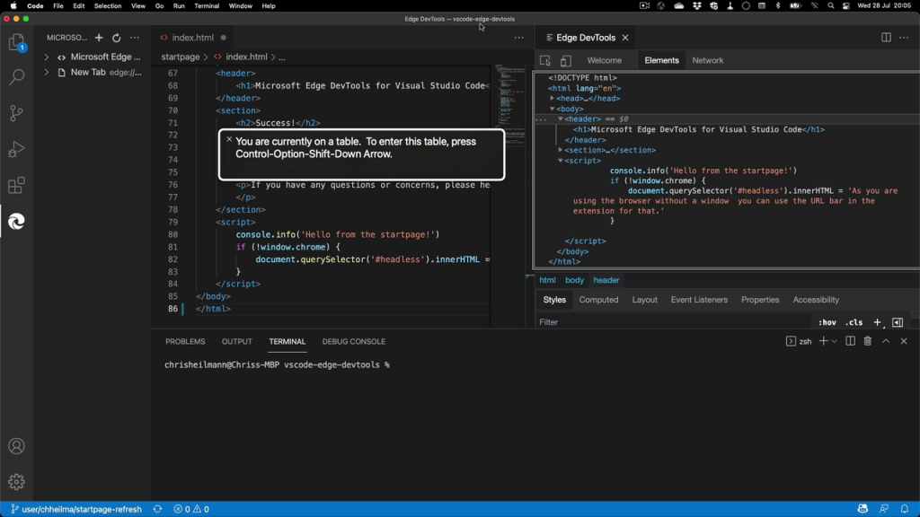
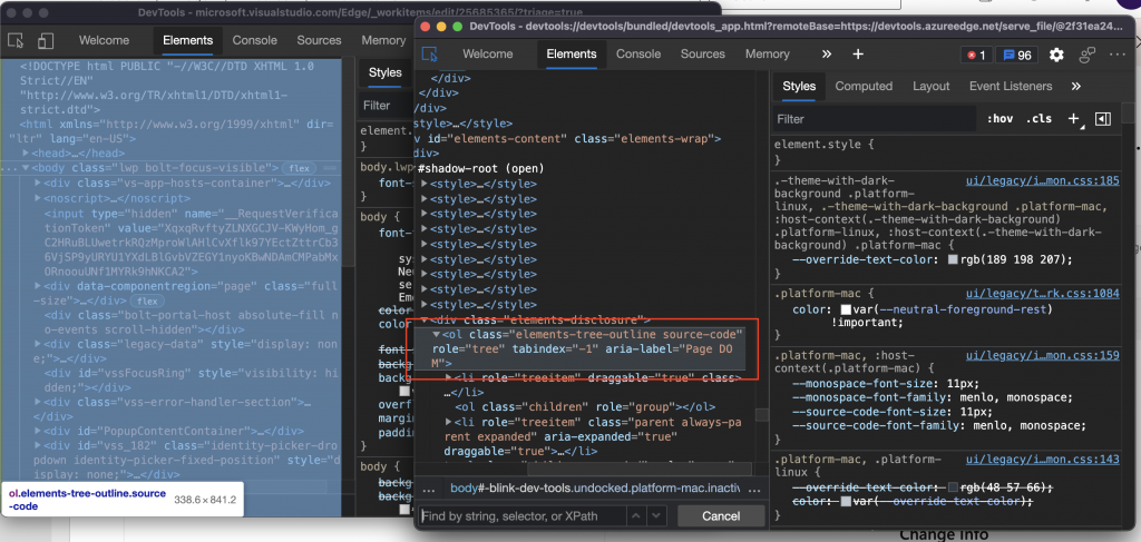
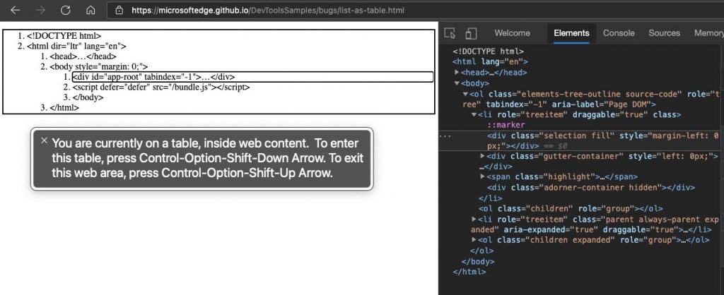
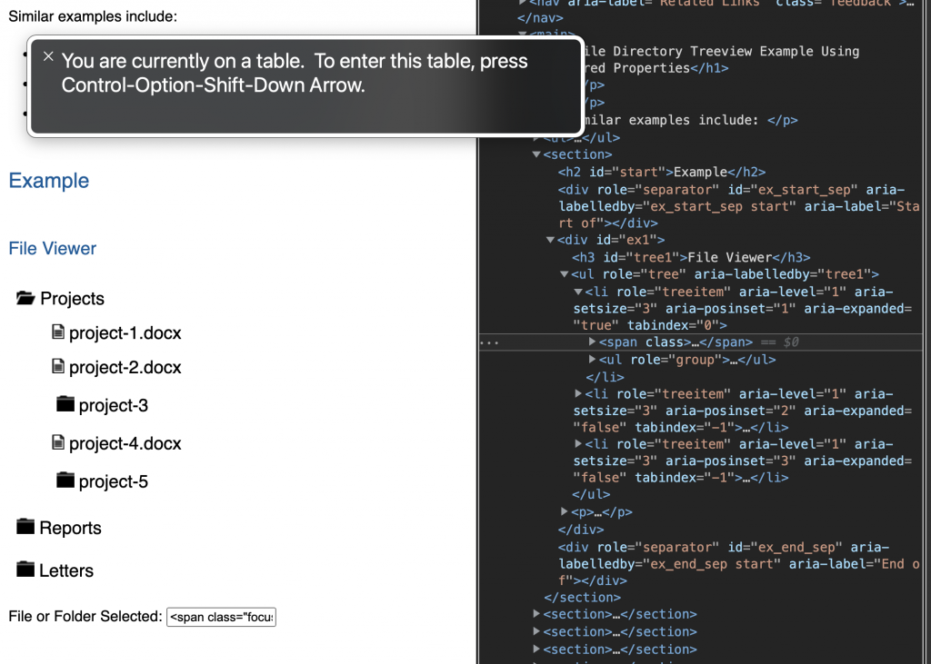
The other day we encountered the issue that a highly used product also got a lot of feedback. Negative feedback, telling us that people don’t know what it is and why it is there and that they want to get rid of it. This is something you want to dive into. Unhappy user feedback is high priority, especially when your product confuses the users. People put effort in to tell you about the problem, you should reward them for that.

As it turns out, there was a simple way to accidentally hit the keyboard shortcut to open the product. For power users keyboard shortcuts are amazing. That’s why developer focused tools have dozens of them. For normal folk, they can appear as witchcraft.

The solution was to add an extra step the first time the keyboard shortcut happens. We show information telling you what will happen now, what product you will open and if that is what you wanted. We offer to never to do that again for people who triggered it by accident and never to show the message again for others.

We didn’t come up with this super clever way of dealing with this ourselves. We did user research and tested various ways to work around the problem.

This will cause a dip in our usage numbers for sure, but it also means that all we lose is accidental, unhappy users. Which is great. But what if I worked elsewhere and the next bonus or funding for my product is dependent on more users each month?

The interesting thing here is that we have proof that those users were not happy getting there. So we can point to the feedback data and show the drop off in negative feedback as a win of happy users. We can only do that as we have an easy to reach and use feedback mechanism in our tool. And this is where far too many products fail, in my book. If you don’t ask your users how they like what you do and allow them to complain about problems, you can’t find issues like these.

We need a new metric of happy users. But I am still at a loss how to get to that one. One thing I know though is that chasing more users or interactions for the sake of growth doesn’t make better products.