Christian Heilmann

You are currently browsing the Christian Heilmann blog archives for July, 2020.

Archive for July, 2020

Style Stage and old people of the web

Wednesday, July 22nd, 2020

On the 10th of July up and coming happy person of the web Stephanie Eckles released Style Stage, which she describes as “A modern CSS showcase styled by community contributions”. It is – in essence – a well written HTML document and she asks for contributors to show what they can do with CSS to style it. She specifically also points out that people should use “modern” CSS and go out of their comfort zone to play with it.

To many people who’ve been around for quite a while in this space, this seemed like a no-news item, as we got all bleary eyed and pointed out the Dave Shea’s CSS Zen Garden pulled exactly the same stunt in 2003.

I came across it from a retweet and retweeted it with a snarky Breaking News – CSS can style HTML comment as I was baffled that this is considered a new and cool thing to do.

That was a dick move and I want to apologise to Stephanie, as there is nothing wrong at all with what she did. On the contrary, I love the focus on newer CSS and that the HTML she provides is bare-bones without any aids that would allow for extra styling. To make something cool with Style Stage, you need to dig deeper into your CSS tricks box.I love that it uses version control to contribute, so people can even get familiar with that along the way without the pressure of contributing to a project with lots of rules and dependencies.

I especially like that it is bare-bones, that she credits CSS Zen Garden and that it is not an ad-ladden cash grab piggy-backing on an educational resource. There was no shortage of horrible sites in the past that scraped CSS Zen Garden and offered similar things. My very own CSS Table Gallery that I released in 2005 to show how to style data tables in CSS died in a heap of spam and security attacks about 4 years ago. I just couldn’t keep up with the people scraping and re-using my content without consent. I had a job to keep me busy.

There are a few things that ail me about my initial response and this is also reflected in a lot of the answers and the responses to Stephanie’s announcement of Style Stage.

  • That it can be a “wow” moment for people now that CSS is enough to style a static HTML document isn’t the fault of new people who are excited about it. It is the fault of the old guard of web developers banging on about the beauty of CSS without considering the needs of new audiences. We failed keeping the excitement of 2003/2004. Instead we sat on our laurels declaring that anyone professional would find our output from back then.
  • The choice of what technology to use has become much harder. We can stomp our little feet and shake our fist at JavaScript overload and people not understanding the power of CSS or not even taking it serious. Or we can listen to why they think it, where they get stuck and make CSS and the tooling around it better. Those who fought the good fight in 2003 probably are too old and busy now. That’s why it is great that people like Stephanie take it on.
  • I wasn’t a big fan of CSS Zen Garden when it came out. Gasp! Why, Chris, why? Well, back then I worked on CMS driven projects. Huge Enterprise web sites, B2B portals, government web sites. The HTML shown in CSS Zen Garden was something I could only dream of. I had to deal with table layouts created by Java or classic ASP. I did a lot with CSS and I managed to cut down immensely on the amount of templates needed by using it to its strengths. But the awesome experimental techniques shown in CSS Zen Garden were impossible to use for me and it felt contrived. That even went as far as me setting up CSS Tool Shed, a similar page to Zen Garden rendering out a full web site with content you couldn’t control – you know, the likes I had to work with. Nobody came and contributed. In retrospect, I shouldn’t be surprised as it felt more like spec work than contributing to a cool gallery. I also was disappointed by the contributions to CSS Zen Garden that got all the accolades. Most of them used image replacement creating gorgeous designs that were inaccessible and – back then – couldn’t even be zoomed by changing the font size. That, to me, was plain design, not web design.
  • CSS Zen Garden removed a lot of old examples lately and even – again, gasp! – changed the HTML some time ago. Last time I met with Dave he told me this was based on feedback he got from teachers who used CSS Zen Garden but complained that it lacked some HTML5 features they’d love to teach their students. So he changed it. Violating the main principle of the project. And – to me – for good reason. We need to move on and help educate people on the changes of the web.

Let’s not get too hung up about the past and how much great and good we did back then. And let’s fight that first urge to be snarky and feel a “oh god, not again” in our heads as that is our baggage and not the one of the web community. We’ve dropped the ball somewhere along the line talking exclusively to a receptive audience instead of moving on with our advocacy into academia, enterprise and education. When I see “web development” courses by the German government in 2020 that talk about “building a DHTML carousel” I see that there was a lot we missed out on.

So, thank you, Stephanie for doing this and I hope you get a lot of great contributions. I think a lot of people can learn from this and see CSS as a valuable skill to have.

Quick tip: how to make mailto: links open in Gmail in Microsoft Edge

Monday, July 20th, 2020

I like mailto: links. They worked forever and they kind of make sense. Lately there was a discussion around their usability and what can be improved, which is great. I got some good feedback on Twitter and dug a bit into our design research if there’s something in the making to make things more obvious. There is. But for now, here is how to make sure that mailto: links in Microsoft Edge open in Gmail in the browser instead of trying to open an app you don’t use. (By default, my Mac opens mail every time, which I never used).

  • Step 1: Go to gmail.com in the browser
  • Step 2: Click the handler icon in the URL bar:
    Hander icon showing in the URL toolbar
  • Step 3: Select “allow”
    Allowing Gmail to open all email links

That’s it. From now on each mailto: link on the web you click on will open in Gmail and not leave the browser. Of course this works for any other webmail client that exposes an handler (Yahoo, Office 365’s Outlook…).

The context menu on any mailto: link also allows you to copy just the email (without the mailto: pseudo) and to reset the handling of emails to the OS default.
Context menu on email links showing lots of options

You can also do so in the browser settings under Site Permissions -> Handlers.

Site Permission settings in Microsoft Edge

A CSS only “click to animate gif” solution

Thursday, July 16th, 2020

Here’s a quick experiment in pure CSS how to cover a GIF with a play button instead of playing it. You can see it in this codepen or also play with it on GitHub. The GitHub code repository is also available.


See the Pen
CSS only "click to show GIF"
by Christian Heilmann (@codepo8)
on CodePen.


Animated GIFs are fun, but they can also be annoying as hell. To some people, they can even be a health issue. They can distract people, confuse them when reading is a problem to start with. They can even cause nausea and – in the worst case scenario – seizures.

On a more technical, but also inclusivity and accessibility issue, they also tend to be huge in file size. And – unlike videos – they don’t stream.

That’s why Operating Systems come with a way to tell software that the user doesn’t want to see any animations. On MacOS, for example, you can enable the “Reduce motion” settings and apps will not swoosh and pop any longer.

MacOS Settings with reduced motion enabled

On the web, this triggers a media query you can react to called prefers-reduced-motion.

Now, the best way to do this has been discussed by Brad Frost and Chris Coyier in detail back in June 2019. Using the picture element and a media attribute on the source element makes sure that the browser shows a fallback and doesn’t even load the big GIF. A simple way to have a “click to play” is also to use a video element and an MP4 instead of GIFs. This sounds more complex, but it does result in smaller files and the user has more control. Also, videos stream, GIFs do not.

Anyways, back to my little experiment here. I wanted to have a GIF covered by a play button and to show the GIF when the user clicks or tabs to it and presses space. And I didn’t want to use any JavaScript. So here is what I came up with:

The HTML is a label surrounding a checkbox and an image

<label class="click-to-gif" title="click/hit space to show gif">
<input type="checkbox">
<img src="https://media.giphy.com/media/XV74ZvGRXcZdS/source.gif"
alt="Captain America saying he can do this all day - animated"
width="500" height="180">
</label>

This gives me a few things for free:

  • The checkbox is keyboard enabled – you can tab to it and check/uncheck it by pressing space
  • The label means that you can click anywhere to check/uncheck the checkbox

The first bit is to make the image display as a block to avoid gaps and to hide the checkbox by positioning it off-screen:

.click-to-gif img {display: block;}
 
.click-to-gif input[type=checkbox] {
  position: absolute;
  left: -100vw;
}

We set the label to block to enable the user to click anywhere and we float it to the left to wrap it around the whole image.
We set a background colour and an inline SVG (this is the play icon, abbreviated here).

label.click-to-gif {
  display: block;
  float: left;
  background: DimGrey no-repeat center center;
  background-image: url('data:image/svg+xml;
   ... 
  fill="LightGrey"/>') ;
}

On hover or focus-within, we change the colours to tell the user that this is interactive. Focus-within is a great addition to CSS as it triggers a change on a parent element when any child element gets focus. That way we can change the look of the label when the checkbox state changes.

.click-to-gif:hover, .click-to-gif:focus-within {
  background: DarkSlateGrey no-repeat center center;
  background-image: url('data:image/svg+xml; 
  ...    
  fill="MediumSeaGreen"/></svg>');
}

When the checkbox isn’t checked, we hide the image by setting its opacity to 0. When the checkbox is checked, we show it. As the above design is all happening in the background, the image will then cover it.

.click-to-gif input[type=checkbox] + img {
  opacity: 0;
}
.click-to-gif input[type=checkbox]:checked + img {
  opacity: 1;
}

And that’s all. If you don’t want this functionality to be the default, but only apply when the user has set his operating system to reduced motion, you can wrap the CSS in a media query:

.click-to-gif img {display: block;}
.click-to-gif input[type=checkbox] {
  position: absolute;
  left: -100vw;
}
 
@media (prefers-reduced-motion: reduce) {
  label.click-to-gif {
    display: block;
    float: left;
    background: DimGrey no-repeat center center;
    background-image: url('data:image/svg+xml;
    ... 
    fill="LightGrey"/>') ;
  }
  .click-to-gif:hover, .click-to-gif:focus-within {
    background: DarkSlateGrey no-repeat center center;
    background-image: url('data:image/svg+xml; 
    ...    
    fill="MediumSeaGreen"/></svg>');
  }
  .click-to-gif input[type=checkbox] + img {
    opacity: 0;
  }
  .click-to-gif input[type=checkbox]:checked + img {
    opacity: 1;
  }
}

If you want to test this without resetting your OS the whole time, you can use the Reduced Motion Simulation in Chromium Devtools as shown in the following video.

To toggle the reduced motion setting, press CMD/Ctrl+Shift+P and type “motion”. You can also find the setting as a drop-down in the rendering pane.

Always bet on HTML – being misunderstood

Monday, July 6th, 2020

A few weeks ago Chris Ferdinandi wrote an ode to HTML called Always bet on HTML in which he once again praises the benefits of HTML as a base for your products on the web. He is correct and makes a lot of great points. However, we made these points for 20+ years and people keep underestimating the benefits of starting with a solid HTML base. Maybe it is time to look at the reasons why people might be less enthused about HTML than Chris (and me) are.

Greek pillars

HTML is not a programming language

HTML is dumb – which is a good thing and one of the cornerstones of its resilience and sturdiness.

Programming languages allow you to use logical constructs like loops and conditions. They also have a concept of variables and you can do calculations on them. You can react to input and convert it before you display results. They need some sort of runtime to execute all of that in.

HTML doesn’t have any of that. Which is OK - it was never meant to have that. But – for some – this makes it a less interesting skill to learn. That might irk us, but it is something we have dealt with since the arguments around the value of HTML started.

HTML is a markup language you use to describe what something is. Then you need to rely on another piece of software like a browser to do something with that information. You don’t install that browser or control it like you would control a runtime on your server. You have no way of knowing if it succeeded or not – all you can do is trust in the platform and your users’ unknown setup.

Support can be sketchy and HTML doesn’t tell you that

That’s why HTML comes with fallback options. Alternative text for images. The inner content of a canvas element to show when canvas isn’t available. There is a problem with that though – when it doesn’t work.

I wrote about a problem like this seven years ago . When you add an image to your HTML document things can go wrong. If the image isn’t avaible or in an unsupported format, the browser displays a broken image and the alternative text. You can even track that in JavaScript – as the image throws an error.

When you try to play a video with a non-existing codec the alternative content in the video element doesn’t show up – all you get is a broken interface. Content inside the video element only shows up in browsers that don’t support it (i.e. none these days). To give your users a great solution you need to progressively enhance. You show an image linked to the video, test in JavaScript if the video could play and then replace that image with a video element. Exactly the opposite that HTML should be about.

The problem goes deeper though. When it comes to budgets, the focus in most cases is on delivering a gorgeous product. That is much more important than resilience and fallback content. The product design shows a colour picker in the companies’ style. Your solution shows a different one or a form field as a fallback.

For us as lovers of the web and developers that’s great and clever. Those who sign off the product cheque think differently – they didn’t ask for that and it smells of extra work. This should be a problem we tackle – not developers who need to stay in their allotted time and deliver.

HTML and browsers are forgiving

One of the main strengths of HTML is that it is resilient. This wasn’t always the case and often you had to do weird things to make even HTML and CSS work in browsers.

Back in the days, for example, older browsers made the error of rendering whitespace in HTML. If you styled a list with background colour there were lines between the items. There were a few fixes for that, but a big and silly one was to use the following markup abomination :

HTML with each line break in an HTML comment

Nowadays, though, the parser is forgiving and will do its very best to guess what you meant with faulty HTML. It closes tags for you, it moves wrongly nested elements out of the parent element and it happily renders <​ilovebacon> as a <​div>.

This was a pragmatic move by browser makers as the web is full of horrible markup. The problem is that it also is a carte blanche for any developer not to give a hoot about the quality of their HTML. In my 20+ career as a web developer I kept running into people who learned HTML in 1998 and never bothered to keep up. Table layout works and browsers can’t break the web so they will keep showing them. Why bother changing my ways as a developer then?

I understand this is glib. But when you have a 9-5 job as the maintaining web developer of a legacy web site with thousands of pages you have a different view. You are happy to sit your time out, hope nothing breaks and not change the world.

So what I am saying is that as HTML can not fail, people don’t take it as serious. A stack that throws errors in your face making it obvious that you’ve done something wrong gets more attention. Semantic and clean HTML has numerous benefits, but many of them aren’t obvious if your goal is to “build things that don’t appear broken – as quickly as possible”.

HTML is “too open”

There is no doubt that we expect more from web products than we did in 1997. The web has become the mainstream platform for media distribution. This clashes with some of its ideas.

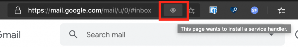
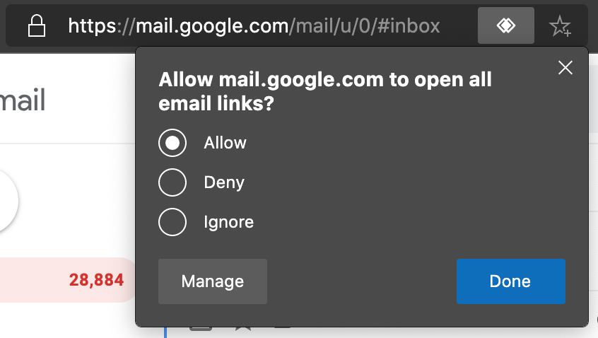
For example, when it comes to video display on the web the video element gives you a way to download the video in case it doesn’t show. As a video content provider you don’t want that. You want people to go to your product and consume the video there alongside your ads. To meet your business goals, you need to work around HTML’s idea of making everything available. Many video platforms offer video download as a carrot to sign up for a full account. And the business folk in your company rely on the developer to safeguard that. Is this good? Not in my book, but this is how our market works.

Only generated HTML scales

HTML is excellent for marking up a single document. It shines when you know what the content is that you’re turning into a web document.

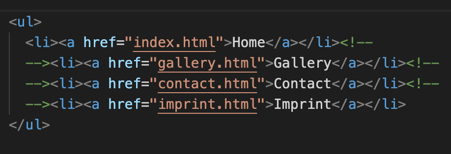
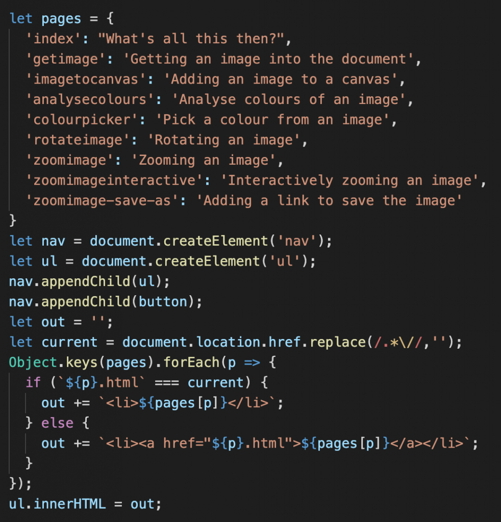
But how often does that happen? Most of the time our products are CMS driven. The content comes either from editors or – in a social product – from our users. Even when we know the content there is the problem of scale. It is fun to create a valid, sensible menu in HTML:

an example of a site navigation in HTML

It is less fun though that you have to change it for every page in the site. And that multiplies when more pages and child pages come into play later down the line.

an example of a site navigation in HTML with a different entry changed than the last example

We invented a few things that helped solving that problem. IDEs with include functionality and clever search and replace were one of them.

The first solutions I used were frames and then server-side includes. The former allowed me to maintain one menu file but meant that you needed to set target attributes on each anchor. The latter had an absolutely bonkers syntax and needed Apache to run (so I couldn’t test my pages on my file system without installing it).

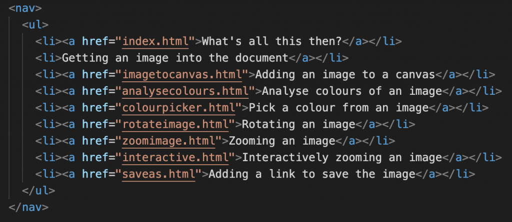
A much easier way is to use a scripting language that deals with the necessary logic and renders out HTML. Including this JavaScript in any document in the site laid out in pages renders the above HTML and automatically shows the current document without a link around it.

JavaScript generating an HTML menu automatically removing the link of the current document

Regardless of language you used for similar functionality, one thing cemented itself in the developer community mindset: HTML needs help to be useful and to scale to larger projects. It is something you generate using a “better” language.

Form styling is a mess

Traditionally the biggest thing people complained about in CSS (other than vertical centering) is that it is hard to style form elements. The purist in me is OK with that – why shouldn’t end users realise that something is a password field? But Flash allowed you to style forms any way you want to, so the web should, too. The problem was that form elements looked dated and in some cases even hard to use (example: scaling radio buttons for mobile). Furthermore, even in modern browsers it needs some in-depth CSS knowledge to reliably style form fields. Which is a shame as the new(ish) functionality of forms like error handling make a lot of basic JavaScript checking obsolete.

The good news is that things are happening. The Edge and Chrome team did a lot of work lately to clean up the UX of form elements of Chromium and even started the Open UI project to scale these efforts.

In any case, the problem of form styling results in many a <​div> with an event handler instead of a <​button>. Many complaints stem from legacy browsers and pains long forgotten, but why take the chance when frontend frameworks come with snazzy interaction components that even look “modern”?

JavaScript can patch anything

The biggest problem with making people understand the power of simplicity that is HTML is that JavaScript is too damn useful.

Ever since the days of DHTML, JavaScript gave developers a sense of control over the problems of HTML and CSS support in browsers. I remember writing scripts to test for document.layers or document.all support and render out different interfaces that way. JavaScript seems the perfect way to patch things and make them work independent of browser or support of new technologies. You could even argue that our practice of “polyfilling” was counterproductive. Polyfilling meant you use JavaScript to give functionality of upcoming standards to older browsers right now. If you already need JavaScript to make something work why not use it from the get-go as HTML/CSS support isn’t reliable? Of course polyfilling means you only use JavaScript in non-support environments. But the presence of JavaScript gives a message to those who only want to get things done that it is probably a safer bet to always use it.

We’ve always been impatient and when something cool that is a web standard wasn’t supported in all major browsers yet, JavaScript came to the rescue. Often by the time all browsers caught up the thing wasn’t even interesting any longer as we moved on to the next new thing to chase.

In summary

On the surface, the choice of HTML as the base of your web product should be blatantly obvious. There are a few valid and human things that make people not agree though.

  • A sense of wanting everything shiny and new right now.
  • A history of sketchy browser support.
  • A lack of simple customisability of the final result.
  • A false sense of being able to fix everything with JavaScript.

The biggest obstacle to embracing HTML is that people don’t want to give up control. JavaScript gives you a sense of control – code that you wrote naturally is perfect, right? In reality though, JavaScript support is flaky. Browsers not supporting features, flaky network conditions and blockers are just a few things that work against you. We’re working hard to make network issues not be a problem any longer. But in essence, relying on JavaScript always means to rely on your users’ environment – something you can’t control.

That said, to me the argument of HTML vs. JavaScript is boring and we’ve spent years running in circles around it. HTML has come leaps and bounds and every new functionality doesn’t only come as a “trust us, this works in browsers” but also with an API to react to non-support or problems and – more importantly – styling hooks.

JavaScript is immensely powerful and – used well – a boon to the experience of our end users. Storing content with service workers, lazy loading things with IntersectionObserver, there are numerous examples of things we can’t do in HTML, but are great customer experiences. Truly, the biggest plus of JavaScript solutions is that you can react to the environment and only deliver what is needed at the time. But that doesn’t mean you can’t render that on the server side in JavaScript after doing a simple test on the client.

The job we have now is to battle some of the old prejudices against HTML with facts and good examples. Not by telling people off for relying on JavaScript. Often the best way is to ask why they chose to do that. If there is a lack of education or HTML knowledge, we can follow up with good resources. I’m pretty sure the image of the “I don’t care about end users, the only thing I care about is developer convenience” code-Bro isn’t as common as we think it is.