Christian Heilmann

You are currently browsing the Christian Heilmann blog archives for November, 2011.

Archive for November, 2011

Lynx would not be impressed – on semantics and HTML

Wednesday, November 16th, 2011

unimpressed lynx Lately there has been a lot of discussion about markup, and especially the new HTML5 elements. There was a big hoo-hah when Hixiethe WHATWG wanted to remove the time element from the HTML spec, Divya stirred lots of emotions with her “Our Pointless Pursuit Of Semantic Value” and of course Jeremy posted his views on the subject, too in a counterpoint article “Pursuing semantic value“.

Maybe there wasn’t a counterpoint, maybe there was. Frankly, I was too busy to read the lot. It also doesn’t matter that much, as I get more and more the feeling that we really need to think about the web as it was and how it will be. The lack of understanding of the value of semantic markup to me is just a symptom of a change that is happening.

Tales of yesteryear

A lot of the debate about semantic value and using the correct HTML is kept alive by people who have been around for a long time and seen browsers fail in more ways we care to remember. Valid markup and sensible structure was our only chance to reach maintainability and make sense of the things around us. This was especially important in the long long ago. I remember using Lynx to surf the web.

Lynx showing twitter.com

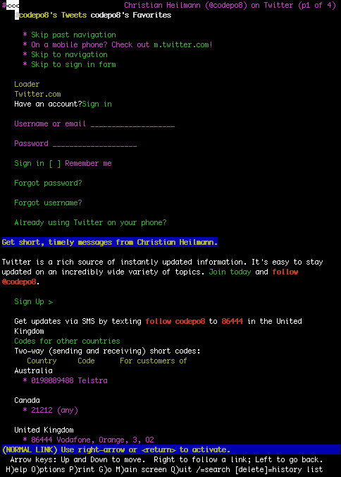
I also remember to keep Lynx in my arsenal for a bit longer. I used it to “see” what search engines and assistive technologies see. The former was correct at the time (not any longer, Google does index Flash and JavaScript and actually follows ill conceived links using hashbangs).

The latter was even wrong back then. A lot of the debate around using proper HTML5 right now tries to back up with the argument that “assistive technology like screen readers need it”. Nah, not quite the case yet.

Build it quickly, make it work

I’ve mentioned it in a few talks that when people mention the good old days where markup mattered and people cared and such they are talking nonsense. These days never existed and when we started with web development we struggled to make things work. We used tables for layout, NBSP for whitespace, lots of BR elements for vertical whitespace and more evil things. We then used spacer gifs for padding and margin and just started to care when CSS got out and supported. The reason was not that we wanted to write cleaner HTML. The reason was that we wanted to make things work as all we got was a design to build, not a description how to structure the document or what to build. When you start from the look of a web product, semantics are already on the endangered list.

Write less, achieve more

This is the mantra of now. The big success of jQuery is based on it. JavaScript standards were too complex and too verbose to write code quickly and change it quickly. So the jQuery crowd analysed what people did the most – changes to the DOM and adding and removing classes (and later Ajax) and made it damn easy and short to do. No need to write code that doesn’t do much.

The same happens over and over again. less and sass make the prefix hell and repetition for different browsers in CSS easy to maintain and client-side templating languages and browser-internal templating and client-side MVC make HTML the outcome of computation and programming logic and not a starting point.

If you can’t see it, why do it?

A lot of what the fans of HTML and semantics are getting excited about is not visible. Whenever a new HTML element got support and had a visual representation in the browser it was a no-brainer. People used it immediately. In most cases they used it wrongly, but they used it (I’ve seen fieldset and legend used around images as it is pretty and of course indentation with BLOCKQUOTE).

A lot of the semantically rich elements don’t show up at all. Blockquotes’s cite attribute was meant to give a quote meaning by telling us where it is from. ACRONYM and ABBR were supposed to tell people what a TLA meant – heck we don’t even do that in meetings and press releases so why bother adding info that the browsers don’t show the users.

This is also a big issue for Microformats. If browsers made an address draggable to your address book or created voting buttons for VoteLinks, if a browser would automatically detect events and give you a simple interface to add to your calendar they’d be a no-brainer to use. As it is, we have a few success stories to tell, for a lot of work to do.

The big book of ARIA

It gets really frustrating when we are talking about accessibility. Making a web document available for people with various abilities should be easy when we stick to keeping things simple and follow human logic.

It should, but it isn’t. And by keeping things very simple we can reach more people but we could also deprive a large group of great interfaces. Whenever we do crazy things in the browser and the talk comes to making them accessibile the way out is the mythical ARIA.

If you dive into ARIA you will realise very quickly that it is a lot of work, hard to understand concepts and above all a lot of code to write. Instead of having accessibility as an integral part of HTML5, we have to deal with two parallel standards. One to achieve things quickly and move the web from documents to applications and another one to keep it available for everyone out there. This is not a good place to be in. Accessibility happens when you embrace it from the very start. There is no magic bullet layer at the end of the process that makes things work.

So what about HTML and semantics?

You know what? There is no solution for all. The reason is not that technology moved on or people don’t care about users or that our standards are holding us back or anything like that. The reason is that “write once, deploy anywhere” is simply bullshit. The one thing that made the web work so far and become an amazing market to work in is flexibility. We all enjoy that you can reach a seemingly similar experience for our end users in many different ways. So why are we banging on about one side of the development range or another?

How about this:

  • If you write a document by hand, use all the semantics you can add in. This is your handwriting, your code is your poetry and people learn from looking at what you did.
  • If you need to write a hard-core application and every byte is a prisoner try to play nice with the semantics but follow your end goal of delivering speed. Make sure to tell people though that your code is the end result of conversions and optimisations and not for humans to look at.
  • Regardless of what you build – when you can use new technology – use it.
  • Remember that the web is not your browser and computer – add fallbacks for other browsers when using bleeding edge technology. When the others catch up you won’t have to alter your code!
  • The main focus of markup and web code that is not optimised for edge case apps is to make it easy for people to maintain it. If people can see in the HTML what is going on – win. If what only works with JS is generated by JS - even better.
  • More markup is not a crime when it is markup that adds value. Arguments that STRONG is worse than B because it means more code and slower loading pages are irrelevant in times of gzipping on the server
  • We can only escape the chicken and egg problem of new HTML when we use it. Right now, if you ask for support in browsers for new elements the answer from most vendors is that nobody uses them so why bother. And when you ask people why they don’t use them they tell you because browsers don’t support them. One of us has to start changing that.

Bigger fish to fry

Personally I am concentrating more on the things that really worry me about the web these days, and it might be interesting to list them.

  • Death of longevity – I always loved the fact that I can find something on the web and go back to it. This is not the case any longer. A lot of my old bookmarks are dead, my tweets go into the data nirvana after a certain number and I cannot access them any longer, and code you write for companies will be totally different shortly after your departure. This is not the web I want. It is a great mix of entertainment and archive and the “real time web” really messes with this.
  • High fidelity web sites – I remember when Flash made our 500Mhz machines flare up. Nowadays almost every cool new site I try out does that to my dual core macbook. I can see in the very near future pages coming up telling me that my video card is not good enough to enjoy them. This is the reason I never played games on a PC. Let’s use cool new and flashy in a sensible manner instead
  • Identity – we are spreading ourselves thin on the web right now and leave a lot of outdated and erroneous profiles of ourselves. Who you are on the web is becoming a very strange concept and some of the work I do right now tries to bring that back into an easier to maintain fashion.
  • The open web – today the US debates if it is a good idea to censor the internet like China, Syria and other countries do. This scares me. I started on the web as it was less regulated and much less commercial than radio or TV. Let’s not give up that freedom
  • The maker web – the web is ubiquitous, we use it as a part of our day-to-day work and play. Lately I find though that the creative part of the web is dying and people are consuming it rather than using and enriching it. This, again, scares and annoys me. We should not become virtual couch potatoes.

Semantics are like wonderful prose. You use them to deliver an enjoyable product. People are not celebrated for writing books. They are celebrated for what they filled them with. If we keep putting things on the web that have structure and get better on more sophisticated display products we are building for the future. If we point fingers at others doing it wrong we waste our time.

Got comments? Give them on Google+ or Facebook

Lynx photo by Jimmy Tohill #40 in the National Geographic photo contest 2011

Great talks: How to Get More Women in Tech in Under a Minute by Caroline Drucker

Wednesday, November 16th, 2011

The other day Addy Osmani asked me to blog more about public speaking as this is what I am doing a lot these days. I will do this (and did) but today I just want to show a great example of one of the ignite talks. Caroline Drucker of SoundCloud gave a great talk on “How to get more women in tech”. See how she approaches a very hot and controversial topic by empowerment and calling out false practice rather than asking why or why nothing changes:

A great example how the ignite format (20 second slides, automatic progression) can be used to bring a message across and inspire thought. I also loved using extra context as humour in the images (the sausage example).

More of these, please.

Full Frontal 2011 – some notes

Tuesday, November 15th, 2011

Last Friday I attended Full Frontal without speaking, which was a welcome change in my schedule. Originally I didn’t mean to go at all but some people dropping out meant that I had to go. Seeing that I love Brighton and have truckloads of respect for Remy and Julie I went down there and I can only say I would have kicked myself if I hadn’t.

Full frontal was a pretty amazing conference with inspiring talks, good info and a quick flow that meant the day was over before I realised it.

Here are my impressions of the talks in succession:

Jeremy Ashkenas kicked off with “CoffeeScript Design Decisions” – an introduction to coffeescript and how it is not Ruby although the syntax looks eerily similar. Mike Davies has a detailed write up on this one and I liked the way Jeremy showed the benefits of Coffeescript without being pushy about it. I can see CS being used and with good debugging tools like SourceMapping this can be quite a boost for developers to build JavaScript without having to juggle its “special cases”

Phil Hawksworth followed up with “Excessive Enhancement – Are we taking proper care of the Web?” – a call to arms to stop us from using new technology in an obstructing and excessive fashion. His whipping boy example was beetle.de which is HTML5/CSS3 and all the other goodies but also clocks in at 11MB of data in hundreds of HTTP requests. In essence Phil repeated a lot of the things that I have been banging on about – that HTML5 is currently mostly used in brochureware sites that can put “skip intro” Flash solutions to shame in their lack of accessibility and responsiveness. Ubelly have a nice write-up of Phil’s talk and you can check the slides here. All in all I was very impressed with the talk. The presentation was very funny, at times it got a bit ranty, but that shows passion. I was very reminded of talks by Jake Archibald and seeing they worked together, that might not be coincidence. Phil also mentioned a lot of tricks how to fix the issues he complained about, which is exactly the right way to deal with this.

Marijn Haverbeke of Eloquent JavaScript fame gave a good round-up of text editors in the browser with “Respectable code-editing in the browser”. The main focus was on Code Mirror and Marijn brought the message across that in-browser editing is not an easy feat but something that needs to be done.

Talking about development in the browser and the cloud: Rik Arends of Cloud 9 was next with “How we Architected Cloud9 IDE for scale on NodeJS” and basically blew me away showing off the new features that make Cloud9 a really interesting choice for collaborative editing in the browser.

After Lunch, Nicholas Zakas did a re-run of his “Scalable JavaScript Application Architecture” talk given some two years ago at another conference. That said, a lot of the talk still rings very much true and Nicolas changed a lot of it to be agnostic of the environment and libraries in use. If you are looking for information to get you on the way to build huge JavaScript solutions, this is a good piece of advice.

Local linked data and open format overlord Glenn Jones was next with “Beyond the page” – a good talk on how new features in HTML5 like drag and drop, File API and post messages allow us to build incredibly rich and web-enabled applications. Glenn showed off all the things that also get me very excited these days about the web, including web intents. A great and inspiring talk with lots of code and ideas to play with now. You could see Glenn’s passion for the topic – especially when he showed how to allow users do drag and drop an image from a browser to the desktop using JavaScript (forgetting that this is possible in browsers without any interfering on our part). The difference though is that you can convert the image while you drag it and automatically rename or pack it, too.

A very charming speaker, Brendan Dawes was next with “Beyond The Planet Of The Geeks” showing us just how much of a geek he is (collecting pencils and paper clips) and how his company and products moved from wild demos and experiments with interaction on a screen to useful and engaging products. To a degree what was shown does not quite meet that yet as the interface at the end was shiny and amazing and looked like Flash but used new technology. It failed to deliver the basic principles mentioned in Phil’s talk of bookmarkability and real links though. I talked with Brendan afterwards and we’ll work on getting the history API and local storage in there to make it beautiful, engaging and a good web citizen.

My absolute highlight of the day was Marcin Wichary with “You gotta do what you gotta do” – a talk about Google doodles and the work that went into them. Marcin was amazing – baffling interactive slides, a very humble demeanour and great information on the tricks that had to be applied to make doodles perform and be small. I was very much reminded on the things we had to do in the demo scene on C64 and Amiga. A great insight into just how much work goes into a thing that is seen for 24 hours and then vanishes. That said, I pestered Marcin afterwards if they are willing to show some of the cool stuff he explained in a blog and he said they would.

All in all it was an incredible day and well worth the money (had I paid for it). The only thing I am really sad about is that there was no recording or filming. Especially Marcin’s talk is something that needs to be archived for people to see.

Update : as Remy just pointed out on Twitter there are audio recordings of the talks available and will be published soon. They are also considering video recordings for the next year.

Fun with 3D transforms and rollovers – kittens in space

Monday, November 14th, 2011

Lately it seems, CSS3 rollover showcases are getting a new revival. The massive collection of effects here made quite the rounds on Twitter the last weeks. As I wanted to play with 3D transforms a bit more, I thought I do a quick demo of how to use them to create a lovely rollover effect on a kitten photo cause we all know this is what the web is about. You can see the effect in action here and get the source code on GitHub. And here is a video of how the effect looks on Firefox 7 which does not support 3D transforms and on Firefox Aurora (or Safari, or Chrome) which do:

Now, how is this done? Here is a step by step example. We start with simple HTML that works on all the browsers (Step 1):

step 1:unstyled

<ul>
  <li class="image3d">
    <figure>
      <img src="mittens.jpg" alt="Mittens the cat">
      <figcaption>
        <p>
          <strong>Mittens</strong> loves to play with yarn and stuff.
        </p>
      </figcaption>
    </figure>
  </li>
  <!-- repeated -->
</ul>

Then we style the caption to overlay the image by giving the LI dimensions and positioning it relative and giving the caption dimensions and positioning it absolutely. We set the opacity of the image to 40% to make the caption more readable (Step 2):

step 2:overlay

.positioned {
  list-style: none;
  width: 300px;
  height: 200px;
  position:relative;
}
.positioned figcaption {
  position: absolute;
  background: rgba( 0, 0, 0, 0.7 );
  color: #fff;
  border-radius: 5px;
  left: 65px;
  bottom: 10px;
  width: 230px;
}
.positioned img {
  opacity:0.4;    
}
.positioned figcaption strong {
  display: block;
  color: lime;
  font-weight: normal;
  font-size:22px;
  padding: 5px 0;
}
.positioned figcaption p {
  display: block;
  color: white;
  padding: 5px;
}

This works in almost any browser. Now we can make it interactive by adding a rollover style. We set the overflow of the list item to hidden and position the caption outside the list item. On rollover, we move the left position to the one inside the LI (Step 3):

step 3: normal
step 3: hover

.interactive {
  overflow: hidden;
}
.interactive img {
  opacity: 1;
}
.interactive figcaption {
  left: 300px;
}  
.interactive:hover img {
  opacity: 0.4;
}
.interactive:hover figcaption {
  left: 75px;
}

To make this smoother, all we need to do is to use CSS transitions on the images and the captions (Step 4). This transitions smoothly between the states without us having to do any calculations. In order to play nicely across browsers, we repeat the instructions with all browser prefixes and fall back to the non-prefixed version.

.smooth img {
  -webkit-transition: all 1s;
  -moz-transition:    all 1s;
  -o-transition:      all 1s;
  -ms-transition:     all 1s;
  transition:         all 1s;
}
.smooth figcaption {
  -webkit-transition: all 1s;
  -moz-transition:    all 1s;
  -ms transition:     all 1s;
  -o-transition:      all 1s;
  transition:         all 1s;
}

Lastly, we do the 3D effect for browsers that support it (Step 5). For this, we give the list item a perspective of 800 pixels. This is like putting a cube into our document where we now can position elements in. In our case, we move the image on rollover 80pixels in the X axis, -20 pixels in the Y axis and -100px in the Z axis. We also rotate it 50 degrees in Y and 10 degrees in X.

step 5: 3D

.threed {
  -webkit-perspective: 800px;
  -moz-perspective:    800px;
  -ms-perspective:     800px;
  -o-perspective:      800px;
  perspective:            800px;
}
.threed:hover img {
  -webkit-transform: rotateY( 50deg ) rotateX( 10deg )
                        translate3d( 80px, -20px, -100px );
  -moz-transform:    rotateY( 50deg ) rotateX( 10deg )
                        translate3d( 80px, -20px, -100px );
  -o-transform:      rotateY( 50deg ) rotateX( 10deg )
                        translate3d( 80px, -20px, -100px );
  -ms-transform:     rotateY( 50deg ) rotateX( 10deg )
                        translate3d( 80px, -20px, -100px );
  transform:            rotateY( 50deg ) rotateX( 10deg )
                        translate3d( 80px, -20px, -100px );
}

That’s it! Smooth kittens in 3D space without any JavaScript or hard calculations on our end.

How to be a kick-ass speaker – MozCamp 2011

Sunday, November 13th, 2011

I am currently at MozCamp in Berlin and my job was to entice all the contributors to the Mozilla project to get out of their shell and start speaking at events about all the great stuff they do. It seems people liked what I had to say, so here are the slides and the audio recording. I will cover this topic more in the next few months, as I think the way we do information sharing in the web development world right now is not really scalable.

The slides are on Slideshare (this time)

Be a kickass speaker – Mozcamp 2011

The audio recording is available on archive.org