Once the Web was a thriving ecosystem of happily evolving, beautiful creatures. Like with any environment, sooner or later man will step in and kill a lot of things – actively or by accident – and diminish the diversity and health of said ecosystem. In this series we will look at some of the strange animals that make up the Web as we know it, re-introduce them and show how you can do your part to make sure they don’t die out.
Today we are looking at an amazingly popular pet animal that is more than often treated not the way it is meant to be treated: the image.

Show me your colours
Images are what made the web pop. Ever since the first browser started supporting them, we had a web that was interesting to publishers beyond the academic community. Show me, don’t tell me, and all that. At the start, things were pretty clear cut:
When Marc Andreesen proposed the IMG tag in 1993 he defined it as thus:
This names a bitmap or pixmap file for the browser to attempt to pull over the network and interpret as an image, to be embedded in the text at the point of the tag’s occurrence.
He also defined what should be done when the image can not be loaded (and also mentioned now very obscure image formats as ones that could be used):
Browsers should be afforded flexibility as to which image formats they support. Xbm and Xpm are good ones to support, for example. If a browser cannot interpret a given format, it can do whatever it wants instead (X Mosaic will pop up a default bitmap as a placeholder).
Simply put, this is what you needed to do in order to add an image of a canyon to the document:
This was when things got wrong: what happens when the image could not be loaded or shown? Show a placeholder. But the placeholder has no meaning, right? All you tell is the end user that something went wrong. Not what the meaning of the image was.
The Object element came later and already explained a few of the shortcomings of the original idea:
Previous versions of HTML allowed authors to include images (via IMG) and applets (via APPLET). These elements have several limitations:
- They fail to solve the more general problem of how to include new and future media types.
- The APPLET element only works with Java-based applets. This element is deprecated in favor of OBJECT.
- They pose accessibility problems.
<object data="canyon.png" type="image/png">
This is a <em>closeup</em> of the Grand Canyon.
</object> |
<object data="canyon.png" type="image/png">
This is a <em>closeup</em> of the Grand Canyon.
</object>
The big thing here is that this could be extended to all kind of embeddable media – music, video, applets and whatever might come next. Instead, we got the IMG tag, and then we got the video element, the audio element and the iframe element – each delivering a highly defined subset of what the generic object element could have done.
Despite the shortcomings of the humble img, it has a few amazing attributes that can work for you:
- alt – the alternative text to give a user agent when the image can not be displayed, which could mean it could not be loaded or that it couldn’t be decoded
- longdesc – a linked document to explain in much wordier fashion what the image describes. This could be for example a longer description of the data and the findings in the data relationships of a chart. Never heard of that one? Join the club!
- name – the name of the image used for scripting (only added for backwards compatibility)
- height and width – to resize images to a certain size or to tell the browser what the size is instead of it having to read that from the image metadata
- usemap and ismap for client side image maps (those were all the rage before we had CSS and could stack elements on top of another)
In addition to that there is always the title attribute, which can be added to almost anything.
As an image is pointing to an external resource, it also allows you to do a lot with JavaScript. You can detect if it was loaded by subscribing to a load event handler and react if there was a problem by subscribing to its error handler. This gives you quite granular control over what is going on.
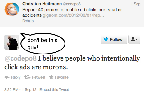
Hurting images: misuse of alt and title
Things got weird when people didn’t use images they way they are meant to because of how they display in browsers. The alt attribute (no, there is no such thing as an alt tag) doesn’t get the information it should contain, instead the title attribute gets a lot of information as it is visible when the user hovers over the element.
A great example how to make the image happy is XKCD. Their makers give the image sensible alternative text in the alt attribute and add extra information in the title. They use the title as a sort of “easter egg”, which is totally fine, and works well for them:

<img src="http://imgs.xkcd.com/comics/automation.png"
title="'Automating' comes from the roots 'auto-'
meaning 'self-', and 'mating', meaning 'screwing'."
alt="Automation"> |
<img src="http://imgs.xkcd.com/comics/automation.png"
title="'Automating' comes from the roots 'auto-'
meaning 'self-', and 'mating', meaning 'screwing'."
alt="Automation">
Of course, to be totally accessible, this image should have a longdesc attribute pointing to a textual representation of the image’s message. This could also be the alternative text, but might be a bit long as there is not only a text displayed in the image to be explained, but also its implications and nuances. If that needs to be done, you could also use a FIGURE and FIGCAPTION construct. HTML5Doctor has an amazingly detailed, yet easy to understand post on those.
Back to alt and title: title should always be treated as a “nice to have” and can not be relied on to ever be accessible to the end user. Alt, on the other hand, is absolutely and utterly needed. If the image for one reason or another can not be displayed (which is totally possible) it is what the user gets. In Firefox and Chrome, for example, instead of the image you only get the text displayed in the browser:

Alternative text is most important for non-sighted users, as screenreaders will announce that text in their stead. If there is no alternative text specified, assistive technology might fall back to reading out the file name, which could be an exercise in annoyance and futility in equal measures.
Images getting a bad reputation: performance
Images lately got a bit of a bad reputation, as they’ve been singled out as a huge source of performance issues with web pages. This is true: the more images you use in your document, the more HTTP negotiation has to happen and the more external files have to be loaded, decoded and displayed. The first big solution came as early as 2004, when Dave Shea coined the term and explained the techniques behind “Image Sprites”. Image sprites were the fabulous idea of using a single image with all the images on the page in one document. Thus, you only load and decode one image and crop and position it visually with CSS in all the different places you need it. The drawback of this technique as described by Dave is that you have no textual fallback – no alt attribute – but that can be remedied as I explained in a comment on the original article using image replacement techniques.
Other problems that occurred in the past (and maybe even now) are that images seem to do a bad job when used in mobile devices. The mobile version of Flickr, for example, used to be much slower when using img elements instead of background images on DIVs, as decribed in the “Creating Responsive HTML5 Touch Interfaces” talk from 2 years ago.
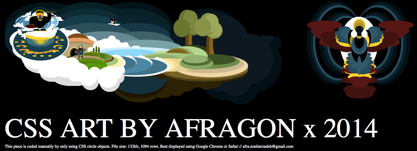
Throwing images out and moving it all to CSS
Nowadays, we can do magic in CSS. We really can. Gradients, drop shadows, rounded corners, background sizing, all the good things we have make creating images for purely artistic parts of our designs (“screen furniture”) utterly unnecessary and give us much more flexibility. A gradient in CSS can clearly resize to any element, a gradient in PNG or JPG would wash out or pixel out.
No argument there. However, lately a lot of showcases use CSS to paint, which, if only a visual aid, is totally fine. Images that are semantically valuable though should not be achieved that way but instead should be an img, for the reasons mentioned before – you can create a textual fallback that will be shown when things go wrong and you can even react when the image was unable to load or decode (using the load and error handlers). Neither is possible in CSS, all you can do is hope that everything is alright. Most browsers will be OK hiding a text in an element you use CSS to style, but not all are able to render the final visual construct you create with lots of CSS instructions. Thus, if things go wrong, you give the user nothing instead of a text to understand.
In other words: while it is possible to create a MacBook using only CSS from one element, you have no idea if it displays correctly. If it is a nice-to-have, all fine. If that MacBook were the logo of your company or a chart explaining information to your readers – bad idea. Painting complex images in CSS using lots and lots of DIVs and SPANs is a parlour trick – it is neither reliable across browsers, backwards compatible nor makes any sense semantically. An image is more than a visual construct – it also gives meaning and you should provide a way to make that meaning obvious when the image can not be seen or is displayed wrongly. That images “painted with HTML and CSS” scale nicely on different resolutions is a problem we need to solve on an image format level (SVG comes to mind), not something we should hack together by abusing HTML for the sake of its visual outcome. We stopped painting with table cells – remember, we did tables with background colours on 1 pixel wide or high rows and columns to create borders – we should not go back to these days.
How to treat images humanely
The technology we have these days allows us to use images in amazing ways. It is up to you to use it wisely:
- If the image is purely there to be pretty, use a CSS background and benefit from the resizing and positioning options you have. Make sure to use a fallback background colour with enough contrast to the text colour in case the image could not be loaded.
- If the image is there to be part of a visual design and needs to scale consider using gradients, rounded corners and drop shadows in CSS instead. Be aware though that these could be bad when moving the element or scrolling the page so use them sparingly.
- If the image plays an important role to the message of the document, or represents an interactive element like a button, use an img tag. These allow for alternative texts and error handling much easier than CSS solutions do. If you use an img give it a sensible alternative text, do not omit the alt attribute or give it an empty attribute or [image].
Not that hard, now is it? Make those images dance and sparkle, I dare you!