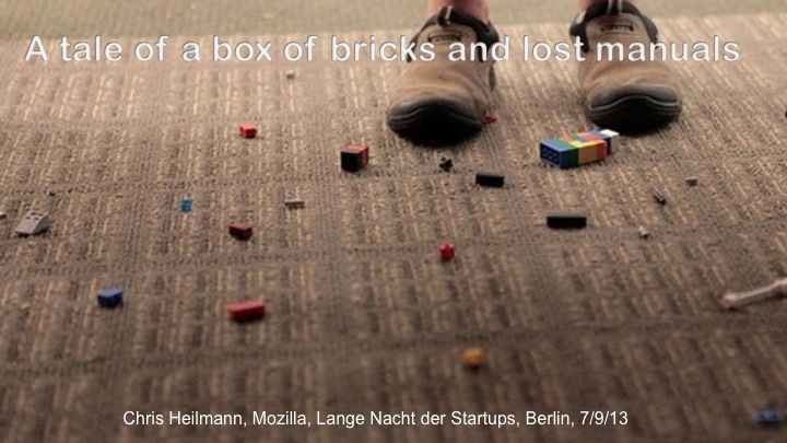
I just got back from Berlin where I gave a closing keynote at the “Lange Nacht der Startups” – an entrepreneur meetup with lots of hacking, celebrities and startups showing what they can do. I was asked to give a talk about Firefox OS (as Deutsche Telekom were a main organiser and they are a Mozilla partner bringing phones to the masses) and I thought I wrap it in a personal story. So here is the transcript of my slides which I almost stuck to (as I wrote it after my talk). Sadly there is no recording.
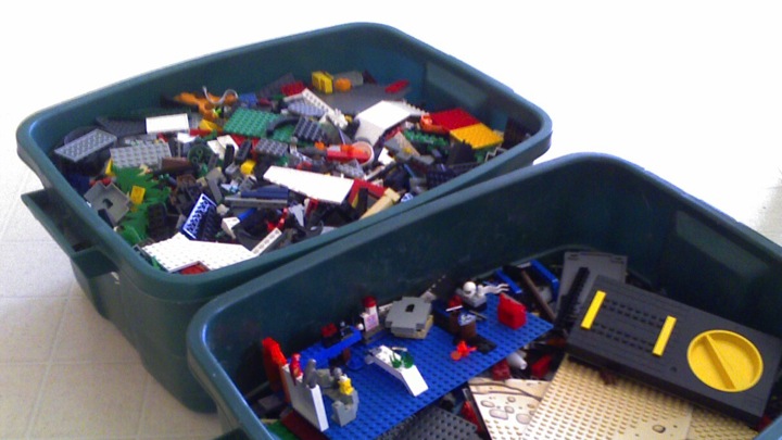
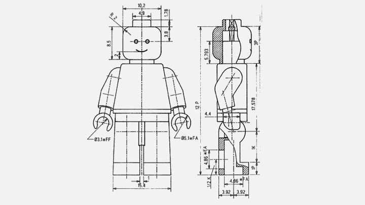
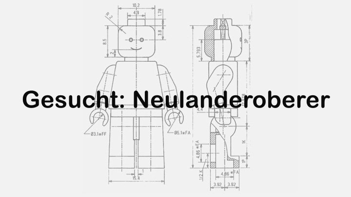
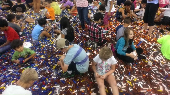
When I was a kid, I inherited something amazing from my older siblings: a massive box of random Lego bricks. This box was collected over the years and what got lost along the way were the original manuals telling you how to assemble them to achieve a certain result: a car, a ship, a boat, a house and many other things. Now they were just bricks and I had to use my own ingenuity and creativity to reach similar results.
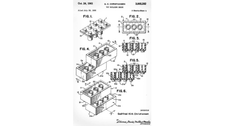
I was empowered to do so because of interoperability of the bricks. That was the genius of Lego: the bricks of old were utterly compatible with the new ones and adding a roof tile for example to a car made for an amazing spoiler.
I built incredible things. Some of them needed my personal eye to really be what I told people they were but, for me, they rocked. When I went to the playground and other, richer, kids had fancy cars and planes and boats I naturally felt bit jealous. When I saw, however, that when they dropped one of the cars things were different. Their cars were broken, they had to go and pester their parents for a new one and throw away the one they were – just earlier – totally happy with. When I dropped my cars, bricks might fall off but I could re-assemble them. Or smugly turn them into a plane or a boat.
The beautiful concept of assembling things from reusable bricks came back to me much later when I became a web developer. I had HTML, CSS and JavaScript and the world was my oyster. I could make a poem look pretty or I could make things fly on the screen. The bricks empower me and they are plain to see. Others could learn from what I did. The manuals wrote themselves as the product allows those who know about the bricks to look for them and see how I put them together. This made me who I am today. Not an expensive course, not a degree, not a piece of paper or login that told me that now I am a maker.
I think this somehow got lost. We think software and especially the mobile world is about fixed states, closed environments and those who can afford accessing and using them. It is an unhealthy market driven by commercialism where things need to break quickly so you can sell more. And, personally, I don’t see it as creative.

Luckily I work for a company that sees things quite similar, and created Firefox OS. This is a mobile operating system, that gives the bricks of the web the credit they deserve. The OS itself and the applications are all written in HTML5, CSS and JavaScript – and all parts of the OS are open source. Nothing is hidden, everything is shared. The idea is to take the success of the open standards on the Desktop web and bring it to the mobile world.
Talking of the world – a big difference that we are making right now is that with partners like Deutsche Telekom and Telefonicá we’re bringing mobile connectivity to the world. The OS has been already released in Spain, Poland, Venezuela and Colombia. The next markets are coming this quarter. In Spain, for example, a phone running Firefox OS is available in the shops for 79 Euro, unlocked and without a contract. And this price already includes 30 Euro for buying apps for the phone. In Poland, phones are available for one Szloty with a contract or 404 without one. Apps can be bought without the need for a credit card – instead you can charge them to your telephone bill or pay with a pre-paid SIM card account. This goes right back to me being jealous of the rich kids with the fancy toys: software is flexible and can be accustomed to various needs and environments. A great mobile experience that is dependent on you buying very expensive hardware and be locked in to a 24 month contract only available in a certain geographical region to me is a big step backwards. It is called the World Wide Web, not Welcome Western World. Mobile web connectivity with the option to have apps that work offline and give a great experience is not something that only the rich need. On the contrary – there is a whole new market, full of information-hungry people who should be allowed to take part in the biggest collection of human knowledge.
And this is where you come in: entrepreneurs, developers, designers, writers, testers, makers. We give you the inter-operable bricks and the platform to distribute your products on. We don’t treat web technologies as a second class citizen and ask you to pay to develop with us or learn a new technology – instead we empower you to use what already works, give it a better and richer experience and bring it to the people who need and want it but so far have been locked out.
The mobile web is upon us, it is needed and it works. We will not be able to have Desktop computers and fast wired connectivity world-wide. But we have a mobile infrastructure that can be used and improved upon. The now and next generation of users are mobile first and we want you to reach them without having to limit yourself to one platform. Developing in HTML5 means you can convert your products to Android and iOS. Starting with iOS means you have to start from scratch when the next platform takes over. And there will be another one. There always is. The lure of building something closed and calling it the best never to be replaced is big and over and over again companies fall for it. Flash was amazing and the only way to deliver rich experiences, remember?

Of course it is scary. Working in a flexible environment is not for everyone. I work from home or on the go and my time schedule is all over the place, seeing that the people I work with are scattered all over the globe. Sometimes my work day starts at 4 and ends a 2 in the morning. I cherish that. I like the flexibility and I found that I am surrounded by amazingly creative people who are in control of their own career, output and destiny. Much like being an entrepreneur is like. Take the plunge, trust the bricks, and I promise you can build for now and tomorrow. Cycling is scary the first time you try it but later it makes you independent of time-tables, much faster than a car in inner city traffic and you keep in shape while you are on the move. The same goes for freeing yourself of the idea of a closed environment being the only thing you could ever release something in.
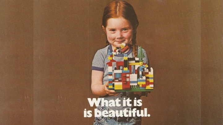
Yes, LEGO changed. Now we have Star Wars, Harry Potter and many other themed bricks. The base bricks, however, remain and still have the same magical empowering features they had in the past – turning consumers who break toys into makers who create them. And this is you on the open web using free and open technologies in ways I can not even begin to predict now. You are invited, you are free to choose, and there is much to discover. Join me and see the bricks and build things of awesome.
Thank you.