Halfstack is a series of events that are very close to my heart. They are predominantly about connections and sharing some nerdy fun. The locations are pubs and cinemas and there is a lot less pressure on presenters and audience. They aren’t a “cool crowd” event where you need to deliver “the killer talk”. Instead they are a social gathering of, well, nerds. They also end in a ridiculously hard and geeky pub quiz and some musical performance.
There’s a beautiful irreverence about them and yet they are well organised and you learn a lot. Especially letting go and playing with technology rather than trying to “be awesome”. The main organiser, Dylan Schiemann spends a lot of time and effort to make these events easy to attend and present at.
I’ve been a supporter from day one of the events as they were easy to attend when I lived in London. I already signed up for the London, Tel Aviv and others when Covid-19 hit. I am now proud owner of flight vouchers and was sad that they won’t happen. When Dylan announced the online edition of Halfstack I wondered if the cozy vibe can survive.
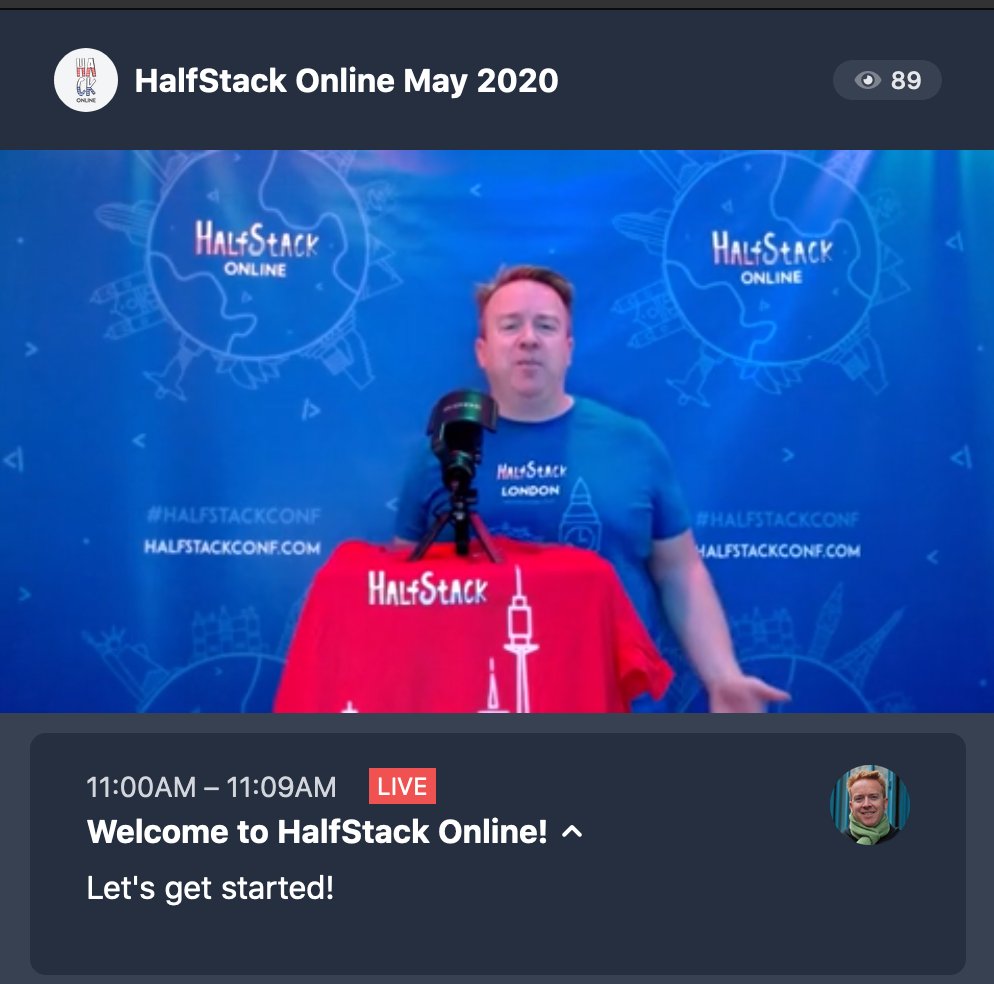
It did. Halfstack Online was a highly affordable, $19 conference with an excellent line-up. Most of the talks were pre-recorded, 30 minute presentations. This made sure that connectivity issues couldn’t ruin the party and it doesn’t get boring. After each talk there was a Skype interview with the presenter. Dylan, Jo and Tony asked prepared questions and those that people submitted in the chat during the presentations.
Dylan put a lot of effort into interspersing the presentations with breaks. There were also quite a few irreverent videos like out-takes of HalfStack conferences. All in all it gave a lovely vibe to the event and took the seriousness out of it.
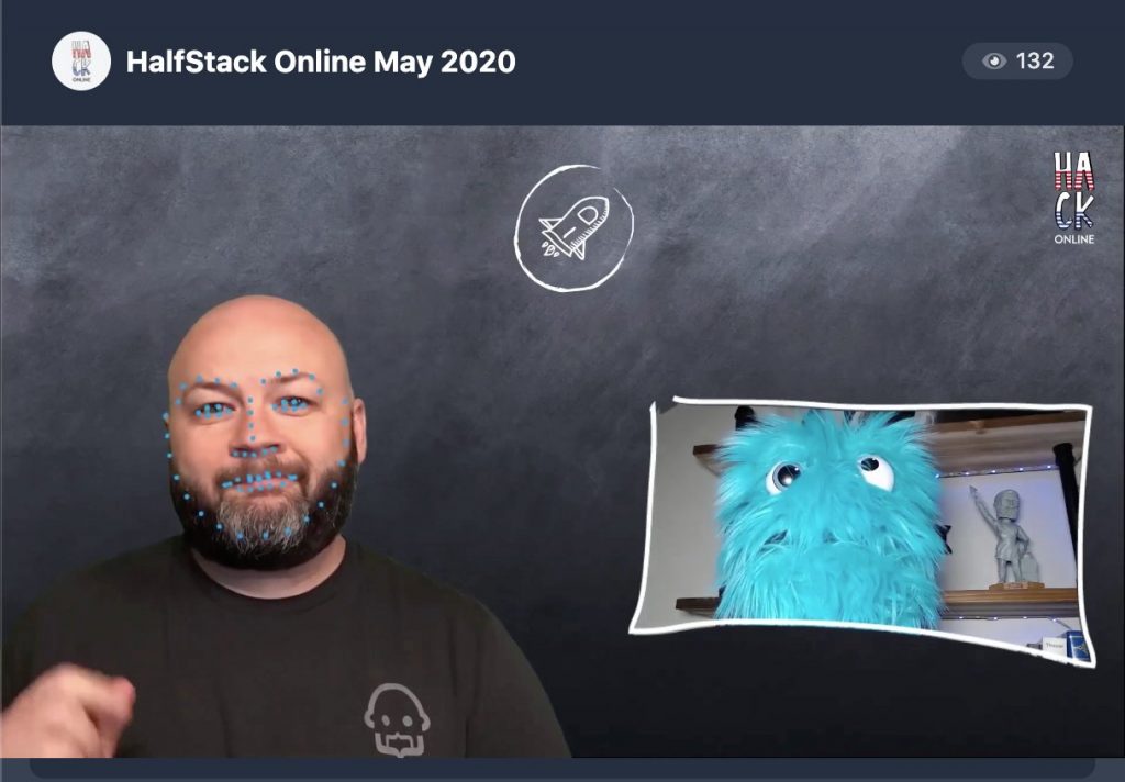
The range of talks reflected the “hey, tell us about something cool people can play with” attitude. We had talks about detecting body movement with TensorFlow and use it as a control for web products. We had in-browser face mapping to control a puppet’s movements. We had a “how to build your own weather station” talk which bravely showed the UK weather. All in all it felt more like a variety show than an event. But one where you learn a lot.
I’ve been to a lot of conferences and many do a great job of skirting the line between inspirational and educational. In Halfstack, this came naturally, as the group running it picked a wild mix. There were no ego talks, no thinly veiled product advertising, just a lot of “here is why I found this interesting, what do you think?”. The divide between presenter and attendee was very low, and I enjoyed this a lot.
It was great to see presenters I’ve seen before on stage relaxing more in a recorded talk. It was funny to be on the Skype backchannel where all the presenters hung out to see them worry about how the video might go down with the audience. There were too many to mention, but the line-up had some immensely creative and inspiring people as well as some who clearly were there to talk about something that they had fun doing. All in all it felt very accessible. There were no “heroes” there, just a bunch of people showing some work – warts and all.
The conference also acts as a fundraiser for Covid-19 related charities. With a ticket price of $19 and first-time expenses on a streaming system there won’t be a six figure donation at the end. But it still is a great thing to support.
There will be another edition of this in August and I am looking forward to see what comes next. I have a few ideas what to do, and for once I feel utterly free to choose something that is not what people expect. And that’s one of the fun bits of Halfstack.
Imagine the creativity of Reasons.to, the creative/educational mix of Beyond Tellerrand and then give it a “jam session/MTV unplugged” kind of feel and you have Halfstack.
My submission this time was a talk that was a walk through the developer tools of Chromium. I showed some of the bits you may not use or never have seen but are in there. I did this more or less for myself, as I caught myself using only a small amount of what I could. I did that because of familiarity and “always having it done that way” which is not a good place to be in as a developer. And I learned a few bits along the way which hopefully inspired some people.
The video should be available soon. Make sure to check HalfStack’s social media channels the next few weeks to see more videos cropping up. I saw most of them but also had to work, and will make sure to check some of them I missed out on.
Posted in General | Comments Off on That was Halfstack Online’s first edition (musings, and slides)
Sometimes it is fun to re-visit very basic HTML things and look what we can do with them nowadays. This is what I will do now with a radio button group. I will progressively enhance it to look great and still work with keyboard and screen readers.
As part of my Logo-O-Matic upgrade, I added text alignment to the generator. At first I used a select element to have a dropdown asking you to select left, centre or right. After using it for a while I was annoyed with it and wanted a simpler way. That’s when I looked at radio groups again.
Radio buttons are a form element group that go back to the old days of radios where you had a preset amount of buttons to choose from. You could only select one of them at a time and when you selected a new one, the formerly chosen one popped out. In most cases this was to select the wave band to choose, others also had preset stations to pick from.
In any case, radio buttons mean that you have a preset amount of options to choose from and you can only have one selected at a time. This is different to checkbox groups where you can select several. Even select menus allow more than one choice when you press shift whilst selecting them and the multiple attribute is present.
When there are not many choices to choose from, a radio group can be a very simple and obvious way to make the user choose one and only one option from them.
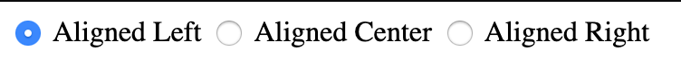
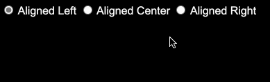
<inputtype="radio"name="aligned"value="left" checked>
Aligned Left
<inputtype="radio"name="aligned"value="center">
Aligned Center
<inputtype="radio"name="aligned"value="right">
Aligned Right
<input type="radio" name="aligned" value="left" checked>
Aligned Left
<input type="radio" name="aligned" value="center">
Aligned Center
<input type="radio" name="aligned" value="right">
Aligned Right
The checked attribute defines the preset. Every time another radio button is activated it moves to that one and its value is what the form will submit as the value of the “aligned” parameter. This is pretty useful and means we don’t have to program that functionality.
Radio group problems
There are of course a few issues with radio groups. One issue is that they are not the prettiest things to look at and they are tough to style. A bigger issue is that they are tiny and hard to access with a mouse. Scaling them makes them even uglier. And, like any form field, screenreaders wouldn’t know what an element is unless you also provide a label.
The latter way is more complex, but also more flexible, as you can put the label anywhere in the document. In case you need to put something else there that shouldn’t be in the label.
Despite all its drawbacks, I like radio groups as they give you all the functionality you want out of the box. You don’t need to set focus to a new element by hand and you don’t need to remove the selected state from the former one. Radio buttons are keyboard and mouse accessible. If you use a keyboard to tab into a radio group you can navigate it using arrow left and right. By using labels you don’t only help improving the accessibility and usability. You also get an easier style-able element that changes the state of the input for you.
Getting the value of a radio button group
On the backend, this is a non-issue. The form only sends the value of the selected element in the group. In JavaScript on the front-end, it was somehow tougher, but much better these days.
Back in the days when I started with web development, this was a horrible task. You had to traverse the elements collection of the form and compare the type, name and check if the element is checked. When you did the right thing and added labels and IDs, you could loop through the IDs you chose. That was a maintenance nightmare.
const form = document.querySelector('form');const log = document.querySelector('output');
form.addEventListener('submit',(event)=>{var data =new FormData(form);var output ='';for(const entry of data){
output = output + `${entry[0]}= ${entry[1]}`;};
log.innerText= output;
event.preventDefault();});
const form = document.querySelector('form');
const log = document.querySelector('output');

form.addEventListener('submit',(event) => {
  var data = new FormData(form);
  var output = '';
  for (const entry of data) {
    output = output + `${entry[0]} = ${entry[1]}`;
  };
  log.innerText = output;
  event.preventDefault();
});
If you want to get the value when you clicked on the element , you can use event delegation and a complex selector. This is also good if you plan on using more click reactions in your form.
form.addEventListener('click',(event)=>{
let t = event.target;if(t.nodeName.toLowerCase()==='input'){// if the user clicked on an input element// (labels forward that click)
let state = document.querySelector('input[type=radio][name=aligned]:checked'// Find the input element with a type of radio// the name aligned and that is currently // checked).value;// and get its value.
log.innerText= state;}});
form.addEventListener('click', (event) => {
  let t = event.target;
  if (t.nodeName.toLowerCase()=== 'input') {
  // if the user clicked on an input element
  // (labels forward that click)
    let state = document.querySelector(
      'input[type=radio][name=aligned]:checked'
      // Find the input element with a type of radio
      // the name aligned and that is currently
      // checked
    ).value;
    // and get its value.
    log.innerText = state;
  }
});
const form = document.querySelector('form');const log = document.querySelector('output')
form.addEventListener('change',(event)=>{
let t = event.target;
log.innerText= t.value;});
const form = document.querySelector('form');
const log = document.querySelector('output')

form.addEventListener('change', (event) => {
  let t = event.target;
  log.innerText = t.value;
});
Replacing the radio buttons
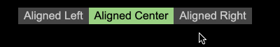
OK, now let’s take a stab at making radio buttons nicer to look at. For this, we could use CSS to change the look of the buttons itself, but there is a lot of cross-browser pain in that one. So the best plan is to replace them with something else. Replacing also means though that we need to replicate the different states of a radio button.
Hiding the radio buttons and styling the label
Hiding things on the web isn’t easy. You want to make them not show up but you also don’t want to make them inaccessible. Non-sighted users and search engines should find content we want to replace with prettier alternatives. Scott O’Hara collected a lot of excellent information on the subject. Applying this knowledge, we can use the following CSS to hide the radio buttons themselves across all kind of browsers and devices. The label will still change the state of the radio button when we click it, so that’s good.
Having hidden the radio buttons, we now need to simulate the different states of the radio button. We can do that in CSS, no JavaScript needed. You can see the result here
/*
Style each label that is following a input
of the type radio as light grey on mid grey
*/
input[type=radio]+ label {background:#444444;color:#ccc;}
/*
Style each label that is following a input
of the type radio as light grey on mid grey
*/
input[type=radio] + label {
  background: #444444;
  color: #ccc;
}
/* Radio buttons that are currently checked should be green... */
input[type=radio]:checked+ label {background:#9AD284;color:#000;}
/* Radio buttons that are currently checked should be green... */
input[type=radio]:checked + label {
  background: #9AD284;
  color: #000;
}
Reacting to interaction
Having the two states isn’t enough, we also need to react to user actions like hovering with a mouse or focusing the element with the keyboard. This invites interaction and is an important usability feature. Luckily, CSS has both :hover and :focus pseudo selectors to create those.
/* When the user hovers over the label... */
input[type=radio]:hover+ label {background:#666;color:#000;}/* When the user focuses the label via keyboard... */
input[type=radio]:focus+ label {background:#666;color:#000;}/* Radio buttons that are checked hovered over */
input[type=radio]:checked:hover+ label {background:#fff;color:#000;}/* Radio buttons that are checked and have focus */
input[type=radio]:checked:focus+ label {background:#fff;color:#000;}
/* When the user hovers over the label... */
input[type=radio]:hover + label {
  background: #666;
  color: #000;
}
/* When the user focuses the label via keyboard... */
input[type=radio]:focus + label {
  background: #666;
  color: #000;
}

/* Radio buttons that are checked hovered over */
input[type=radio]:checked:hover + label {
  background: #fff;
  color: #000;
}
/* Radio buttons that are checked and have focus */
input[type=radio]:checked:focus + label {
  background: #fff;
  color: #000;
}
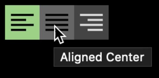
Adding the SVG buttons
Traditionally we replaced things that aren’t pretty with images. However, this is annoying both in terms of performance and zoom quality. Instead of using bitmap images to replace the button which get blurry when zoomed, let’s use SVG, which scales better. We also can inline SVG which means we can edit it in the document if needed. The last excellent part of SVG is that you can change the colours of SVG paths in CSS instead of creating a new image.
This looks great, and if you click the different icons you can see that it also works. But you have no idea which one is currently active. To fix this, we need to add the changes to the fill state of the SVG to our CSS.
Making the SVG icons accessible
The first thing to do is to style the SVG to allow for colour to be changed. We can do this by setting the fill to currentColor which means the colour of the SVG fill will now be the text colour (thanks to Arnout ‘3rdEden’ for the reminder).
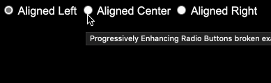
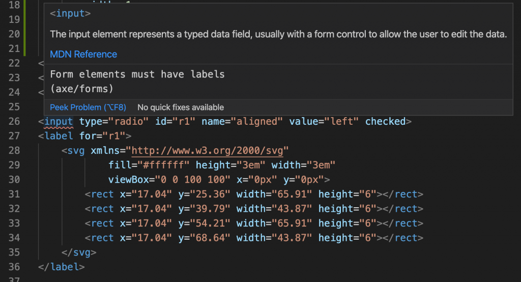
This fixes the “I have no clue where I am” issue. However, there is also another problem. We replaced the text inside the label, and thus the radio button is hidden and has no description. Something once again flagged up by Webhint in my editor:
To remedy that we need to add a title to each of the SVG elements. This should act like an alternative text to the image when it can’t be seen and you can actually see it when you hover over the element:
However, for screenreaders this isn’t enough. We also need to give the SVG element a role of “img” and announce the title of the SVG using “aria-labelledby” pointing to an ID on the title element:
This announces our images correctly as label text to assistive technology like screenreaders and also gets rid of the errors in Webhint.
Adding some fanciness
And that’s it, using these steps we were able to create pretty, styled and accessible radio buttons that have all the benefits of radio groups and are screenreader and keyboard accessible. Without any fancy JavaScript or frameworks.
A small extra I added to the final example is a transition between the states and an inner shadow to make it really obvious which state is currently chosen.
This was fun and it is amazing how far you can come without having to write any logic in your code. Instead you let HTML do what it does best and CSS to react to user input and show different visual outcome. However, I think there would be a lot to gain by cleaning up the mess that is form element styling and I wished it would be easier and more predictable cross-browser to style these elements.
Another thing I am not too happy about is the need to define relationships with IDs and “for” and “aria-labelledby” attributes respectively. IDs have to be unique and generating them is annoying. Sure, you can re-use them in CSS and it makes for easier query selectors, but I never feel good adding one to a document that should be easily extensible.
There is a proposal to get a has: selector into CSS, which would allow at least to get rid of the for-ID relationship and nest the SVG inside the label using a label:has(>input[type=radio]) selector instead, but the browser support so far is non-existent.
In his CSS, he positions the label relative, sets the text colour to transparent to hide it, and set to overflow to hidden to not expand the label to the full width of the text.