Christian Heilmann

You are currently browsing the Christian Heilmann blog archives for June, 2017.

Archive for June, 2017

Any web site can become a PWA – but we need to do better

Tuesday, June 27th, 2017

Over on his blog, I just go a ding from Jeremy.

Literally any website can—and should—be a progressive web app. Don’t let anyone tell you otherwise. I was at an event last year where I heard Chris Heilmann say that you shouldn’t make your blog into a progressive web app. I couldn’t believe what I was hearing. He repeats that message in this video chat: “When somebody, for example, turns their blog into a PWA, I don’t see the point. I don’t want to have that icon on my homepage. This doesn’t make any sense to me” Excuse me!? Just because you don’t want to have someone’s icon on your home screen, that person shouldn’t be using state-of-the-art technologies!? Excuse my French, but Fuck. That. Shit!
Our imaginations have become so limited by what native mobile apps currently do that we can’t see past merely imitating the status quo like a sad cargo cult.
I don’t want the web to equal native; I want the web to surpass it. I, for one, would prefer a reality where my home screen isn’t filled with the icons of startups and companies that have fulfilled the criteria of the gatekeepers. But a home screen filled with the faces of people who didn’t have to ask anyone’s permission to publish? That’s what I want!

Suffice to say, I am not telling anyone not to use great, modern technologies to the benefit of their end users and their own publishing convenience. And the stack that make up PWA are great to make either more successful than it is now.

PWA presentation at JSPoland
Me, literally telling the world that a PWA can be anything

I want us to do more. I want modern web technologies not to be a personal thing to use. I want it to be what we do at work, not to bring to work or point to at some amazing web person’s web presence or a showcase of a large web company.

All power to us for using whatever great technology in the environment we control, but we need to aim higher. We need to go where mistakes happen and bring the convenience and sensible upgrades to hacky old solutions. I don’t have the power to tell anyone not to use something on their blog. But I also don’t want to have a lot of things out there touted as “PWAs” that are a terrible experience. We’ve done that over and over with all kind of packaging formats. We need to get it right this time as our tools have never been better.

I publicly spoke out over and over again against stores in the current form as they are a barrier to access. A barrier that seems artificial, when we have the web, right?

Maybe. Fact is that a whole new generation of people know apps. Not the web. They know the web as something riddled with ads and malware you need blockers for. In some places where the web is not as conveniently available as it is where we are people even consider Facebook the web. As it is made available to people easier than the bloated web.

When I say that I don’t see the point of turning a blog into a PWA it hits exactly the confusion point of the “app” part. To me, an app is a “do” thing, not a “read” thing. I see no point in having the Wired, the Guardian, The Rolling Stone, The Times etc… app. Icons on a crammed desktop don’t scale. I use a news reader to read news items. I use an RSS aggregator to read blogs. I use an ebook reader to read books (or a browser). I use Spotify or iTunes to listen to music. I don’t have an app for each band or movie.

I’ve been publishing for donkey’s years on the web. And I choose to use a blog as I have no idea how you consume it. And I like that. I don’t think there should be a “Chris Heilmann” icon on your desktop. It should be in the contacts, it should maybe show up as a post or a bookmark. You can’t do anything on this blog except for reading it. Use what makes you most happy to do that.

I very much agree with Jeremy:

I don’t want the web to equal native; I want the web to surpass it.

And that’s exactly what I mean when I don’t want a blog as an app – no matter what format of app. I want people to create PWAs that are more than bookmarks – even offline working ones that give me a notification when new content is available.

Does this mean I say that you shouldn’t use a manifest and service worker to improve web pages or your blog? Hell, no. Go wild – do the right thing. Especially do the one thing that PWAs require: stop publishing over HTTP and secure your servers. Man in the middle attacks need to stop, especially with various governments happily being that man in the middle.

I want the web to succeed where it matters. I want native apps to go away. I don’t want to download an app to get tickets to the subway in Berlin. I don’t want an app for each airport I go to. I very much don’t want an app for each event I attend. I don’t want an app for each restaurant I frequent. I don’t need those relationships and having to give them a part of the limited space on my phone. Or on my desktop/launch bar.

We need the web to beat native where it is terrible: distribution and convenience. I want people to do things without having to go to a store, download and install an app and run it. I want people to get access to free content without a credit card. You need a credit card to access free stuff on app stores – this is a huge barrier. I want people to find the next train, book restaurants, get a doctor and find things regardless of connection and device. I want people to take pictures and sharing them. I don’t want people to use insecure, outdated versions of their apps as it is too much to get 50MB updates every day. I don’t want people to use what comes on the phone and use the browser as the last resort. And for this, we need great PWAs of known entities and great new players.

Try before you buy
PWA is try before you buy

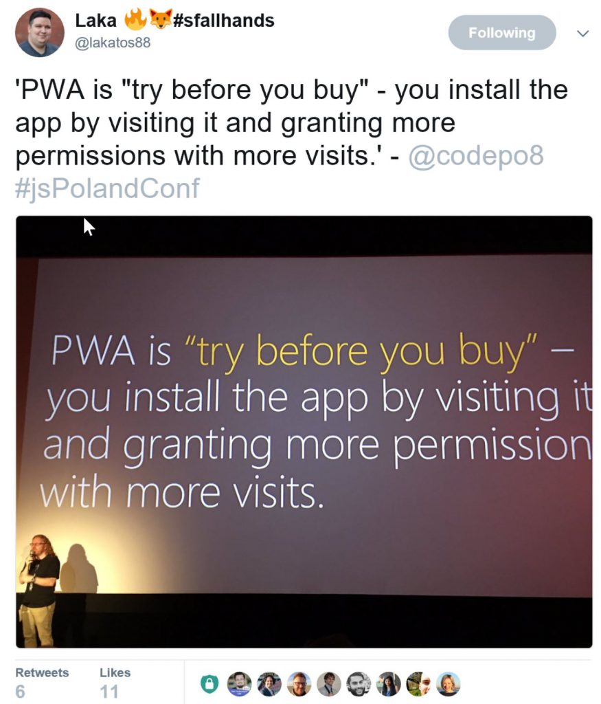
I want people to understand that they are in control. As I said last week in Poland, PWA is proper try before you buy. You go to a URL, you like what you see. With later visits you promote it to get more access, work offline and even give you notifications.

A PWA has to earn that right. And this is where we need kick-ass examples. I have no native Twitter any more, Twitter Lite does the trick and saves me a lot of data and space. I go around showing this to people and I see them kick out native Twitter. That’s what we need.

Every time we promote the web as the cool thing it is we repeat the same points.

  • It is easy to publish
  • it is available for everyone
  • it is not beholden to anyone
  • It is independent of platform, form factor and generally inviting.

When you see the web that millions of people use every day the story is very different.

It is that bad that every browser maker has a department of cross-browser compliance. We all approach big companies pointing out how their products break and what can be done to fix them. We even offer developer resources to not rely on that webkit prefix. In almost all cases we get asked what the business benefit of that is.

Sure, we have a lot of small victories, but it is grim to show someone the web these days. In our bubble, things are great and amazing.

How did that happen? We have the technology. We have the knowledge. We have the information out there in hundreds of talks, books and posts. Who do we reach is the question. Who builds this horrible web? Or who builds great stuff at home and gets mostly frustrated at work because things are beyond repair?

When I say that I don’t want a blog as an app I am not saying that you shouldn’t supercharge your blog. I am not forbidding anyone to publish and use technology.

But, I don’t think that is enough. We need commercial successes. We need to beat the marketing of native apps. We need to debunk myths of native convenience by building better, web based, solutions.

We’ve proven the web works well for self-publishing. Now we need to go where people build an iOS and Android app to have an online presence for their company with higher functionality. We need these people to understand that the web is a great way to publish and get users that do things with your product. We think this is common sense, but it isn’t. We have to remind people again about how great the web is. And how much easier it is using web technology.

For this, we need first and foremost find out how to make money on the web on a huge scale. We need to find a way that people pay for content instead of publishers showing a lot of ads as the simpler way. We need to show numbers and successes of commercial, existing products. Google is spending a lot of money on that with PWA roadshows. Every big web company does. I also all work directly with partners to fix their web products across browsers and turn them into PWAs. And there are some great first case studies available. We need more of those.

I want developers not to have to use their spare time and learn new web technologies on their personal projects. I want companies to understand the value of PWA and – most importantly – fix the broken nonsense they have on the web and keep in maintenance mode.

If you think these and other PWA case studies are by chance and because people involved just love the web – think again. A lot of effort goes into convincing companies to do the “very obvious” thing. A lot of cost of time and money is involved. A lot of internal developers put their career on the line to tell their superiors that there is another way instead of delivering what’s wanted. We want this to work, and we need to remind people that quality means effort. Not adding a manifest and a service worker to an existing product that has been in maintenance hell for years.

Jeremy wants a certain world:

I, for one, would prefer a reality where my home screen isn’t filled with the icons of startups and companies that have fulfilled the criteria of the gatekeepers. But a home screen filled with the faces of people who didn’t have to ask anyone’s permission to publish? That’s what I want!

I want more. I want the commercial world and the marketing hype of “online” not to be about native apps and closed stores. I don’t want people to think it is OK to demand an iPhone to access their content. I don’t want companies to waste money trying to show up in an app store when they could easily be found on the web. I think we already have the world Jeremy describes. And – to repeat – I don’t want anyone not to embrace this if they want to or they think it is a good idea.

Nothing necessary to turn your current web product into a PWA is a waste. All steps are beneficial to the health and quality of your product. That is the great part. But it does mean certain quality goals should be met to avoid users with an “app” expectation not getting what they want. We have to discuss these quality goals and right now quite a few companies roll out their ideas. This doesn’t mean we censor the web or lock out people (there are other people working on that outside of companies). It means we don’t want another “HTML5 Apps are a bad experience” on our hands.

I’ve been running this blog for ages. I learned a lot. That’s great. But I don’t want the web to be a thing for people already believing in it. I want everyone to use it instead of silos like app stores – especially commercial companies. We’ve been shirking away from the responsibility of making the enterprise and products people use day to day embrace the web for too long. The current demise of the native/app store model is a great opportunity to do this. I want everyone with the interest and knowledge to be part of this.

I can’t see myself ever having a phone full with the faces of people. This is what the address book is for. The same way my ebook reader (which is my browser) is what I use to read books. I don’t have an app for each author.

I like the concept of having a feed reader to check in bulk what people that inspire me are up to. I like reading aggregators that do the searching for me. And if I want to talk to the people behind those publications I contact them and talk to them. Or – even better – meet them.

An app – to me – is a thing I do something with. This blog is an app for me, but not for others. You can’t edit. I even turned off comments as I spent more time moderating than answering. That’s why it isn’t a PWA. I could turn it into one, but then I would feel that I should publish a lot more once you promoted me to be on your home screen.

So when I talk about personal blogs not being PWAs to me, this is what I mean. Apps to me are things to do things with. If I can’t do anything with it except for reading and sharing I don’t stop you from publishing it as a PWA. But I am not likely to install it. The same way I don’t download the Kim Kardashian app or apps of bands.

This is not about your right to publish. It is about earning the space in the limited environment that is our user’s home screens, docks and desktops. If you’re happy to have that full of friend’s blogs or people you like – great. I’d rather soon see phones in shops that out-of-the-box come with PWAs for people to do things. Not native apps that need a 200MB update the first time you connect and won’t get that upgrade and become a security risk. I want web access to be front and centre on new devices. And to do that, we need to aim higher and do better.

CSS vs. JavaScript: Trust vs. Control

Wednesday, June 21st, 2017

When GotoConf Amsterdam asked me to speak, I thought it’d be another machine learning or Progressive Web Apps talk. Instead the organisers asked me to cover CSS. An under-represented language in their “programming languages” track. Now, I’ve been a fan of CSS from the very beginning. I assumed that people in a hard-core development conference won’t be as excited. They’d have not looked at CSS in detail. Instead, my assumption was that it is more of a necessary annoyance to them. So I wrote a talk about what using CSS means and how we don’t use it to its strengths.

Here are the notes of my talk.

A boring fight

Captain America vs. Iron Man

The other day I watched “Captain America: Civil War “again. And once again it bored me and I didn’t quite get the concept of it. The idea of super heroes forced to be responsible for their collateral damage is not new. Asking for control over them is not new either. “The Incredibles” did a great job with that.

I was more bored about the premise of all these cool super heroes fighting against each other. We know their powers. We know that they are deep down friends who saved each other’s lives on countless occasions. We know that their powers match. There is no violence, no real drive, no anger in these encounters. It feels like Marvel introduced too many cool characters and now tries to find a way to let people take sides. Sell more toys, create artificial drama.

I get the same impression when we talk about using CSS or JavaScript for layout. Both have their merits, both have their powers. Both have fanbases ready to dig up the most detailed information to advocate for one over the other. But I find this boring. Both used together is what brought the web forward. And it is holding us back that there are two massive camps. One end sees CSS as a thing of the past and in our module driven world we should do all in a scripting space. The other sees CSS and its preprocessors and build scripts as more than enough to do everything. Remember DHTML days when we did everything with JavaScript? Remember the “CSS only solutions” backlash? When we (ab)used checkboxes for complex interactivity to avoid using any JavaScript?

Giana Blantin put it nicely:

Can these two groups:
“CSS is so easy, it isn’t even coding”
“CSS is so hard, we need to replace it with JS!”
please talk to each other?

A lot of the misconceptions of CSS is because developers don’t understand how it differs from programming. Instead, we fiddle with it and change things around. After breaking something, we conclude that it is not good enough and we need to replace it.

I know Open GL - I can do gradients

Often this is overshooting the mark. Much like using OpenGL for simple gradient creation we don’t need to bring out the big guns all the time. CSS has a few tricks up its sleeve that we can’t match with client-side scripting. And it has nothing to do with syntax or language features. It is about sharing responsibility.

Who is at fault and who should be tolerant?

CSS, much like HTML is fault tolerant. This can be confusing. What it means is that end users should not suffer from the mistakes of the developer. Products built with CSS still show up when the developer made a mistake. They don’t look perfect, but they work. When a CSS parser encounters a property it doesn’t understand – it skips it. When it encounters a value it can’t deal with or the property doesn’t support – it skips it. That way we stay backwards compatible.

A button that has a background colour and a gradient will show the colour on older environments. It also shows it in environments that don’t support gradients because of performance issues. Faster, more hi-fi and supporting environments will show a gradient.

You don’t need to know the environment and you don’t need to make that decision. The OS, the browser and the proxies involved make these decisions for you.

JavaScript is not fault tolerant. This can be disastrous. You are much more in control when using JavaScript. But you are also much more responsible.

JavaScript on the client can break for dozens of causes. The browser can be non-supportive, the connection can be flaky. The mobile provider your end users have may see it as their job to minify and pack scripts going down the wire. When JavaScript encounters something it doesn’t understand – it breaks. It packs in and doesn’t show anything, thus punishing the user of your product for your errors. Or those errors introduced by the other people and scripts involved delivering your code to the end users.

In other words:

  • CSS - You apply your styles and you hope it worked.
  • JavaScript - You control the styling and you can and should verify that it worked

CSS means embracing the “squishiness” of the web, as Brad Frost put it. The web isn’t a fixed canvas you can set pixels on. A lot of things on it are beyond your control:

  • The browsers of your users
  • The resolution, pixel density and colour settings of their devices
  • Their connection reliability and speed
  • Their connection restrictiveness – resource blocking is a thing
  • Their font size and zoom needs
  • The availability of resources on their machines for your product (is the CPU already burning?)
  • The amount of text content and image sizes in your product – CMS anyone?

This can be daunting and often we want to control the environment our products run in – if only to keep our sanity. This means though that we block out a lot of potential users.

In this unknown environment we have to decide who takes on the job to deal with its performance problems:

  • CSS - It is the job of the browser to perform well, use GPU resources and skip functionality.
  • JavaScript - It’s your job to test for support. And to ensure rendering, painting and reflow is fast. And to keep animation in sync.

CSS is damn good at that and browser makers put a lot of effort into tweaking the interface performance.

So why do we under-estimate CSS and over-value the benefits of JavaScript? I guess one thing to blame is a classic – Internet Explorer.

CSS and its bumpy history

CSS had to grow up fast and didn’t get the support from browsers that it needed to be a reliable tool.

CSS was very limited at first and meant as a replacement for visual HTML and attributes. Begone all those font, bgcolor, align, center, HR and friends. Patchy browser support and very odd errors without debugging options didn’t help it. We knew things were wrong but we couldn’t do anything about it. We even couldn’t ask anyone as browser makers weren’t available for feedback.

When the iPhone came out CSS had its day in the limelight. The “HTML5 is the future” story needed a lot of extra functionality. With Apple calling the shots there and standardisation taking too long a lot was “Webkit only”. T

his meant prefixes in CSS and once again forking for different rendering engines. Browser makers innovated and showed dominance over others with prefixed functionality. As developers this meant repetition and having to pick a support plan for each of them. And of course one to support older, outdated browsers. These new browser wars around prefixes caused a lot of arguments and confusion.

And last but not least there was until recently no layout model in CSS. Instead we hacked using positioning and floating. Positioning, especially absolute positioning in pixels isn’t sensible on the web. People can resize the font and contents will overlap. Positioning with floating needs clearing elements.

It is not what you call a reliable base line or one that was simple to understand if you’re not “web native”

We needed to make CSS work regardless of browser support

Our solution was to patch with JavaScript. We can read out conditions and react to them creating HTML and applying styling. As JavaScript is a programming language we have full control over what is happening. We have conditions, loops, comparisons – all the things a programmer misses in CSS. This, to a degree is a misunderstanding of CSS as a concept. A selector that matches several elements is – in essence – a loop. We can even use :nth-child() to target an element in a collection.

In general CSS has been going leaps and bounds since we had to use JavaScript to patch it. Especially disappointing browser support is a much smaller problem.

  • Evergreen browsers are a thing – all browsers are on a constant upgrade path. We even learn from browser makers what’s coming down the line.
  • Browser tooling gives detailed insights into what CSS applies to what. We even get visual tools like animation editors and colour pickers.
    Bezier editor in Firefox Devtools
    Firefox Developer tools have a visual editor for bezier animations
  • CSS support across browsers is well documented: caniuse.com is an incredible resource. It not only shows which browser and which environment supports what. It also explains bugs in the implementations, offers links to the specs and the bug reports. It even has an API to embed this information into documentation and developer tools.
    Can I use information in Visual Studio Code's editor footer
    Using the “Can I use” extension for Visual Studio Code you can display browser support information directly in your editor. You learn who you lock out while you code!
  • We have support channels and bug tracking for almost all browsers. Some even allow you to file a bug using Twitter. The teams of browser makers are active on social media and reachable.
  • Pre-processors like Sass and Less have turned up the heat to innovate the CSS spec faster. Much like jQuery inspired JavaScript of today, these lead to functionality people want.
  • The community spends a lot of time making CSS more maintainable. Approaches like Object Oriented CSS by Nicole Sullivan and Atomic Design by Brad Frost have been around for ages and should help reduce complexity.

What CSS can do for you

Here are some amazing things CSS can do now and you should consider using.

Calculated CSS values

One thing that always seemed to be missing in CSS was a way to calculate values. The classic example is an absolutely positioned element that is 100% wide but needs padding. In the olden days we needed to do that by nesting another element and apply the padding to that one. For quite some time though we could use CSS calc() for that and apply a width of calc(100% – 1em).

Calculations are very well supported across browsers. There shouldn’t be any qualms about using them.

Media Queries

CSS Media Queries allow you to react to changes of the viewport of the document. In essence they mean that you apply part of your style sheet when the viewport meets a certain criteria. This could be a viewport that is at least a certain width or at most a certain height. You can also check for portrait or landscape orientation of the screen or if the document is a printout.
CSS Media Queries also have a JavaScript equal in matchMedia. This allows you to load content on demand. One Media Queries problem is that browsers load images in blocks regardless of the match.

Generated content

Using the ::before and ::after pseudo selectors in CSS allows you to create content that is purely visual. This is a great way to make sure that things that are for cosmetic reasons don’t need an own, empty DIV, SPAN, B or I element. It is a way to keep everything visual maintained in the style sheet instead of scripts or the HTML document. You can pair this with drop shadows, gradients and other CSS features that create visuals.. An impressive showcase of that is “A Single DIV“. This web site shows dozens of visuals created from a single DIV element.

Sully of Monsters, inc. as a single DIV
This graphic is a single DIV created with generated content

Animations and transitions

Animations and transitions in CSS were the big breakthrough when the iPhone came out. Transitions allow you to create a smooth change from one state to another. You don’t need to know what changes should happen. All you tell the browser is how long to transition and what easing function to use. Animations give you more granular control. You define keyframes and what should animate how. Both Animations and transitions fire events before, during and after. This allows you to interact with JavaScript in a predictable manner. The benefit of using CSS for this is that the browser ensures the performance of the animation. This happens by running them on the GPU and throttling the frame rate should the need occur. This is an important step to ensuring a good battery life of your users’ phones. If you animate in JavaScript, this can easily go wrong.

Viewport Units

Media Queries make sense when you want to define experiences in detail. Instead, you can also use viewport units to size elements according to the available space. Viewport Width (vw) is a percentage of the full viewport width. So on a 480px wide screen 10vw is 10% or 48px. This differs from the % unit, which is the percentage of the parent element and not the viewport. Nested percentages will get smaller, vw will not. Viewport Height (vh) is a percentage of the full viewport height. You can also make yourself independent of orientation my using vmin and vmax. These either take the smaller or the larger of vw and vh. The only niggle in support of viewport units is that to date Edge doesn’t support vmin and vmax.

CSS Tricks has a great article on how powerful viewport units can be. From resolution independent embeds to viewport dependent typography you can use viewport units to create highly flexible interfaces.

Flexbox

Flexbox is a way to create layout of elements in CSS. In essence is it everything people who claimed layout tables were easier missed in CSS - and much more. You can align child elements of an element to be on the right, left, top or bottom. You can define them to fill up the available space, with each using either the same amount or more than the others. You can also define them to use the available space between each other or around each of them. It is as flexible as it says on the tin. If you want to have a visual editor to see what that means, Build With React has a great flexbox editor to play with.

Playing with the different settings of Flexbox

There is also a game called Flexbox Froggy. It teaches the concepts in an enjoyable and accessible manner and is great for kids to start with CSS.

Flexbox Froggie

A great talk about Flexbox is the one Zoe Gillenwater gave at various events. What I like most about the talk is how Zoe shows how they used Flexbox in production. The examples are from booking.com and show fallbacks for browsers that don’t support it.

CSS Grid

If Flexbox is the answer to layout elements in a row or a column, CSS Grid is taking it to the next level. Using it you can lay out elements in a defined grid in two dimensions, both rows and columns. Grid has been cooking for a while and now is finally supported across the board.

A simple grid example
A few settings turn a series of elements into a flexible grid

Grid can be daunting to look at as its flexibility means there are a lot of options to choose from. By far the simplest way to get started is Rachel Andrew’s “Grid by Example” resource. This one has copy+paste examples of grid layouts. Many of them come with fallbacks for unsupported browsers. Training videos explaining the ins and outs of them make it an amazing resource.

If you learn better with challenges, you can grasp CSS Grid by playing the CSS Grid Garden.

CSS Grid Garden
Learn to water carrots with CSS Grid Garden

There are some “must see” talks about CSS grids online. The first one is “CSS Grid Layout“, again by Rachel Andrew.

Jen Simmons is taking a different approach. In her “Real Art Direction on the Web” talk she shows how Grid’s versatility can help us to break out of our “box layout” thinking.

There is no problem with mixing and matching Grid and Flexbox. It can and should use Flexbox in its cells. Together, these tools allow you to create flexible layouts. Layouts that allow for variable content and change to fit the available space. Web layouts.

CSS Custom properties (variables)

One of the most demanded features of CSS that preprocessors like Sass and Less had for a long time is variables. Now we have CSS Custom Properties which are the thing that gets me most excited about CSS. You can define re-usable settings once in your document and apply them throughout. The most common use case for that is custom colours and sizes. But you can go further and define fonts and other typography. You can also use them to nest calculations in CSS. This wasn’t possible before. An amazing feature is that Custom Properties can also be set dynamically with JavaScript.

Example of reading and setting CSS Custom properties in JavaScript
How to read and write custom CSS properties with JavaScript – (excerpt from Lea Verou’s talk)

If you want to learn all about the amazing power of CSS Custom Properties there is a talk you shouldn’t miss. Lea Verou’s “CSS Variables: var(—subtitle)” is a treasure trove of information.

CSS Feature Queries

Another very welcome addition to CSS was Feature Queries. These work much like Media Queries. By using @supports you check if the current user agent supports a certain feature. You then define a block of CSS that only gets applied when there is feature support. This might feel odd as the fault tolerant nature of CSS should already take care of that. What it does though is give you much more granular control. It also allows you to define a fallback when there is no support for a certain feature using the “not” keyword.

CSS and JavaScript?

CSS and JavaScript working together is powerful and the right thing to do. As far as CSS has come, it still can’t do everything. There are scenarios where the very nature of CSS stands in contrast with what we want to achieve.

As Cristiano Rastelli explains in his “Let there be peace on CSS” talk, the cherished feature of “Separation of Concerns” doesn’t apply in a module world.

Separation of Concerns in a component world

When CSS became a thing we moved all the look and feel and behaviour out of HTML into CSS and JavaScript. We define either on a document or even project wide level. We celebrate the fact that CSS does inherit from parent elements. When we build components that can be consistenly re-used we don’t want that. We want them to carry their look, feel and behaviour without bleeding out either to adjacent ones or inherit from their parents.

CSS and JavaScript working together in a non-component world

When building document-based solutions there is no excuse not to dig into the power of CSS. You can and should use JavaScript to bring information CSS can’t read into CSS. It is prudent though to do so in the least intrusive way possible.

The hierarchy of making CSS and JS work with another in this scenario the following:

  • Use CSS when you can – using the things you saw here
  • If you need to communicate with CSS, consider changing Custom Properties
  • If that’s not an option apply classes to parent elements using classList.
  • As a very last resort, you can alter the style directly

Example of getting the mouse position into your CSS
An excellent example showing how to read the mouse position in JavaScript and store it in CSS Custom Properties – (excerpt from Lea Verou’s talk)

Whenever you change styles dynamically, remember that you are working against the browser. Every style change has consequences in reflow, rendering and painting. Paul Lewis and Das Surma maintain a handy guide called CSSTriggers. This one describes in detail which CSS changes result in what punishment to the browser.

CSS Triggers
CSS Triggers gives you information of the effects of different style changes

In Summary

CSS is much more reliable than it used to be and there is not much left that should be different to what it is. The main thing to remember is that CSS isn’t meant to do the same things JavaScript does. Even layout languages don’t work the way CSS does and cover the same need. It has a pretty tough job to do and it does it well. When you use CSS, the browser helps you meet the needs of your end users regardless of their setup. This is a core principle of the web and defined in the W3C HTML Design Principles:

Users over authors over implementors over specifiers over theoretical purity

Our users deserve interfaces that are smooth, reliable and don’t kill their batteries. So, consider CSS a bit more. You can be lazy and build on the work of the community.

Inspiring and active CSS people to follow

When researching this talk I kept going back to resources written and maintained by fabulous people on the web. Here is a short list in no particular order of people you should follow if you want to be up to scratch with your CSS knowledge. I have to thank each of them. They’re making the web easier for all of us.

  • Ire Aderinokun (@ireaderinokun) writes a lot of easy to grasp and to the point CSS information bits on her blog, bitsofco.de.
  • Ana Tudor (@anatudor) is a developer who creates ridiculously complex and beautiful animations in CSS. Her Codepen is one of the most frequented ones and what she does to the CSS engines is a great help for browser makers to test their performance
  • Jen Simmons (@jensimmons) is a CSS layout and design expert working for Mozilla
  • Rachel Andrew (@rachelandrew) to me is the #1 CSS grids expert
  • Chris Coyier (@chriscoyier) is the founder of the amazing CSS resource CSS Tricks and the interactive development playground Codepen
  • Sarah Drasner (@sarah_edo) is an animation and design expert focused on building maintainable products
  • Zoe M. Gillenwater (@zomigi) is a lead developer using bleeding edge CSS in production
  • Brad Frost (@brad_frost) is the author of Atomic Design, a scalable way to use and re-use CSS in large projects
  • Rachel Nabors (@rachelnabors) is a comic artist and animation expert writing about web animations and merits of different technologies
  • Una Kravets (@una) is a developer specialising in CSS and its new features. She also is a podcaster and has her finger very much on the pulse of CSS and other visual technologies
  • Lea Verou (@leaverou) is the author of the excellent CSS secrets book, a researcher at MIT and invited expert by the CSS working group of the W3C. She is meticulous in her research and ruthless in her delivery of lots of great information in a short amount of time.
  • Sara Soueidan (@sarasoueidan) is a developer who is an expert on responsive designs and pragmatic approaches to using newest technologies.

I keep getting inspired by these people (amongs others) daily, and hope you will start to get the same experience.

First impressions of my HoloLens

Wednesday, June 7th, 2017

Chris Heilmann with his HoloLens

Also available on Medium.

I am now proud owner of a HoloLens. I am not officially trained up on it yet as a Microsoft Employee. But I wanted to share the first impressions of setting it up and using it.

These are my personal impressions and not an official stance by my company. I’m sharing my first excitement here. I hope can make some people understand what is happening here.

This is also just a user POV as I haven’t started developing for it yet, but this will happen soon – promised.

HoloLens is unique

First of all, it is important to understand that HoloLens is something pretty unique. Every time I mention it people start making comparisons to the Occulus or Vive, but those don’t work.

A high-powered, multi camera mobile on your head

HoloLens is a self-contained computer you wear on your head. You don’t need anything else. It is not a peripheral, there is no other computer or server necessary. This is important when considering the price. Many VR headsets are much cheaper, but they aren’t Mixed Reality and they need a hefty computer to run. It doesn’t even need an internet connection all the time. Just because you wear them on your head doesn’t mean you can compare these products on even ground.

You should plan coding for it like a mobile phone on your head in terms of CPU/GPU power. The specs are high, but the demand of the way it works are, too. If you build for HoloLens be conservative with the resources you need – you’ll make me happy. Waiting isn’t fun, even when it is a floating animation in your room.

Your natural movement is an event

Anke calibrating HoloLens
When you’re calibrating your HoloLens and all the dog can think of is you holding a treat instead of using the “bloom”

HoloLens is a system that uses natural motion of your head and body to explore an augmented space. This means you don’t lose connection to the real world – you still see it through the device. What you get is a constant analysis of your surroundings and Holograms overlayed on it. You open apps and either use them floating before you or dock them to a wall to use later when you look at said wall. You distribute your work space in your living space – without needing to go to IKEA to buy furniture.

This means the way you move and where you look become events software can interact with. The “gaze” gesture, which is “looking at something” is akin to a hover with a mouse. The “air tap” gesture is a click or submit.

That way the relative small size of you viewport compared to Occulus or Vive is less relevant. You’re not stuck in it as your viewport follows your head movement. You’re not supposed to have a whole takeover. HoloLens is there to augment the world – not replace it.

Your whole body is now an event trigger. Instead of learning keyboard shortcuts, you learn gestures. Or you can use your voice.

Gestures vs. Voice Recognition

You can use your hands to select and interact with things. Or you can say “select” to interact and “next” to move on in menus. Voice recognition is always on and Cortana is just one “Hey Cortana” away. You can use it to open apps, search the web, research, all kind of things. It still feels odd to me to talk to my phone. I am on Android, maybe Siri is a better experience. It feels more natural to talk to a voice in a space of apps I distributed around my house.

Spatial sound

HoloLens has a lot of speakers built in which allows you to hear sounds from all directions. This is pretty amazing when it comes to games like RoboRaid:

And even more so in Fragments:

When using the speakers, there is not much privacy though. It is pretty easy to hear what HoloLens says when you are close to someone wearing it.

If you want a keyboard, you can have one

If you enter a lot of text into web sites or something similar, you can also pair a bluetooth keyboard. Or clicker, or whatever. At first it annoyed me to enter my pretty secure passwords in a floating keyboard. But the more I got used to HoloLens interaction, the easier it became.

A whole new way of interaction

I’m not a big fan of VR because I am prone to get nauseous if the frame rate isn’t perfect. I am also getting car sick a lot, so it isn’t something to look forward to. I also feel confined by it – it fills me with dread missing out on things around me whilst being in a virtual space. I don’t like blindfolds and earplugs either.

The only discomfort I felt from HoloLens is having something weighing close to a kilogram on your head. But you get used to it. At the beginning you will also feel your fingers cramp up during air tapping and your shoulders hurt. This means you are doing it wrong. The more natural you move, the easier it is for HoloLens to understand you. An air tap doesn’t need full movement. Consider lifting your finger and pointing at stuff. Just like interrupting a meeting.

An outstanding onboarding experience

What made me go “wow” was the way you set up and start working with the HoloLens. The team did an incredible job there. The same way Apple did a great job getting people used to using a touch device back when the iPhone came out. Setting up a HoloLens is an experience of discovery.

You put on the device and a friendly “hello” appears with Cortana’s voice telling you what to do. You get to set up the device to your needs by calibrating it to your eyes. Cortana tells you step by step how to use the gestures you need to find your way around. Each step is full of friendly “well done” messages. When you get stuck, the system tells you flat out not to worry and come back to it later. It is an enjoyable learning experience.

How I use it

Putting cat Holograms on the dog

Right now, I have my kitchen cupboards as my work benches. Edge is on one of them and next to it is my task list of the day. I have a few games on the other side of the room. When it comes to Holograms, there is a cat on our dog’s bowl and a Unicorn above the bed to give us nice dreams. Because we can.

Skype is pretty amazing on HoloLens:

Some niggles I have

It is important to remember a few things about the HoloLens:

  • It isn’t a consumer device but for now a B2B tool. On the one side there is the high price. And there is a focus on working with it rather than playing games.
  • It is not an outside device. HoloLens scans your environment and turns it into meshes. After it created the meshes it stores them in “spaces” avoiding the need to keep scanning. Outside this means a constant re-evaluating of the space. This is expensive and not worth-while. So there is no danger of a re-emergence of the annoying Google Glass people in the street. It stilll is disconcerning to look at someone not knowing if they film you or not.
  • I agree with a lot of other people that there should be a way to have several user accounts with stored calibration info on a single HoloLens. Whilst you can share experiences with other HoloLens users, it would be great to hand it over without recalibration and giving someone else access to my Windows account.
  • There should be a way to wipe all the Holograms in a space with a single command. When you let other people play with your device you end up with lots of tigers, spacemen and all kind of other things in your space that you need to delete by hand.
  • Whilst it is easy to shoot video and take pictures of your experience, the sharing experience is very basic. You can store it to OneDrive or Facebook. No option to mail it or to add Twitter. That said, Skype helps with that.

This is truly some next level experience

I am sure that there are great things to come in the VR/AR/MR space. Many experiences might be much more detailed and Hi-Fi. Yet, I am blown away by the usefulness of this device. I see partners and companies already use it to plan architectural projects. I see how people repair devices in the field with Skype instructions from the office. I get flashbacks to Star Trek’s Holodeck – something I loved as a teen.

It is pretty damn compelling to be able to use your physical space as a digital canvas. You don’t have to leave your flat. And you don’t run the danger of bumping into things while you are off into cyberspace. It is augmentation as it should be. In a few years I will probably chuckle at this post when my cyber contacts and ear piece do the same thing for me. But for now, I am happy I had the chance to try this out.