CSS vs. JavaScript: Trust vs. Control
Wednesday, June 21st, 2017 at 6:44 amWhen GotoConf Amsterdam asked me to speak, I thought it’d be another machine learning or Progressive Web Apps talk. Instead the organisers asked me to cover CSS. An under-represented language in their “programming languages” track. Now, I’ve been a fan of CSS from the very beginning. I assumed that people in a hard-core development conference won’t be as excited. They’d have not looked at CSS in detail. Instead, my assumption was that it is more of a necessary annoyance to them. So I wrote a talk about what using CSS means and how we don’t use it to its strengths.
Here are the notes of my talk.
A boring fight

The other day I watched “Captain America: Civil War “again. And once again it bored me and I didn’t quite get the concept of it. The idea of super heroes forced to be responsible for their collateral damage is not new. Asking for control over them is not new either. “The Incredibles” did a great job with that.
I was more bored about the premise of all these cool super heroes fighting against each other. We know their powers. We know that they are deep down friends who saved each other’s lives on countless occasions. We know that their powers match. There is no violence, no real drive, no anger in these encounters. It feels like Marvel introduced too many cool characters and now tries to find a way to let people take sides. Sell more toys, create artificial drama.
I get the same impression when we talk about using CSS or JavaScript for layout. Both have their merits, both have their powers. Both have fanbases ready to dig up the most detailed information to advocate for one over the other. But I find this boring. Both used together is what brought the web forward. And it is holding us back that there are two massive camps. One end sees CSS as a thing of the past and in our module driven world we should do all in a scripting space. The other sees CSS and its preprocessors and build scripts as more than enough to do everything. Remember DHTML days when we did everything with JavaScript? Remember the “CSS only solutions” backlash? When we (ab)used checkboxes for complex interactivity to avoid using any JavaScript?
Can these two groups:
“CSS is so easy, it isn’t even coding”
“CSS is so hard, we need to replace it with JS!”
please talk to each other?
A lot of the misconceptions of CSS is because developers don’t understand how it differs from programming. Instead, we fiddle with it and change things around. After breaking something, we conclude that it is not good enough and we need to replace it.
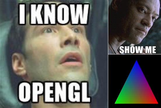
Often this is overshooting the mark. Much like using OpenGL for simple gradient creation we don’t need to bring out the big guns all the time. CSS has a few tricks up its sleeve that we can’t match with client-side scripting. And it has nothing to do with syntax or language features. It is about sharing responsibility.
Who is at fault and who should be tolerant?
CSS, much like HTML is fault tolerant. This can be confusing. What it means is that end users should not suffer from the mistakes of the developer. Products built with CSS still show up when the developer made a mistake. They don’t look perfect, but they work. When a CSS parser encounters a property it doesn’t understand – it skips it. When it encounters a value it can’t deal with or the property doesn’t support – it skips it. That way we stay backwards compatible.
A button that has a background colour and a gradient will show the colour on older environments. It also shows it in environments that don’t support gradients because of performance issues. Faster, more hi-fi and supporting environments will show a gradient.
You don’t need to know the environment and you don’t need to make that decision. The OS, the browser and the proxies involved make these decisions for you.
JavaScript is not fault tolerant. This can be disastrous. You are much more in control when using JavaScript. But you are also much more responsible.
JavaScript on the client can break for dozens of causes. The browser can be non-supportive, the connection can be flaky. The mobile provider your end users have may see it as their job to minify and pack scripts going down the wire. When JavaScript encounters something it doesn’t understand – it breaks. It packs in and doesn’t show anything, thus punishing the user of your product for your errors. Or those errors introduced by the other people and scripts involved delivering your code to the end users.
In other words:
- CSS - You apply your styles and you hope it worked.
- JavaScript - You control the styling and you can and should verify that it worked
CSS means embracing the “squishiness” of the web, as Brad Frost put it. The web isn’t a fixed canvas you can set pixels on. A lot of things on it are beyond your control:
- The browsers of your users
- The resolution, pixel density and colour settings of their devices
- Their connection reliability and speed
- Their connection restrictiveness – resource blocking is a thing
- Their font size and zoom needs
- The availability of resources on their machines for your product (is the CPU already burning?)
- The amount of text content and image sizes in your product – CMS anyone?
This can be daunting and often we want to control the environment our products run in – if only to keep our sanity. This means though that we block out a lot of potential users.
In this unknown environment we have to decide who takes on the job to deal with its performance problems:
- CSS - It is the job of the browser to perform well, use GPU resources and skip functionality.
- JavaScript - It’s your job to test for support. And to ensure rendering, painting and reflow is fast. And to keep animation in sync.
CSS is damn good at that and browser makers put a lot of effort into tweaking the interface performance.
So why do we under-estimate CSS and over-value the benefits of JavaScript? I guess one thing to blame is a classic – Internet Explorer.
CSS and its bumpy history
CSS had to grow up fast and didn’t get the support from browsers that it needed to be a reliable tool.
CSS was very limited at first and meant as a replacement for visual HTML and attributes. Begone all those font, bgcolor, align, center, HR and friends. Patchy browser support and very odd errors without debugging options didn’t help it. We knew things were wrong but we couldn’t do anything about it. We even couldn’t ask anyone as browser makers weren’t available for feedback.
When the iPhone came out CSS had its day in the limelight. The “HTML5 is the future” story needed a lot of extra functionality. With Apple calling the shots there and standardisation taking too long a lot was “Webkit only”. T
his meant prefixes in CSS and once again forking for different rendering engines. Browser makers innovated and showed dominance over others with prefixed functionality. As developers this meant repetition and having to pick a support plan for each of them. And of course one to support older, outdated browsers. These new browser wars around prefixes caused a lot of arguments and confusion.
And last but not least there was until recently no layout model in CSS. Instead we hacked using positioning and floating. Positioning, especially absolute positioning in pixels isn’t sensible on the web. People can resize the font and contents will overlap. Positioning with floating needs clearing elements.
It is not what you call a reliable base line or one that was simple to understand if you’re not “web native”
We needed to make CSS work regardless of browser support
Our solution was to patch with JavaScript. We can read out conditions and react to them creating HTML and applying styling. As JavaScript is a programming language we have full control over what is happening. We have conditions, loops, comparisons – all the things a programmer misses in CSS. This, to a degree is a misunderstanding of CSS as a concept. A selector that matches several elements is – in essence – a loop. We can even use :nth-child() to target an element in a collection.
In general CSS has been going leaps and bounds since we had to use JavaScript to patch it. Especially disappointing browser support is a much smaller problem.
- Evergreen browsers are a thing – all browsers are on a constant upgrade path. We even learn from browser makers what’s coming down the line.
- Browser tooling gives detailed insights into what CSS applies to what. We even get visual tools like animation editors and colour pickers.
Firefox Developer tools have a visual editor for bezier animations - CSS support across browsers is well documented: caniuse.com is an incredible resource. It not only shows which browser and which environment supports what. It also explains bugs in the implementations, offers links to the specs and the bug reports. It even has an API to embed this information into documentation and developer tools.
Using the “Can I use” extension for Visual Studio Code you can display browser support information directly in your editor. You learn who you lock out while you code! - We have support channels and bug tracking for almost all browsers. Some even allow you to file a bug using Twitter. The teams of browser makers are active on social media and reachable.
- Pre-processors like Sass and Less have turned up the heat to innovate the CSS spec faster. Much like jQuery inspired JavaScript of today, these lead to functionality people want.
- The community spends a lot of time making CSS more maintainable. Approaches like Object Oriented CSS by Nicole Sullivan and Atomic Design by Brad Frost have been around for ages and should help reduce complexity.
What CSS can do for you
Here are some amazing things CSS can do now and you should consider using.
Calculated CSS values
One thing that always seemed to be missing in CSS was a way to calculate values. The classic example is an absolutely positioned element that is 100% wide but needs padding. In the olden days we needed to do that by nesting another element and apply the padding to that one. For quite some time though we could use CSS calc() for that and apply a width of calc(100% – 1em).
Calculations are very well supported across browsers. There shouldn’t be any qualms about using them.
Media Queries
CSS Media Queries allow you to react to changes of the viewport of the document. In essence they mean that you apply part of your style sheet when the viewport meets a certain criteria. This could be a viewport that is at least a certain width or at most a certain height. You can also check for portrait or landscape orientation of the screen or if the document is a printout.
CSS Media Queries also have a JavaScript equal in matchMedia. This allows you to load content on demand. One Media Queries problem is that browsers load images in blocks regardless of the match.
Generated content
Using the ::before and ::after pseudo selectors in CSS allows you to create content that is purely visual. This is a great way to make sure that things that are for cosmetic reasons don’t need an own, empty DIV, SPAN, B or I element. It is a way to keep everything visual maintained in the style sheet instead of scripts or the HTML document. You can pair this with drop shadows, gradients and other CSS features that create visuals.. An impressive showcase of that is “A Single DIV“. This web site shows dozens of visuals created from a single DIV element.

Animations and transitions
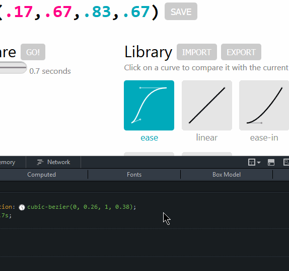
Animations and transitions in CSS were the big breakthrough when the iPhone came out. Transitions allow you to create a smooth change from one state to another. You don’t need to know what changes should happen. All you tell the browser is how long to transition and what easing function to use. Animations give you more granular control. You define keyframes and what should animate how. Both Animations and transitions fire events before, during and after. This allows you to interact with JavaScript in a predictable manner. The benefit of using CSS for this is that the browser ensures the performance of the animation. This happens by running them on the GPU and throttling the frame rate should the need occur. This is an important step to ensuring a good battery life of your users’ phones. If you animate in JavaScript, this can easily go wrong.
Viewport Units
Media Queries make sense when you want to define experiences in detail. Instead, you can also use viewport units to size elements according to the available space. Viewport Width (vw) is a percentage of the full viewport width. So on a 480px wide screen 10vw is 10% or 48px. This differs from the % unit, which is the percentage of the parent element and not the viewport. Nested percentages will get smaller, vw will not. Viewport Height (vh) is a percentage of the full viewport height. You can also make yourself independent of orientation my using vmin and vmax. These either take the smaller or the larger of vw and vh. The only niggle in support of viewport units is that to date Edge doesn’t support vmin and vmax.
CSS Tricks has a great article on how powerful viewport units can be. From resolution independent embeds to viewport dependent typography you can use viewport units to create highly flexible interfaces.
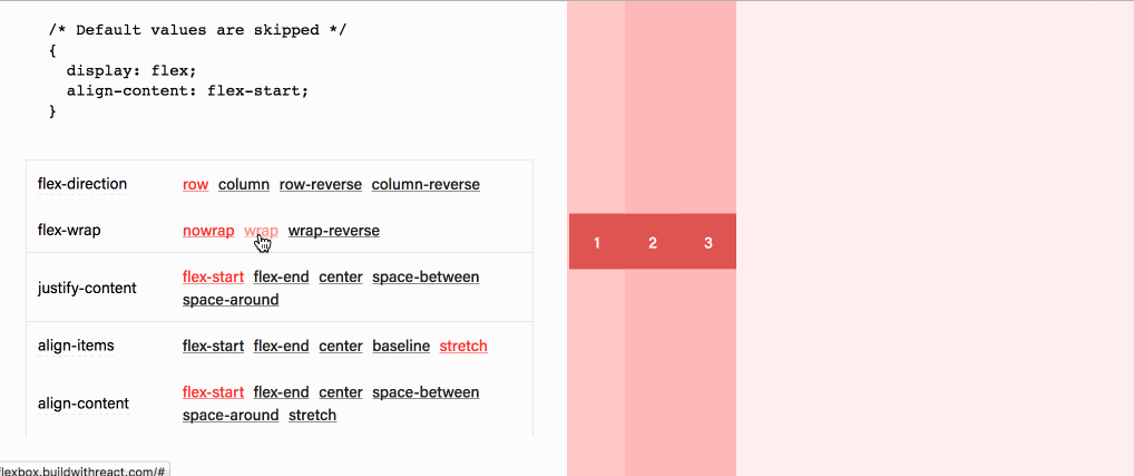
Flexbox
Flexbox is a way to create layout of elements in CSS. In essence is it everything people who claimed layout tables were easier missed in CSS - and much more. You can align child elements of an element to be on the right, left, top or bottom. You can define them to fill up the available space, with each using either the same amount or more than the others. You can also define them to use the available space between each other or around each of them. It is as flexible as it says on the tin. If you want to have a visual editor to see what that means, Build With React has a great flexbox editor to play with.
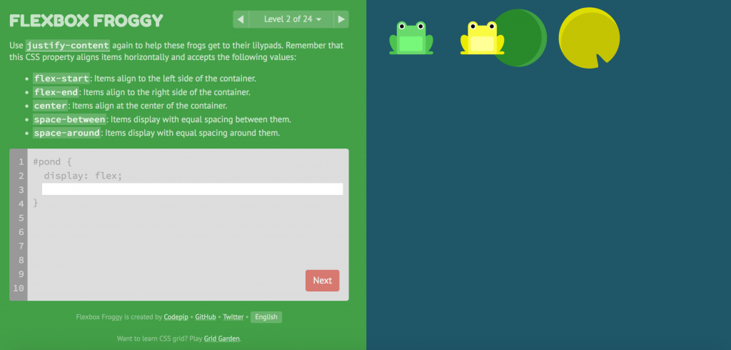
There is also a game called Flexbox Froggy. It teaches the concepts in an enjoyable and accessible manner and is great for kids to start with CSS.
A great talk about Flexbox is the one Zoe Gillenwater gave at various events. What I like most about the talk is how Zoe shows how they used Flexbox in production. The examples are from booking.com and show fallbacks for browsers that don’t support it.
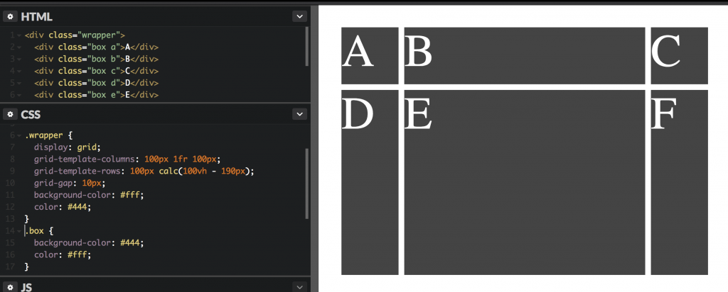
CSS Grid
If Flexbox is the answer to layout elements in a row or a column, CSS Grid is taking it to the next level. Using it you can lay out elements in a defined grid in two dimensions, both rows and columns. Grid has been cooking for a while and now is finally supported across the board.
Grid can be daunting to look at as its flexibility means there are a lot of options to choose from. By far the simplest way to get started is Rachel Andrew’s “Grid by Example” resource. This one has copy+paste examples of grid layouts. Many of them come with fallbacks for unsupported browsers. Training videos explaining the ins and outs of them make it an amazing resource.
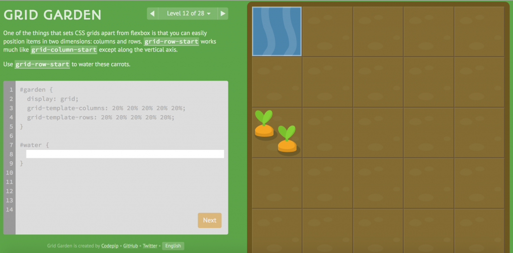
If you learn better with challenges, you can grasp CSS Grid by playing the CSS Grid Garden.
There are some “must see” talks about CSS grids online. The first one is “CSS Grid Layout“, again by Rachel Andrew.
Jen Simmons is taking a different approach. In her “Real Art Direction on the Web” talk she shows how Grid’s versatility can help us to break out of our “box layout” thinking.
There is no problem with mixing and matching Grid and Flexbox. It can and should use Flexbox in its cells. Together, these tools allow you to create flexible layouts. Layouts that allow for variable content and change to fit the available space. Web layouts.
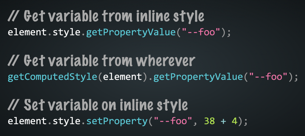
CSS Custom properties (variables)
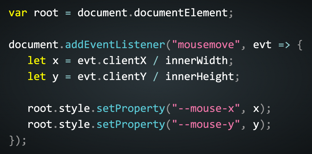
One of the most demanded features of CSS that preprocessors like Sass and Less had for a long time is variables. Now we have CSS Custom Properties which are the thing that gets me most excited about CSS. You can define re-usable settings once in your document and apply them throughout. The most common use case for that is custom colours and sizes. But you can go further and define fonts and other typography. You can also use them to nest calculations in CSS. This wasn’t possible before. An amazing feature is that Custom Properties can also be set dynamically with JavaScript.
If you want to learn all about the amazing power of CSS Custom Properties there is a talk you shouldn’t miss. Lea Verou’s “CSS Variables: var(—subtitle)” is a treasure trove of information.
CSS Feature Queries
Another very welcome addition to CSS was Feature Queries. These work much like Media Queries. By using @supports you check if the current user agent supports a certain feature. You then define a block of CSS that only gets applied when there is feature support. This might feel odd as the fault tolerant nature of CSS should already take care of that. What it does though is give you much more granular control. It also allows you to define a fallback when there is no support for a certain feature using the “not” keyword.
CSS and JavaScript?
CSS and JavaScript working together is powerful and the right thing to do. As far as CSS has come, it still can’t do everything. There are scenarios where the very nature of CSS stands in contrast with what we want to achieve.
As Cristiano Rastelli explains in his “Let there be peace on CSS” talk, the cherished feature of “Separation of Concerns” doesn’t apply in a module world.
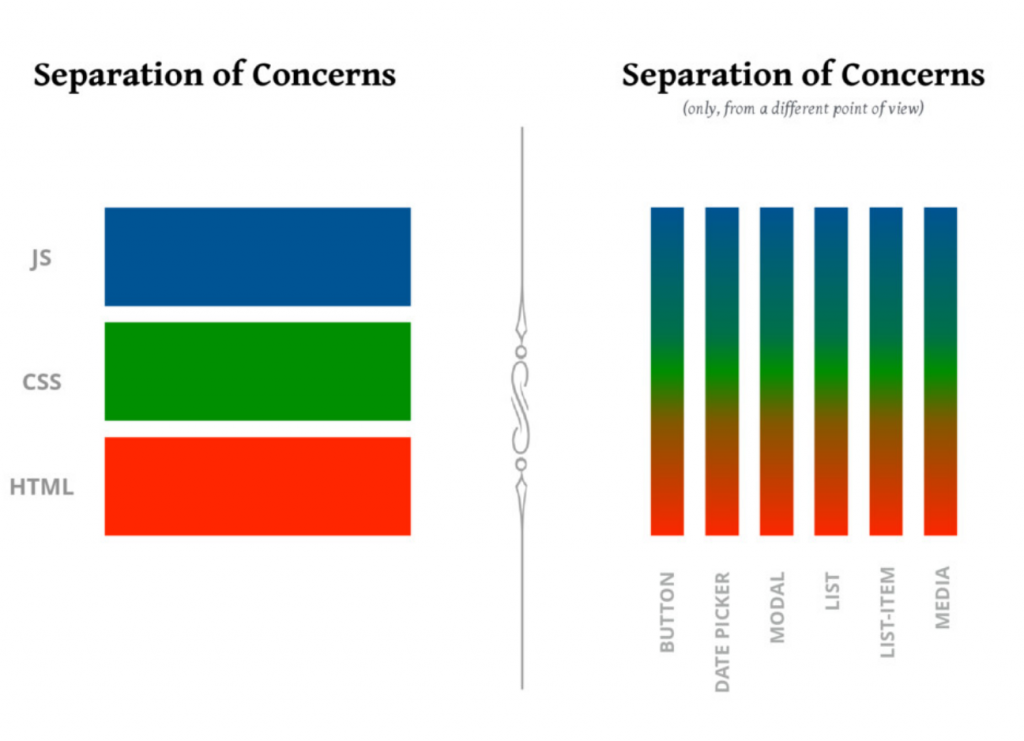
When CSS became a thing we moved all the look and feel and behaviour out of HTML into CSS and JavaScript. We define either on a document or even project wide level. We celebrate the fact that CSS does inherit from parent elements. When we build components that can be consistenly re-used we don’t want that. We want them to carry their look, feel and behaviour without bleeding out either to adjacent ones or inherit from their parents.
CSS and JavaScript working together in a non-component world
When building document-based solutions there is no excuse not to dig into the power of CSS. You can and should use JavaScript to bring information CSS can’t read into CSS. It is prudent though to do so in the least intrusive way possible.
The hierarchy of making CSS and JS work with another in this scenario the following:
- Use CSS when you can – using the things you saw here
- If you need to communicate with CSS, consider changing Custom Properties
- If that’s not an option apply classes to parent elements using classList.
- As a very last resort, you can alter the style directly
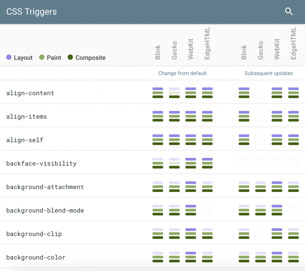
Whenever you change styles dynamically, remember that you are working against the browser. Every style change has consequences in reflow, rendering and painting. Paul Lewis and Das Surma maintain a handy guide called CSSTriggers. This one describes in detail which CSS changes result in what punishment to the browser.
In Summary
CSS is much more reliable than it used to be and there is not much left that should be different to what it is. The main thing to remember is that CSS isn’t meant to do the same things JavaScript does. Even layout languages don’t work the way CSS does and cover the same need. It has a pretty tough job to do and it does it well. When you use CSS, the browser helps you meet the needs of your end users regardless of their setup. This is a core principle of the web and defined in the W3C HTML Design Principles:
Users over authors over implementors over specifiers over theoretical purity
Our users deserve interfaces that are smooth, reliable and don’t kill their batteries. So, consider CSS a bit more. You can be lazy and build on the work of the community.
Inspiring and active CSS people to follow
When researching this talk I kept going back to resources written and maintained by fabulous people on the web. Here is a short list in no particular order of people you should follow if you want to be up to scratch with your CSS knowledge. I have to thank each of them. They’re making the web easier for all of us.
- Ire Aderinokun (@ireaderinokun) writes a lot of easy to grasp and to the point CSS information bits on her blog, bitsofco.de.
- Ana Tudor (@anatudor) is a developer who creates ridiculously complex and beautiful animations in CSS. Her Codepen is one of the most frequented ones and what she does to the CSS engines is a great help for browser makers to test their performance
- Jen Simmons (@jensimmons) is a CSS layout and design expert working for Mozilla
- Rachel Andrew (@rachelandrew) to me is the #1 CSS grids expert
- Chris Coyier (@chriscoyier) is the founder of the amazing CSS resource CSS Tricks and the interactive development playground Codepen
- Sarah Drasner (@sarah_edo) is an animation and design expert focused on building maintainable products
- Zoe M. Gillenwater (@zomigi) is a lead developer using bleeding edge CSS in production
- Brad Frost (@brad_frost) is the author of Atomic Design, a scalable way to use and re-use CSS in large projects
- Rachel Nabors (@rachelnabors) is a comic artist and animation expert writing about web animations and merits of different technologies
- Una Kravets (@una) is a developer specialising in CSS and its new features. She also is a podcaster and has her finger very much on the pulse of CSS and other visual technologies
- Lea Verou (@leaverou) is the author of the excellent CSS secrets book, a researcher at MIT and invited expert by the CSS working group of the W3C. She is meticulous in her research and ruthless in her delivery of lots of great information in a short amount of time.
- Sara Soueidan (@sarasoueidan) is a developer who is an expert on responsive designs and pragmatic approaches to using newest technologies.
I keep getting inspired by these people (amongs others) daily, and hope you will start to get the same experience.