Christian Heilmann

You are currently browsing the Christian Heilmann blog archives for December, 2012.

Archive for December, 2012

Conditional loading of resources with mediaqueries

Wednesday, December 19th, 2012

Here is a quick idea about making mediaqueries not only apply styles according to certain criteria being met, but also loading the resources needed on demand. You can check a quick and dirty screencast with the idea or just read on.

Mediaqueries are very, very useful things. They allow us to react to the screen size and orientation and even resolution of the device our apps and sites are shown in. That is in and of itself nothing new – in the past we just used JavaScript to read attributes like window.innerWidth and reacted accordingly but with mediaqueries we can do all of this in plain CSS and can add several conditions inside a single style sheet.

In addition to the @media selectors in a style sheet we can also add a media attribute to elements and make them dependent on the query. So for example if we want to apply a certain style sheet only when the screen size is larger than 600 pixels we can do this in HTML:

<link rel="stylesheet" 
      media="screen and (min-width: 601px)" 
      href="large.css">

Handy isn’t it? And as we applied the mediaquery we only request this file when and if it is needed which means we even save on an HTTP request and don’t suffer the latency issues connected with loading a file over the wire (or over a 3G or EDGE connection). Especially with movies and source elements this can save us a lot of time and traffic. Sadly, though, that is not the case.

Load all the things – even when they don’t apply

Let’s take this HTML document:

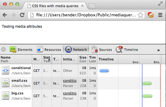
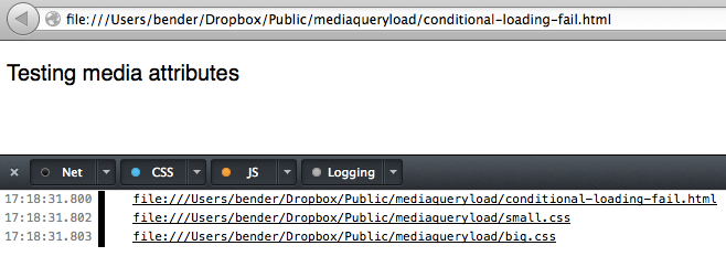
<!DOCTYPE HTML>
<html lang="en-US">
<head>
  <meta charset="UTF-8">
  <style type="text/css">
    body { font-family: Helvetica, Arial, sans-serif; }
    p    { font-size: 12px; }
  </style>
  <link rel="stylesheet"
        media="screen and (min-width: 600px)" 
        href="small.css">
  <link rel="stylesheet"
        media="screen and (min-width: 4000px)" 
        href="big.css">
  <title>CSS files with media queries</title>
</head>
<body>
<p>Testing media attributes</p>
</body>
</html>

If your screen is less than 600 pixels wide the paragraph should be 12px in size, over 600 pixels it is 20px (as defined in small.css) and on a screen more than 4000 pixels wide (not likely, right?) it should be 200px (as defined in big.css).

That works. So we really do not need to load big.css, right? Sadly enough though all the browsers I tested in do. This seems wasteful but is based on how browsers worked in the past and – I assume – done to make rendering happen as early as possible. Try it out with your devtools of choice open.

Chrome loading both CSS files
Firefox loading both CSS files

Update: As Ilya Grigorik points out in “Debunking Responsive CSS Performance Myths” this behaviour is by design. Make sure to read the comments on this post. However, stay with me as I think we should have a handle on loading all kind of resources on demand, which will be shown later.

I am quite sure that CSS preprocessors like SASS and LESS can help with that, but I was wondering how we could extend this idea. How can you not only apply styles to elements that match a certain query, but how can you load them only when and if they are applied? The answer – as always – is JavaScript.

Matchmedia to the rescue

Mediaqueries are not only applicable to CSS, they are also available in JavaScript. You can even have events firing when they are applied which gives you a much more granular control. If you want a good overview of the JavaScript equivalent of @media or the media attribute, this article introducing matchmedia is a good start.

Using matchmedia you can execute blocks of JavaScript only when a certain mediaquery condition is met. This means you could just write out the CSS when and if the query is true:

if (window.matchMedia('screen and (min-width: 600px)')){
  document.write('<link rel="stylesheet" 
                  href="small.css">');
}

Of course, that would make you a terrible person, as document.write() is known to kill cute kittens from a distance of 20 feet. So let’s be more clever about this.

Instead of applying the CSS with a link element with a href which causes the undesired loading we dig into the toolbox of HTML5 and use data attributes instead. Anything we want dependent on the query, gets a data- prefix:

<link rel="stylesheet" class="mediaquerydependent" 
      data-media="screen and (min-width: 600px)" 
      data-href="green.css">
<link rel="stylesheet" class="mediaquerydependent" 
      data-media="screen and (min-width: 4000px)" 
      data-href="blue.css">

We also add a class of mediaquerydependent to give us a hook for JavaScript to do its magic. As I wanted to go further with this and not only load CSS but anything that points to a resource, we can do the same for an image, for example:

<img data-src="http://placekitten.com/500/500" 
     data-alt="kitten" 
     class="mediaquerydependent" 
     data-media="screen and (min-width: 600px)">

All that is missing then is a small JavaScript to loop through all the elements we want to change, evaluate their mediaqueries and change the data- prefixed attributes back to real ones. This is that script:

(function(){
  var queries = document.
                querySelectorAll('.mediaquerydependent'),
      all = queries.length,
      cur = null,
      attr = null;
  while (all--) {
    cur = queries[all];
    if (cur.dataset.media &&
        window.matchMedia(cur.dataset.media).matches) {
      for (attr in cur.dataset) {
        if (attr !== 'media') {
          cur.setAttribute(attr, cur.dataset[attr]);
        }
      }
    }
  }
}());

Here is what it does:

  1. We use querySelectorAll to get all the elements that need the mediaquery check and loop over them (using a reverse while loop).
  2. We test if the element has a data-media property and if the query defined in it is true
  3. We then loop through all data-prefixed attributes and add a non-prefixed attribute with its value (omitting the media one)

In other words, if the condition of a minimum width of 600 pixels is met our image example will become:

<img data-src="http://placekitten.com/500/500" 
     data-alt="kitten" 
     class="mediaquerydependent" 
     data-media="screen and (min-width: 600px)">
     src="http://placekitten.com/500/500" 
     alt="kitten">

This will make the browser load the image and apply the alternative text.

But, what if JavaScript is not available?

When JavaScript is not available you have no problem either. As you are already in a fairyland, just ask a wandering magician on his unicorn to help you out.

Seriously though, you can of course provide presets that are available should the script fail. Just add the href of a fallback which will always be loaded and replaced only when needed.

<link rel="stylesheet" class="mediaquerydependent" 
      href="standard.css"
      data-media="screen and (min-width: 600px)" 
      data-href="green.css">

This will load standard.css in any case and replace it with green.css when the screen is more than 600 pixels wide.

Right now, this script only runs on first load of the page, but you could easily run it on window resize, too. As said, there are even events that get fired with matchmedia but pending testing according to the original article this is still broken in iOS, so I wanted to keep it safe. After all mediaqueries are there to give the user what they can consume on a certain device – the use case of resizing a window to see changes is more of a developer thing.

This could be used to conditionally load high resolution images, couldn’t it? You can grab the code on GitHub and see it in action here.

On Sencha’s Fastbook “HTML5 Tech demo”

Monday, December 17th, 2012

You might have seen the big splash Sencha landed today with their Fastbook HTML5 demo showing that using HTML5, CSS and JavaScript you can make a damn responsive version of Facebook. You can see the demo on Vimeo:

All the details are in their post “The Making of Fastbook – an HTML5 love story“. I saw this and went “holy crap, that is awesome”. As an Android user I’ve seen the native app crash several times when trying to scroll through a lot of data (also on Twitter, so this might be a Samsung implementation problem) and the HTML5 demo is incredibly smooth and compelling.

And then of course, the developer in me thought that something must be amiss about this – it is too smooth, it is too “sales demo”. And of course I got backup – the comments on the blog bring up that this is not running in a web view where a lot of the performance issues would come up and Mozilla internal mails already complained about the fact that the demo does not support any other browsers than webkit – no Firefox, no Opera and no Windows at all. To the internets! Someone is wrong about calling something HTML5 without supporting everything.

And then I stopped. And reflected. And thought for a second what we are doing here. There seems to be this massive Pavlovian response in engineers to want to find the flaws in something rather than looking at the benefits.

pavlovs dogs
Cartoon of awesome by The Rut

Yes, this only works on Webkit, which is bad as HTML5 is more than Webkit. It was also wrong of Sencha to claim that this is showing love to HTML5 without embracing the nature of HTML5 as browser-agnostic platform. But this is marketing war. This is making a demo and showing that things can work when you put effort into it. This is a direct response to the in 99% of the cases misquoted Zuckerberg statement that HTML5 wasn’t the right choice for Facebook at the time. But still I vented my disappointment:

Disappointed that @Sencha’s HTML5 love story means webkit love story. No, Firefox Mobile, no Firefox OS, no Opera and no Windows. :(((

Of course the Twitter stream from that consisted of people telling Sencha off and many people who want to see HTML5 fail (although it wouldn’t make any difference to their lives) harping on about the awful state of HTML5 and the bane of browser inconsistencies – another Pavlovian response every time you say HTML5.

Here comes the kicker, though. Quite a few of Sencha’s folks agreed and explained that this was a quick tech demo and thus only worked in Webkit. Jared Nicholls, their Senior Software architect kept it succinct:

@codepo8 agreed and fixable. Only 24 hours in a day.

So instead of waving my finger and complaining about the thing that could have been but wasn’t thought of I am trying to get conversations going to fix and enhance. Let’s see where this goes.

Sometimes the right thing to do is not to listen to the angry man inside your head and see how something can be done better. Sencha’s demo is a damn good marketing move and well done indeed. So instead of shooting it down it makes sense to work together.

How to read performance articles

Monday, December 17th, 2012

Summary: Performance articles are very good to make a point, but they are very much fixed in time and the shelf-life of their findings can be very short. This can lead to great ideas and technologies being prematurely discarded instead of their implementations being improved or fixed. Proceed with caution.

Every few months I see articles about how someone likes some of the great new features we have in HTML5 and how simple they are to use. Without fail, there will be a follow-up post by performance specialists warning everybody about using these technologies as they are slow.

Performance is sexy, and performance is damn important. Our end users should not suffer from our mistakes. There is no doubt about that. There is also no doubt though, that a simple API and one that builds on top of existing development practices will be used more than one that is more obscure but better performing.

This is the dilemma we find ourselves in. LocalStorage is damn easy, but can perform terribly, using WebSQL or IndexDB is much harder but performs better but is not supported consistently across browsers. Data attributes on HTML elements are an incredibly clever way to add extra information to HTML and keep them easy to maintain, but suffers from reading and writing to the DOM which is always slow.

Instead of finding a middle ground, however, we write articles, give talks or post about our favourite point of view of the subject at hand. Performance articles boast with a lot of numbers, graphs and interactive tests that allow people to run a bit of script across several browsers and paint a picture of doom and gloom.

Designers who just want to use technologies on the other hand then write articles that show that not everything is terrible as they never reach the brute force amount of tests these test cases use to come up with a sensible sample to make a statement one way or another.

I am bored of this, and I think we are wasting our time. What needs to happen is that performance testing and implementation should lead to what we really need: improved browsers with fixes for issues that cause delay. A lot of performance articles would be better off as comments in a bugtracking system, because there they get read by the people who can fix the issues. We need much more feedback from implementers why they don’t like to use a more performance efficient technology and what could be done to make them like it.

Right now our polarised writing causes the worst outcome: people are afraid to use technologies and browser vendors don’t see a point in fixing them because of that.

Libraries love implementers

Libraries, on the other hand, recognise the issues and fix them internally. Almost every jQuery script you see is incredibly tightly knit with the DOM and reads and writes on iterations, fails to do caching or concatenation before causing reflows and would be an absolute nightmare if implemented in plain JavaScript. Library makers learned this and swallowed that pill – implementers like using the DOM, they just don’t like the DOM API. Storing something in an attribute makes it easy to change and means that people will not mess with your code. That’s why libraries use caching mechanisms and delayed writing and all in all a DOM facade to allow developers to use and abuse the DOM without the performance punishment (in many cases, not all of course).

The same needs to happen in browsers and standards. That something is slow is not the news. We live in a world of ever changing browsers and technologies. As Jake Archibald put it:

@codepo8 agreed. Also, most “x is faster than y” advice has a very short shelf life

A lot of the performance issues of technologies is based in how they were defined or the lack of definition and browsers implementing them differently. These are the hardest to fix. But we can only fix them when and if people use them. Without usage no browser vendor will be enticed to spend time and effort fixing the issues – after all as nobody complains, it probably is OK.

Read with caution

So when reading about the performance of anything web related, I think it is important to consider a few things. I also think that well-written posts, books and articles should mention those instead of showing a graph and declaring “xyz considered harmful”:

  • What usage of the technology causes issues – if storing lots of large videos slows down localStorage that doesn’t mean using it for a few small strings makes it a “do not use technology”
  • What are the effects of the performance issue – if what you do delays a page load for 10 seconds, that is an issue, if the problem only persists in certain browsers and with a certain kind of data, less so
  • Are there workarounds – what can implementers do to still use the technology, reap its rewards but not cause the issues?
  • What are the catalysts – a lot of times a performance issue does not really show until you use it excessively. DOM access for example when cached is not a problem, when you keep reading and writing the same values, it is though

Of course, performance experts will tell you that this is a given. People should take the numbers with a grain of salt and test them against their own implementations. Well, that is not how publishing works and this is certainly not how quoting in a 140 character medium works.

A current example

Let’s take a quick example about this:

Stoyan Stefanov’s “Efficient HTML5 data- attributes” talks about the performance of HTML5 data attributes and that they are slow. We have the graphs as proof, we have an interactive test to run in our browsers. And of course Twitter was full of “data attributes are slow and suck”. The interesting part of the article to me, however, was in the last two paragraphs:

Using data attributes is convenient, but if you’re doing a lot of reading and writing, your application’s performance will suffer. In such cases it’s better to create a small utility in JavaScript which will store and associate data about particular DOM nodes.

In this article, you saw a very simple Data utility. You can always make it better. For example, for convenience you can still produce markup with data attributes and the first time you use Data.get() or Data.set(), you can carry over the values from the DOM to the Data object and then use the Data object from then on.

This, to me, is the missed opportunity here. Right now data attributes perform terribly as they are connected to the DOM node, meaning you do an attribute read and write to the DOM every time you read a dataset property. This doesn’t make much sense – why would you need an extra API then?

The mythical Data utility Stoyan writes about is what this article should have started with. Of course, I can see his plan to make people start playing with the idea and thus getting deeper into the subject matter. This would be lovely, but it means that readers need to either do that or check the comments or follow-ups for that solution. Articles have a much shorter shelf-life these days as they had in the past – it makes more sense to show a solution that fixes the issues rather than a blueprint for one. This is not a workshop.

The magic moment here is not saying that the following will be slow to read and write if you use dataset or get attribute:

<div id="foo" data-x="200" data-y="300"></div>

It is also not that you can replace it with a much better performing script like this:

Data.set(div, {x: 200, y: 300});

They are not the same – by a long shot. The former is much easier to maintain and keeps all the data in the same spot. The latter is spreading the info into two documents and two languages – very much against the whole idea of what data attributes are there for.

An article with this title should have shown a solution that turns the HTML solution into a performing solution – by, for example, looping the document once and storing the information in a data object for lookup.

I am not saying that the article is bad – I think the last two paragraphs made it much more objective. What I am saying though is that it is primed to be quoted wrongly and lead to truisms that stand in the way of the underlying issue being fixed.

Performance improvements happen in several areas. The ones with the biggest impact is making browsers faster by fixing issues under the hood and by making it easy for people to develop. We promised developers a lot with the HTML5 standards – this stuff should perform without implementers having to build their own workarounds. This is the main lesson we learned from the success of jQuery.

So, if you read “xyz considered harmful”, read carefully, consider the implementation parameters and don’t discard a very useful tool just because you see some numbers that right now look grim. Technology changes faster than we think and we need to measure with use cases, not lab tests.

[worth watching] Indie Game – The Movie

Friday, December 14th, 2012

We might be late to the party but yesterday we splashed out a wild $10 to download and watch Indie Game – The Movie directly from the makers.

indie game the movie

The very nicely priced movie came in numerous high-quality DRM free download formats including subtitles, captions and creator’s audio track and is a great example how film distribution should be done in almost 2013 rather than telling me I am not in the correct country.

You can watch the trailer here:

Like almost anything awesome, the movie by James Swirsky and Lisanne Pajot originated in Canada and follows a few indie game developers in interviews: Edmund McMillen and Tommy Refenes building and shipping Super Meat Boy, Phil Fish trying to finish and get the rights to release Fez and Jonathan Blow creating Braid.

The imagery and movie making technique is amazing and beautifully done and the movie is a very interesting documentary about the issues indie game developers have to deal with: publishing issues, legal obligations, public feedback and above all personal problems and social anxieties. Whilst a portrait of highly gifted and intelligent people you will be hard pushed to find anybody “normal” in the conventional social sense here.

I was especially taken by the interviews showing the makers dealing with online feedback, demands for the game to come out, hate mail, odd reviews but also all of them reacting badly to positive feedback. As someone who publishes a lot online and spreads out whatever I do for free I could very much relate to these parts.

All in all this is a must watch for anyone who wants to publish in our market – not only games, but anything really. You won’t get car chases and shoot-outs but it is still a very much worth your while movie.

Quick review: The Mobile book by Smashing Magazine

Wednesday, December 12th, 2012

I just spend some time to read myself into the “Mobile Book” by Smashing Magazine and here are my first impressions.

grey matter in 3D

The book, overall, managed to collect an impressive amount of writers known to be “in the know” about all things mobile and each delivered a chapter based on their subject matter. In detail, we have the following:

  • What’s Going On In Mobile? by Peter-Paul Koch
  • The Future Of Mobile by Stephanie Rieger
  • Responsive Design Strategy by Trent Walton
  • Responsive Design Patterns by Brad Frost
  • Optimizing For Mobile by Dave Olson
  • Hands-On Design For Mobile by Dennis Kardys
  • Designing For Touch by Josh Clark

The e-book edition also comes with extra chapters:

  • Mobile UX Design Patterns by Greg Nudelman and Rian van der Merwe
  • Developing And Designing For iOS by Nathan Barry
  • Developing And Debugging HTML5 Apps by Remy Sharp
  • Understanding The Android Platform by Sebastiaan de With
  • Designing For The Windows Phone by Arturo Toledo

The book feels overall very rounded and does a great job in covering all the aspects of mobile development. All of the look and feel things, intended audience and other info is covered in a lovely Mobile book factsheet for the press in case you are interested in that. I read the chapters I wanted on my Macbook Air and on my Android device and in both cases they were beautifully done and easy to take in.

Layout preview and stuff

I especially like the fact that the book covers mobile in a holistic sense, giving us a great overview of the market with PPK’s chapter and diving into the different skills needed in detail chapters. I also like that it is platform agnostic, meaning that what you learn in it is applicable across the board. Far too many publications are more or less veiled “here is how to do mobile for iOS” instructions which will be outdated in half a year tops. The information here is written cleverly and whilst it is a snapshot of the current situation it is written in a way that explains what can be used later and what might just be an issue for now and not worth us wrecking our brains over.

I haven’t read the extra chapter, which is a shame as – biased as I am towards HTML5 - I’d have loved to see Remy’s chapter as part of the main book. I am totally fine getting Android, iOS and Windows specific data as a nice to have, but a real HTML5 chapter would have been good.

That said, Dave Olson’s chapter was quite a revelation to me – its title doesn’t give it enough credit. There is information in there that can make you hit the ground running optimising your web product and it leaves you with links and articles to dive into that can keep you busy for months. It crammed a bit much in and could be a book in itself, but it is well worth your time.

In general I think this book is a great addition for a company or agency library. As a specialist, it can leave you with a few chapters that are very much beyond your reach and can leave you with dangerous “knowledge” but a team reading the applicable chapters and then pooling their knowledge and learnings can use this book to go into the mobile future kicking and screaming. And kicking arse.