The Verge’s new way to display news item links is a terrible idea
Monday, August 14th, 2023 at 4:35 pm
Sometimes it is baffling to me why people publish on the web and don’t follow the simplest ideas that made the web what it is. Take a link for example. You can link anything in HTML so that when users interact with it they go to another URL, or a target inside the current document.
Links should do two things:
- Tell you where they are going
- Work for everyone
HTML links using the anchor element are amazingly accessible. They can be activated using mouse or keyboard, you can open the context menu on them and open them in a new tab, copy the link’s URL or bookmark them.
It is also immensely important that the link has some text and that this text is unique. The reason is that people who rely on assistive technology like screenreaders will access links outside of context.
Imagine that you can’t see and you want to quickly navigate a document without having to wait for the computer to read it all out to you. Screenreaders give you that option by offering the heading structure of a document and a list of landmarks in the document. Another fast way of navigating inside the document is getting a list of all the links in the document. According to WebAIM’s screen reader survey 67.7% of screenreader users navigate the document by skipping from heading to heading. 7.1% navigate via links and 8.1% read the whole document.
This weekend the Verge announced a new series on their magazine called The Installer, a newsletter that is also a web page. What a shocking new idea. What really baffled me though is that they chose to use a new way to display links that are part of the news announcement. And they chose one that breaks every link convention and represents an accessibility nightmare.
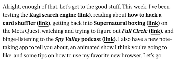
As explained in the screenshot, the installer displays news items as bold and not linked. Instead, each of the items is followed by the text “link” inside parenthesis. Why? Don’t know. What I do know though is that this means non-sighted people who’d love to consume the newsletter quickly and navigate only the links will get a list of items called “link” – and nothing else. Instead of getting a list of items to try out – the reason for the newsletter – they get a surprise every time they activate one of the links. Even without going through the links list but using the tab key to go through them with a screenreader enabled it’s easy to realise that this is an issue. Check out the following screen recording.
Isn’t it great that the email link and the subscribe link tell me what to do?
Sadly, this problem isn’t uncommon. WebAIM checks the accesssibility of the one million most used web sites every year. And the result is that 17.3% of pages had ambiguous link text like “click here”, “continue” and similar ones that only make sense in context and otherwise are just a nuisance. Image you are lost in a huge department store and you see arrows pointing down to the ground everywhere telling you that “you are here”.
I am not saying that all links should be blue and underlined (or purple when they are visited), although there are good reasons for that, too, but I am simply baffled how the most natural thing that makes the web work – the link – is still something people keep trying to reinvent instead of just using what works.
Do you want to be inclusive and reach the largest possible number of readers out there? Use headings, use links that are unique and write sensible alternative text for all images you use. It isn’t magic, it’s common sense.