Back to Basics: Creating a clickable card interface in plain HTML, CSS and JavaScript
Thursday, November 26th, 2020 at 10:19 pmOne request that keeps coming up in web design right now are card interfaces that work like this:
- They should have headings and text and link to another document
- You should be able to click anywhere on the card to go to the other document
- Except, there could also be inline links in text that should go to another document
- And they should have a button to close them
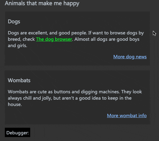
Basically this:
The problem with that interface is that whilst anchor elements can contain other elements, nesting them makes no semantic sense and is invalid HTML.
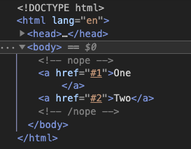
So if you tried:
<a href="#1">One <a href="#2">Two</a> </a> |
The HTML parser rightfully would kick the second link out.
We need to be cleverer about this. I wanted to work with that and play with some features of the browser developer tools at the same time. That’s how I came up with a clickable card interface in 50 lines of CSS and 11 lines of JavaScript.
You can take a look at the source code of the solution on GitHub and also play with it there.
I explain in detail what’s happening here in this ~15 minute video tutorial on YouTube.
The Developer Tools features in use are:
I also tested an earlier version of the card interface in the browser and with Voiceover on Mac.
Here are the steps to make it happen:
Using semantic HTML
<ul class="fullclick"> <li> <h2>Dogs</h2> <p> Dogs are excellent, and good people. If want to browse dogs by breed, check <a href="https://codepo8.github.io/dog-browser/"> The dog browser</a>. Almost all dogs are good boys and girls. </p> <a href="dogs.html" class="main">More dog news</a> <button title="click to close" aria-label="click to close">x</button> </li> <li> <h2>Wombats</h2> <p> Wombats are cute as buttons and digging machines. They look always chill and jolly, but aren't a good idea to keep in the house. </p> <a href="wombat.html" class="main">More wombat info</a> <button title="click to close" aria-label="click to close">x</button> </li> </ul> |
- An unordered list is easy to style and will also tell screenreaders that the items are linked. It will even announce “1 of 2”, “2 of 2” and so on.
- Using a button with an aria-label to close the card makes it keyboard accessible and screenreaders won’t read “button x” which doesn’t give much information.
Making the whole card clickable
- Positioning each list item relative makes sure all positioned elements are contained in it.
- Create an overlay over the whole list item that links to the document works with CSS generated content. Setting a z-index of 1 makes sure this covers all elements without positioning.
.fullclick li { list-style: none; margin: 1em 0; padding: 20px 10px; background: #2b2b2b; position: relative; } .fullclick a.main { color: #85baff; text-align: right; display: block; z-index: 1; } .fullclick li a.main::after { position: absolute; top: 0; left: 0; right: 0; bottom: 0; content: ' '; } |
Making inline links and buttons interactive
- Positioning the inline links relative and the button absolute and giving them a z-index of 2 makes sure they can be interactive above the overlay.
- Using event delegation we can make each button remove the parent element on click
Making the interaction smoother
- Highlighting the current card on hover and on focus-within in CSS makes it easier to realise where you are on the screen
- Triggering a new transition on click of the button and listening to the transitionend event means the card fade out
- Checking the ‘prefers-reduced-motion: reduce’ CSS media query with matchMedia ensures that users with animation turned off don’t get any
The different stages
- Unstyled Version – the bare bones HTML without any styles or scripts – works only as a list.
- Clickable Card – you can click the whole card to go to the link destination
- Adding Button and Links – adding the HTML for inline links and closing buttons. This doesn’t do anything as they are still covered.
- Fixing Button and Links – setting the inline links to relative and upping the z-index
- Adding Hover Effects – making it look nicer and more obvious which card you are on
- Hiding on Click – adding the click handler
- Hiding Smoothly on Click – adding the transition
- Final – all together working in harmony
- Debug – debugging version showing what happens when you click on elements rather than leaving the page