Slimming down the web: Remove code to fix things, don’t add the “clever” thing
Wednesday, July 8th, 2015 at 12:24 amToday we saw a new, interesting service called Does it work on Edge? which allows you to enter a URL, and get that URL rendered in Microsoft Edge. It also gives you a report in case there are issues with your HTML or CSS that are troublesome for Edge (much like Microsoft’s own service does). In most cases, this will be browser-specific code like prefixed CSS. All in all this is a great service, one of many that make our lives as developers very easy.
If you release something on the web, you get feedback. When I tweeted enthusiastically about the service, one of the answers was by @jlbruno, who was concerned about the form not being keyboard accessible.
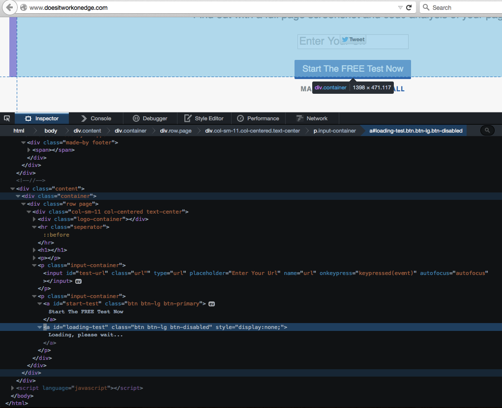
The reason for this is simple: the form on the site itself is none insofar there is no submit button of any kind. The button in the page is a anchor pointing nowhere and the input element itself has a keypress event attached to it (even inline):
 click for bigger
There’s also another anchor that points nowhere that is a loading message with a display of none. Once you click the first one, this one gets a display of block and replaces the original link visually. This is great UX - telling you something is going on – but it only really works when I can see it. It also gives me a link element that does nothing.
Once the complaint got heard, the developers of the site took action and added an autofocus attribute to the input field, and proudly announcing that now the form is keyboard accessible.
Now, I am not having a go here at the developers of the site. I am more concerned that this is pretty much the state of web development we have right now:
- The visual outcome of our tools is the most important aspect – make it look good across all platforms, no matter how.
- As developers, we most likely are abled individuals with great computers and fast connections. Our machines execute JavaScript reliably and we use a trackpad or mouse.
- When something goes wrong, we don’t analyse what the issue is, but instead we look for a tool that solves the issue for us – the fancier that tool is, the better
How can this be keyboard accessible?
In this case, the whole construct is far too complex for the job at hand. If you want to create something like this and make it accessible to keyboard and mouse users alike, the course of action is simple:
- Use a form elment with an input element and a submit button
Use the REST URL of your service (which I very much assume this product has) as the action and re-render the page when it is done.
If you want to get fancy and not reload the page, but keep all in place assign a submit handler to the form element, call preventDefault() and do all the JS magic you want to do:
- You can still have a keypress handler on the input element if you want to interact with the entries while they happen. If you look at the code on the page now, all it does is check for the enter button. Hitting the enter button in a form with a submit button or a button element submits the form – this whole code never has to be written, simply by understanding how forms work.
- You can change the value of a submit button when the submit handler kicks in (or the innerHTML of the button) and make it inactive. This way you can show a loading message and you prevent duplicate form submissions
What’s wrong with autofocus?
Visually and functionally on a browser that was lucky enough to not encounter a JavaScript error until now, the autofocus solution does look like it does the job. However, what it does is shift the focus of the document to the input field once the page has loaded. A screenreader user thusly would never ever learn what the site is about as you skip the header and all the information. As the input element also lacks a label, there isn’t even any information as to what the user is supposed to enter here. You sent that user into a corner without any means of knowing what’s going on. Furthermore, keyboard users are primed and ready to start navigating around the page as soon as it loads. By hijacking the keyboard navigation and automatically sending it to your field you confuse people. Imagine pressing the TV listings button on a TV and instead it just sends you to the poodle grooming channel every time you do it.
The web is obese enough!
So here’s my plea in this: let’s break that pattern of working on the web. Our products don’t get better when we use fancier code. They get better when they are easier to use for everybody. The fascinating bit here is that by understanding how HTML works and what it does in browsers, we can avoid writing a lot of code that looks great but breaks very easily.
There is no shortage of articles lamenting how the web is too slow, too complex and too big on the wire compared to native apps. We can blame tools for that or we could do something about it. And maybe not looking for a readymade solution or the first result of Stackoverflow is the right way to do that.
Trust me, writing code for the web is much more rewarding when it is your code and you learned something while you implemented it.
Let’s stop adding more when doing the right thing is enough.