Microsoft’s first web page and what it can teach us
Friday, August 8th, 2014 at 1:33 pmToday Microsoft released a re-creation of their first web site, 20 years ago complete with a readme.html explaining how it was done and why some things are the way they are.
I found this very interesting. First of all because it took me back to my beginnings – I built my first page in 1996 or so. Secondly this is an interesting reminder how creating things for the web changed over time whilst our mistakes or misconceptions stayed the same.
There are a few details worth mentioning in this page:
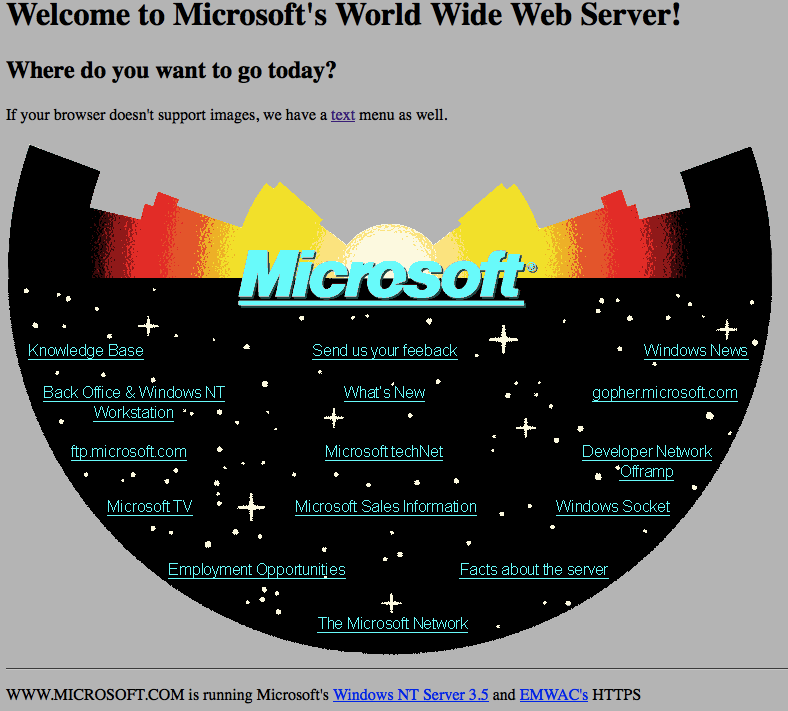
- Notice that whilst it uses an image for the whole navigation the texts in the image are underlined. Back then the concept of “text with underscore = clickable and taking you somewhere” was not quite ingrained in people. We needed to remind people of this new concept which meant consistency was king – even in images.
- The site is using the ISMAP attribute and a client side CGI program to turn x and y coordinates of the click into a redirect. I remember writing these in Perl and it is still a quite cool feature if you think about. You get the same mouse tracking for free if you use input type=image as that tells you where the image was clicked as form submission parameters
- Client-side image maps came later and where a pain to create. I remember first using Coffeecup’s Image Mapper (and being super excited to meet Jay Cornelius, the creator, later at the Webmaster Jam session when I was speaking there) and afterwards Adobe’s ImageReady (which turned each layer into an AREA element)
- Table layouts came afterwards and boy this kind of layout would have been one hell of a complex table to create with spacer GIFs and colspan and rowspan.
And this, to me, is the most interesting part here: one of the first web sites created by a large corporation makes the most basic mistake in web design – starting with a fixed design created in a graphical tool and trying to create the HTML to make it work. In other words: putting print on the web.
The web was meant to be consumed on any device capable of HTTP and text display (or voice, or whatever you want to turn the incoming text into). Text browsers like Lynx were not uncommon back then. And here is Microsoft creating a web page that is a big image with no text alternative. Also interesting to mention is that the image is 767px × 513px big. Back then I had a computer capable of 640 × 480 pixels resolution and browsers didn’t scale pictures automatically. This means that I would have had quite horrible scrollbars.
If you had a text browser, of course there is something for you:
If your browser doesn’t support images, we have a text menu as well.
This means that this page is also the first example of graceful degradation – years before JavaScript, Flash or DHTML. It means that the navigation menu of the page had to be maintained in two places (or with a CGI script on the server). Granted, the concept of progressive enhancement wasn’t even spoken of and with the technology of the day almost impossible (could you detect if images are supported and then load the image version and hide the text menu? Probably with a beacon…).
And this haunts us until now: the first demos of web technology already tried to be pretty and shiny instead of embracing the unknown that is the web. Fixed layouts were a problem then and still are. Trying to make them work meant a lot of effort and maintainability debt. This gets worse the more technologies you rely on and the more steps you put into between what you code and what the browser is meant to display for you.
It is the right of the user to resize a font. It is completely impossible to make assumptions of ability, screen size, connection speed or technical setup of the people we serve our content to. As Brad Frost put it, we have to Embrace the Squishiness of the web and leave breathing room in our designs.
One thing, however, is very cool: this page is 20 years old, the technology it is recreated in is the same age. Yet I can consume the page right now on the newest technology, in browsers Microsoft never dreamed of existing (not that they didn’t try to prevent that, mind you) and even on my shiny mobile device or TV set.
Let’s see if we can do the same with Apps created right now for iOS or Android.
This is the power of the web: what you build now in a sensible, thought-out and progressively enhanced manner will always stay consumable. Things you force into a more defined and controlled format will not. Something to think about. Nobody stops you from building an amazing app for one platform only. But don’t pretend what you did there is better or even comparable to a product based on open web technologies. They are different beasts with different goals. And they can exist together.