Conditional loading of resources with mediaqueries
Wednesday, December 19th, 2012 at 12:51 amHere is a quick idea about making mediaqueries not only apply styles according to certain criteria being met, but also loading the resources needed on demand. You can check a quick and dirty screencast with the idea or just read on.
Mediaqueries are very, very useful things. They allow us to react to the screen size and orientation and even resolution of the device our apps and sites are shown in. That is in and of itself nothing new – in the past we just used JavaScript to read attributes like window.innerWidth and reacted accordingly but with mediaqueries we can do all of this in plain CSS and can add several conditions inside a single style sheet.
In addition to the @media selectors in a style sheet we can also add a media attribute to elements and make them dependent on the query. So for example if we want to apply a certain style sheet only when the screen size is larger than 600 pixels we can do this in HTML:
<link rel="stylesheet" media="screen and (min-width: 601px)" href="large.css"> |
Handy isn’t it? And as we applied the mediaquery we only request this file when and if it is needed which means we even save on an HTTP request and don’t suffer the latency issues connected with loading a file over the wire (or over a 3G or EDGE connection). Especially with movies and source elements this can save us a lot of time and traffic. Sadly, though, that is not the case.
Load all the things – even when they don’t apply
Let’s take this HTML document:
<!DOCTYPE HTML> <html lang="en-US"> <head> <meta charset="UTF-8"> <style type="text/css"> body { font-family: Helvetica, Arial, sans-serif; } p { font-size: 12px; } </style> <link rel="stylesheet" media="screen and (min-width: 600px)" href="small.css"> <link rel="stylesheet" media="screen and (min-width: 4000px)" href="big.css"> <title>CSS files with media queries</title> </head> <body> <p>Testing media attributes</p> </body> </html> |
If your screen is less than 600 pixels wide the paragraph should be 12px in size, over 600 pixels it is 20px (as defined in small.css) and on a screen more than 4000 pixels wide (not likely, right?) it should be 200px (as defined in big.css).
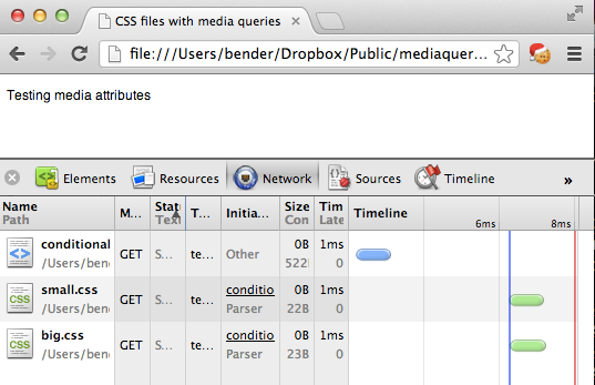
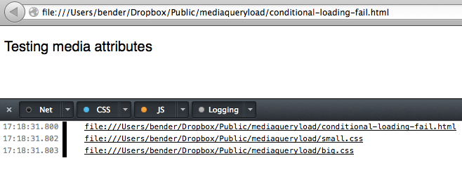
That works. So we really do not need to load big.css, right? Sadly enough though all the browsers I tested in do. This seems wasteful but is based on how browsers worked in the past and – I assume – done to make rendering happen as early as possible. Try it out with your devtools of choice open.


Update: As Ilya Grigorik points out in “Debunking Responsive CSS Performance Myths” this behaviour is by design. Make sure to read the comments on this post. However, stay with me as I think we should have a handle on loading all kind of resources on demand, which will be shown later.
I am quite sure that CSS preprocessors like SASS and LESS can help with that, but I was wondering how we could extend this idea. How can you not only apply styles to elements that match a certain query, but how can you load them only when and if they are applied? The answer – as always – is JavaScript.
Matchmedia to the rescue
Mediaqueries are not only applicable to CSS, they are also available in JavaScript. You can even have events firing when they are applied which gives you a much more granular control. If you want a good overview of the JavaScript equivalent of @media or the media attribute, this article introducing matchmedia is a good start.
Using matchmedia you can execute blocks of JavaScript only when a certain mediaquery condition is met. This means you could just write out the CSS when and if the query is true:
if (window.matchMedia('screen and (min-width: 600px)')){ document.write('<link rel="stylesheet" href="small.css">'); } |
Of course, that would make you a terrible person, as document.write() is known to kill cute kittens from a distance of 20 feet. So let’s be more clever about this.
Instead of applying the CSS with a link element with a href which causes the undesired loading we dig into the toolbox of HTML5 and use data attributes instead. Anything we want dependent on the query, gets a data- prefix:
<link rel="stylesheet" class="mediaquerydependent" data-media="screen and (min-width: 600px)" data-href="green.css"> <link rel="stylesheet" class="mediaquerydependent" data-media="screen and (min-width: 4000px)" data-href="blue.css"> |
We also add a class of mediaquerydependent to give us a hook for JavaScript to do its magic. As I wanted to go further with this and not only load CSS but anything that points to a resource, we can do the same for an image, for example:
<img data-src="http://placekitten.com/500/500" data-alt="kitten" class="mediaquerydependent" data-media="screen and (min-width: 600px)"> |
All that is missing then is a small JavaScript to loop through all the elements we want to change, evaluate their mediaqueries and change the data- prefixed attributes back to real ones. This is that script:
(function(){ var queries = document. querySelectorAll('.mediaquerydependent'), all = queries.length, cur = null, attr = null; while (all--) { cur = queries[all]; if (cur.dataset.media && window.matchMedia(cur.dataset.media).matches) { for (attr in cur.dataset) { if (attr !== 'media') { cur.setAttribute(attr, cur.dataset[attr]); } } } } }()); |
Here is what it does:
- We use
querySelectorAllto get all the elements that need the mediaquery check and loop over them (using a reverse while loop). - We test if the element has a
data-mediaproperty and if the query defined in it is true - We then loop through all
data-prefixed attributes and add a non-prefixed attribute with its value (omitting the media one)
In other words, if the condition of a minimum width of 600 pixels is met our image example will become:
<img data-src="http://placekitten.com/500/500" data-alt="kitten" class="mediaquerydependent" data-media="screen and (min-width: 600px)"> src="http://placekitten.com/500/500" alt="kitten"> |
This will make the browser load the image and apply the alternative text.
But, what if JavaScript is not available?
When JavaScript is not available you have no problem either. As you are already in a fairyland, just ask a wandering magician on his unicorn to help you out.
Seriously though, you can of course provide presets that are available should the script fail. Just add the href of a fallback which will always be loaded and replaced only when needed.
<link rel="stylesheet" class="mediaquerydependent" href="standard.css" data-media="screen and (min-width: 600px)" data-href="green.css"> |
This will load standard.css in any case and replace it with green.css when the screen is more than 600 pixels wide.
Right now, this script only runs on first load of the page, but you could easily run it on window resize, too. As said, there are even events that get fired with matchmedia but pending testing according to the original article this is still broken in iOS, so I wanted to keep it safe. After all mediaqueries are there to give the user what they can consume on a certain device – the use case of resizing a window to see changes is more of a developer thing.
This could be used to conditionally load high resolution images, couldn’t it? You can grab the code on GitHub and see it in action here.