Fun with 3D transforms and rollovers – kittens in space
Monday, November 14th, 2011 at 3:39 pmLately it seems, CSS3 rollover showcases are getting a new revival. The massive collection of effects here made quite the rounds on Twitter the last weeks. As I wanted to play with 3D transforms a bit more, I thought I do a quick demo of how to use them to create a lovely rollover effect on a kitten photo cause we all know this is what the web is about. You can see the effect in action here and get the source code on GitHub. And here is a video of how the effect looks on Firefox 7 which does not support 3D transforms and on Firefox Aurora (or Safari, or Chrome) which do:
Now, how is this done? Here is a step by step example. We start with simple HTML that works on all the browsers (Step 1):
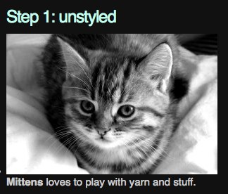
<ul> <li class="image3d"> <figure> <img src="mittens.jpg" alt="Mittens the cat"> <figcaption> <p> <strong>Mittens</strong> loves to play with yarn and stuff. </p> </figcaption> </figure> </li> <!-- repeated --> </ul> |
Then we style the caption to overlay the image by giving the LI dimensions and positioning it relative and giving the caption dimensions and positioning it absolutely. We set the opacity of the image to 40% to make the caption more readable (Step 2):
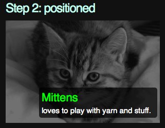
.positioned { list-style: none; width: 300px; height: 200px; position:relative; } .positioned figcaption { position: absolute; background: rgba( 0, 0, 0, 0.7 ); color: #fff; border-radius: 5px; left: 65px; bottom: 10px; width: 230px; } .positioned img { opacity:0.4; } .positioned figcaption strong { display: block; color: lime; font-weight: normal; font-size:22px; padding: 5px 0; } .positioned figcaption p { display: block; color: white; padding: 5px; } |
This works in almost any browser. Now we can make it interactive by adding a rollover style. We set the overflow of the list item to hidden and position the caption outside the list item. On rollover, we move the left position to the one inside the LI (Step 3):
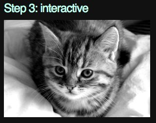
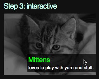
.interactive { overflow: hidden; } .interactive img { opacity: 1; } .interactive figcaption { left: 300px; } .interactive:hover img { opacity: 0.4; } .interactive:hover figcaption { left: 75px; } |
To make this smoother, all we need to do is to use CSS transitions on the images and the captions (Step 4). This transitions smoothly between the states without us having to do any calculations. In order to play nicely across browsers, we repeat the instructions with all browser prefixes and fall back to the non-prefixed version.
.smooth img { -webkit-transition: all 1s; -moz-transition: all 1s; -o-transition: all 1s; -ms-transition: all 1s; transition: all 1s; } .smooth figcaption { -webkit-transition: all 1s; -moz-transition: all 1s; -ms transition: all 1s; -o-transition: all 1s; transition: all 1s; } |
Lastly, we do the 3D effect for browsers that support it (Step 5). For this, we give the list item a perspective of 800 pixels. This is like putting a cube into our document where we now can position elements in. In our case, we move the image on rollover 80pixels in the X axis, -20 pixels in the Y axis and -100px in the Z axis. We also rotate it 50 degrees in Y and 10 degrees in X.
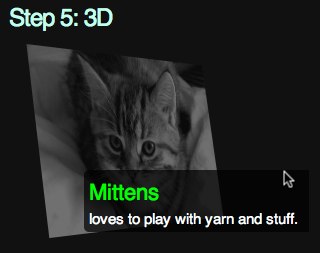
.threed { -webkit-perspective: 800px; -moz-perspective: 800px; -ms-perspective: 800px; -o-perspective: 800px; perspective: 800px; } .threed:hover img { -webkit-transform: rotateY( 50deg ) rotateX( 10deg ) translate3d( 80px, -20px, -100px ); -moz-transform: rotateY( 50deg ) rotateX( 10deg ) translate3d( 80px, -20px, -100px ); -o-transform: rotateY( 50deg ) rotateX( 10deg ) translate3d( 80px, -20px, -100px ); -ms-transform: rotateY( 50deg ) rotateX( 10deg ) translate3d( 80px, -20px, -100px ); transform: rotateY( 50deg ) rotateX( 10deg ) translate3d( 80px, -20px, -100px ); } |
That’s it! Smooth kittens in 3D space without any JavaScript or hard calculations on our end.